Canvas Typography and Fonts
- Subscribe to RSS Feed
- Mark as New
- Mark as Read
- Bookmark
- Subscribe
- Printer Friendly Page
- Report Inappropriate Content
Typography is an important aspect of our web interfaces and helps us express creativity and meaning when we are communicating our content to our students. The fonts we choose can help us deliver our messages, and they can even evoke reactions from our readers.
An especially important aspect of typography and fonts in education is readability. Fonts can be fun, casual, modern, professional, etc., but one of the most important things for instructional designers to consider is that the content on the page is easy to read and understand. When fonts are easy to read, then readers are more likely to read more of the content. Here are some guidelines for deciding which fonts and typography techniques can help determine which route to take when designing Canvas content.
Be mindful about serifs
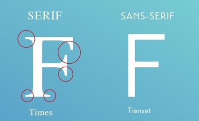
The serifs are the little embellishments that you sometimes find at the end of fonts. A traditional serif font would be Times New Roman, whereas common sans serif fonts are Calibri and Helvetica.
The research on the effectiveness serif vs. sans serif is rather mixed. This likely reflects the variety, variations, and ornamentation of fonts on the market. Some research purports that the serifs help lead the viewer from one letter to the other, creating a flow throughout the sentence. Other research indicates that serifs can be distracting and can prevent readers from efficiently reading at length. Interestingly, although it is often ridiculed, there is research claiming that Comic Sans is a good font for accessibility and dyslexia.
Keep lines short
When you glance at billboards, magazines, posters, and flyers, you'll notice that their content is most effective when lines are short and perhaps bulleted. A Canvas page is not a flyer or billboard, but we still can work to keep our lines short. Some of our students view the content on phones or tablets, in which case line content is not is not so much an issue. Others are viewing the content on computer screens and perhaps very large monitors (or even TVs or projectors). The Baymard Institute researches user experience, and they recommend keeping line length to under 75 characters for an optimal line length.
One trick you can employ to keep the lines from running too long is to use a div in the HTML editor to constrain the width. That might look something like this:
<div style="width: 800px;">
<p>Page content....</p>
</div>
Be consistent
It is tempting to change up the look and feel of the typography, whether from one page to another or within a page. People may be tempted to adjust the size, color, family, placement, headings, etc. It is okay to occasionally employ (accessible) novelty in order to draw attention to a very specific bit of text. However, when such is overused then not only is the novelty nullified, but it can be deleterious to the overall experience as it creates too many distractions. As Syndrome stated:
Be mindful of emphasizing text
Although we want to maintain consistency, it is perfectly fine to emphasize portions of text. However, don't be tempted to go overboard with changing the color and size of the text; instead try to make use of bold, italics, underline, and headings (H2 -H4). These are picked up by screen readers for those who need accessible accommodations. Of the options, the web design preference is to use bold before italics and underline. Headings are great for breaking text up into sections.
For more Canvas typography and font tips and tricks, including how to use the RCE and HTML editors, blockquotes, abbreviations, etc., check out this quick video:
You must be a registered user to add a comment. If you've already registered, sign in. Otherwise, register and sign in.


