Dynamic page flow with course menu navigation
- Mark as New
- Bookmark
- Subscribe
- Mute
- Subscribe to RSS Feed
- Permalink
- Report Inappropriate Content
Hello designers,
I have a (hopefully easy) question regarding the viewing of canvas across different platforms (mobile, laptop and desktop). I have recently been shown the light with using divs instead of trying to create our page with tables. However I am in a pickle of making this look nice, I am currently happy-ish with desktop and mobile, however have come unstuck with laptop. All browsing has been completed in a chrome browser. I have attached some images to try to assist with my dilemma.
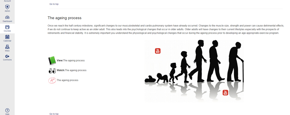
Img 1 View from desktop
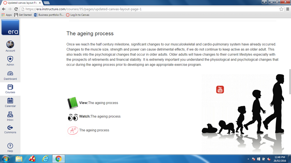
Img 2 View from laptop with course menu
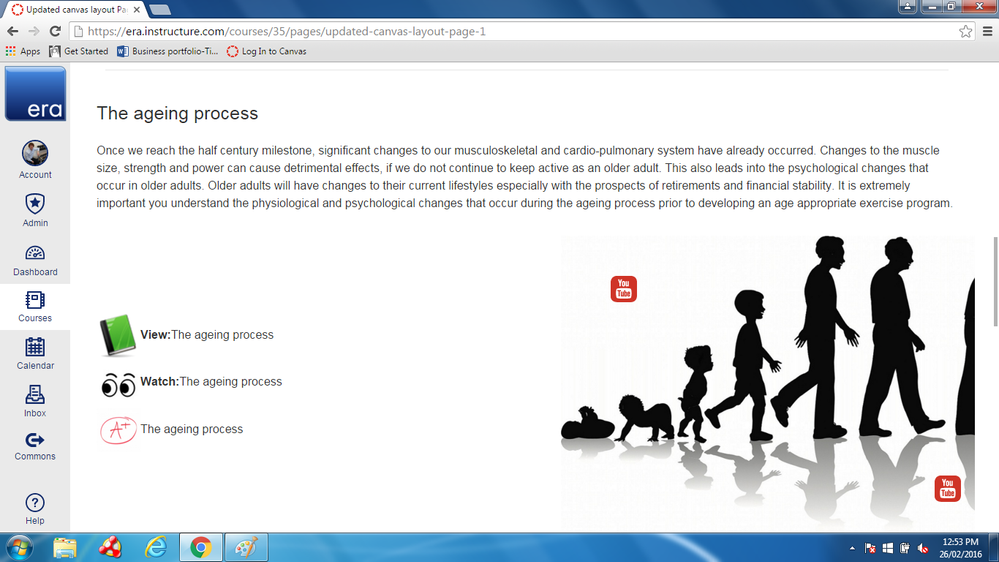
Img 3 View from laptop with course menu collapsed
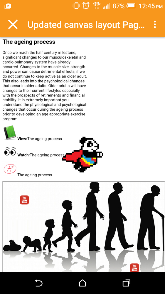
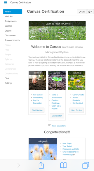
Img 4 View from mobile (I could have waited for the flying panda to go, but come on.. its a flying panda)
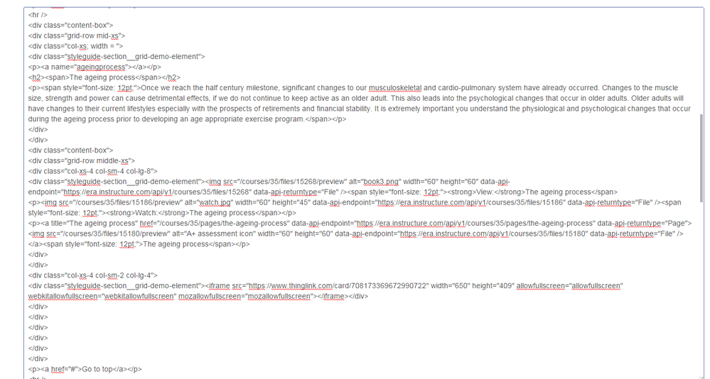
Img 5 HTML editor of "the ageing process"
- As you can see I have tried to throw in three sizes for the flexbox grid (it does not seem to differentiate between large screen - 24' and laptop ~15')
For anyone that is very involved in programming and canvas, I apologise for what is no doubt hacked together "coding". I would greatly appreciate any tips and pointers for best practice in getting appropriate size across all three viewing platforms.
This also is an opener for one last point automatically adjusting iframes anyone?? i've tried the width100% etc etc but doesn't seem to work as canvas inserts a fixed height in.
Thanks to everyone who has spent the time to cast their eyes over this post! I look forward to a good discussion.

