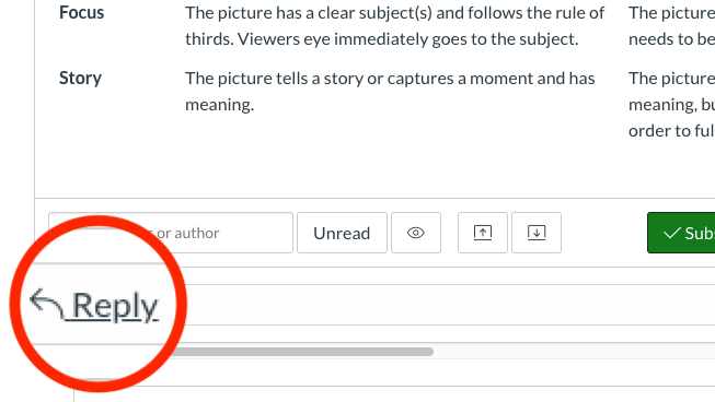
Discussion Post REPLY Button Needed

(1)

I have had numerous students confused about where to "submit" their discussion post replies to other students or to even join the conversation through a simple reply "button" icon vs. the text + arrow. The subscribe/d button is very visible when viewing the post as it is green and white, but even I had to really look for it myself in the beginning. 

It would be nice if this could be changed. I had to create a tutorial with this photo for students to see where to start their reply without adding to another replier's post.  

Screen shot with highlighted Reply text and arrow

4 Comments
kcg
Community Explorer

I agree.  I'm also having a problem with my students typing their initial posts in the search bar and then hitting next and deleting their work.  

Steven_S
Community Champion

agreed.  the location to start an initial post should be more prominent than a subscribe button.  I think, however, that having a textbox ready to type in might be the most familiar way for them to respond: Discussion-Post-Reply-Box

supermarnick
Community Explorer

YES! I completely concur and would like to see Instructure fix this issue. My middle school students are so confused on discussion assignments because there is no apparent button for them to begin their reply. The REPLY button needs to look like an actual action button. Let's fix this folks! 

ProductPanda
Instructure
Instructure
Status changed to: Archived
Comments from Instructure

As part of the new Ideas & Themes process, all ideas in Idea Conversations were reviewed by the Product Team. Any Idea that was associated with an identified theme was moved to the new Idea & Themes space. Any Idea that was not part of the move is being marked as Archived. This will preserve the history of the conversations while also letting Community members know that Instructure will not explore the request at this time.