Remove colour overlay from course cards that have an image

This idea has been developed and deployed to Canvas


Howdy all,

Firstly I have to say the new course cards image feature is awesome and a great leap forward. I have been using it a bit now and have a small request for a future revision.


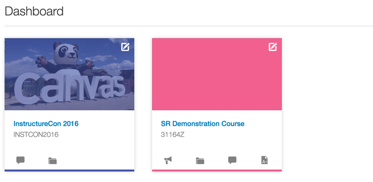
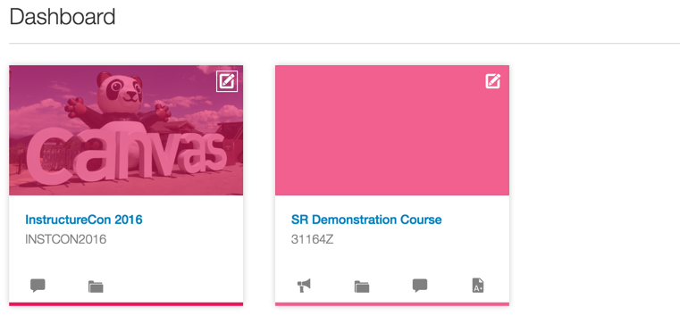
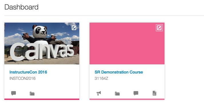
When a course is given an image for the course card on a user's dashboard, I would really like to see the colour overlay removed (so that the image does not looked washed out with the user selected colour).


Ideally, I would love to see this configurable on an account level rather than an individual course level, but that is just from an administrator's perspective.


Just to visualise this more, the current behaviour with a couple of different colours:

200569_canvas_demo_1.pngcanvas_demo_1.png

200579_canvas_demo_2.pngcanvas_demo_2.png


And the ideal/requested behaviour:

200580_canvas_demo_3.pngcanvas_demo_3.png


Additional thoughts:

I do realise the colour is important for a few different areas in relation to the course, so perhaps the bottom bar could be extended as a border around the entire card (just as one example).


Many thanks  team,

Keep up the awesome work!


Comments from Instructure

For more information, please read through the Canvas Production Release Notes (2017-05-13) 

208 Comments
kona
Community Coach
Community Coach

I agree! That looks really nice!

garrett_william
Community Participant

I prefer the small thin line that is generated at the bottom of the card and showcased at the top of this comment thread. The color bar to the right is very heavy and makes the image look chopped off. My current CSS implementation that removes the color overlay has worked out nicely. There has been no confusion regarding what color corresponds with the course. In design, understated elements can go a long way. Especially when you have some many competing colors due to the individual theming of a Canvas instance. There is less color clash and the cards are more pleasing to the eye with a simple color strip.

Here are some examples:

Dashboard, no color overlay

laurakgibbs
Community Champion

Thin line works nicely also.

At this point, the solution that sounds best to me is the solution we can have soonest. I'm honestly not sure why this is such a hard fix to implement, especially if admins are able to implement a simple CSS fix.

I certainly hope a good solution will be in place for the coming school year in Fall.

joseph_ledosque
Community Novice

I completely agree that the thin bar looks better. If it is between a thick side bar to preserve the edit icon or no change at all, though, I'll take the side bar.

I think that making each school implement the change on their own by modifying the CSS is not a viable option. There are too many schools that are going to be wary of messing with the CSS file.

laurakgibbs
Community Champion

Agreed! I'm a faculty member; that means I've got limited "social capital" in terms of making admin requests, and I don't want to have to use it for this CSS fix. 🙂

johnmartin
Community Champion

I wish there was some movement on this 😞

garrett_william
Community Participant

I totally agree, we are in a trust account and I was able to make the fix, but then had to turn around and convince the other Canvas admin in our district it was safe to do . . . really need something that allows an easier implementation for teacher/ course users and something that provides more control if an admin wants to lock it down for branding purposes

rgibson1
Community Champion

Nearly a year ago this was debuted at Keystone. I couldn't wait to get it launched. Then the dreaded overlay was introduced instead. It's been DOA ever since. I think they are trying to wait us out and hope we won't notice, but we're not turning it on. What baffles me is that they have it in the Canvas Network. Do the two development teams not talk to each other?

susan_cornish
Community Novice

I'm keen to see the colour overlay removed. We use photoreal images as a key component of our look and feel, and have selected strong images for each of our courses. They look so muddy with the colour overlay.

Renee_Carney
Community Team
Community Team
Idea is currently in development

A solution for the color overlay concerns is now in development.