Student Gradebook UI design

0 Likes
(4)

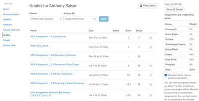
Problem: Some courses can have 100+ assignments making the gradebook extremely long to scroll through to find the right assignment a student would need or want to do through the gradebook.

I note that each assignment has a grouping and that each grouping is weighted differently. The student could be more effective with their time if they had an "at a glance" understanding and focus in where they feel most important.

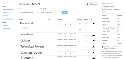
Solution: I propose that if the assignments in gradebook were "nested" together as indicated by the [Arrange by] menu then each nesting having dropdowns for expansion would make it easier for the student to chose what to do.

For example:

This first image is what I currently see as a student:

CanvasOriginalGradesUX.png

This next image is a proposed solution that would have help me greatly for that class:

CanvasProposalGradesUX.png

I trust that a more professional UI designer can take inspiration from this to improve as they see fit. Parallels to this problem and solution can apply to the mobile app.

There are a couple other little enhancements that could be made but require further discussion.

This is the biggest change I see that would be most helpful. I hope that the images and their differences are self explanatory as they should be.

4 Comments
Stef_retired
Instructure Alumni
Instructure Alumni
Status changed to: Open
 
StephensErica
Community Member

As an observer (parent), it would be helpful to be able to sort the grades by category for exactly the reason that the OP stated. If assignments are worth 20%, projects are worth 30%, and tests are worth 50%, I have to do a lot of mental gymnastics to figure out how each item factors into the student's grade. The simple ability to sort the grades removes at least one summersault.

sgarcia1
Community Participant

I agree that the Gradebook on the desktop version needs a redesign urgently. There are several different ideas at the forum regarding this, we should be able to merge them at one post and get more upvotes so Canvas looks at it.
In fact, I think the way grades are displayed in the Canvas App is way more intuitive. It contains the factors you are mentioning:
- Display the assignments by Module / Assignment group by default (in other words, display the grades semantically and not chronologically)
- When you tap on a specific grade, it will show you the details in a very visual way (including a chart where you can understand at a glance if your grade is ahead, average or behind the rest of the class)

Screenshot_20220720-152534.png

Screenshot_20220720-152543.png


 My suggestion here is, why don't use this app design also in the desktop version?

Do not forget to upvote this idea (giving 5 stars to the original post) so it gets more attention from Canvas.

ProductPanda
Instructure
Instructure
Status changed to: Archived
Comments from Instructure

As part of the new Ideas & Themes process, all ideas in Idea Conversations were reviewed by the Product Team. Any Idea that was associated with an identified theme was moved to the new Idea & Themes space. Any Idea that was not part of the move is being marked as Archived. This will preserve the history of the conversations while also letting Community members know that Instructure will not explore the request at this time.