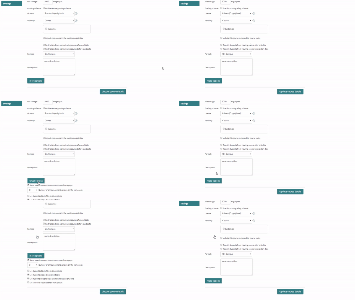
As a new canvas using institution, we have had to train staff and develop training resources. During training and development of said resources it became clear that there are some elements in the Canvas UI/UX that forces additional and unnecessary training needs. Having to incorporate explanations of features that should be intuitive in the first place in our training is unnecessary and excessive.
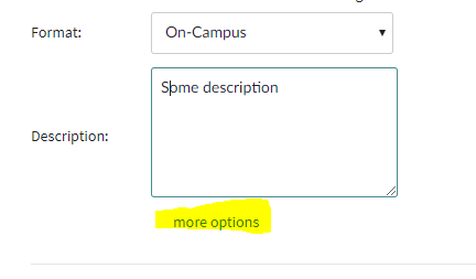
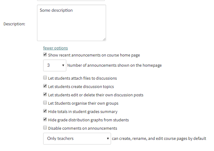
One example of such an element is the "more options" element in the course details tab in the course settings. We have during training and in subsequent support scenarios noticed that the design of this option is actually obfuscating the underlying content. We have had feedback from our users saying that it look like it's more options for the course description field and not additional course detail settings.
Current design - minimized
Current design - expanded
"Feature" idea
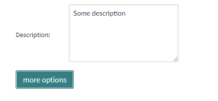
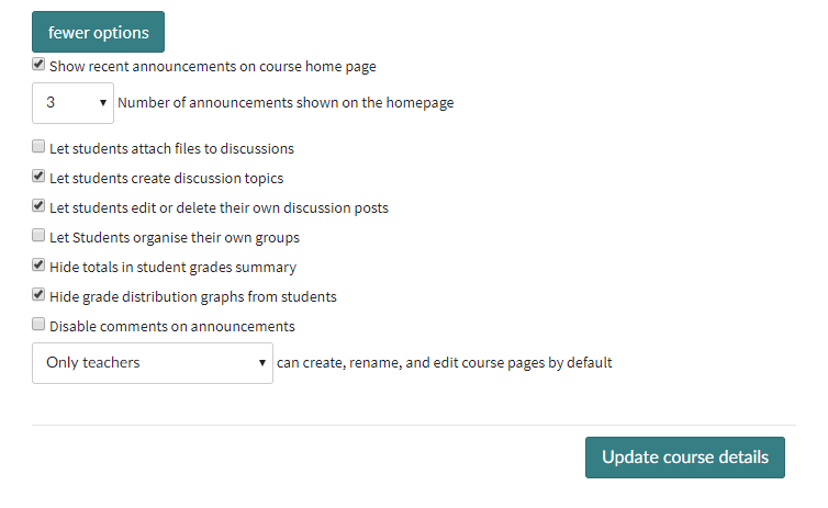
Make the element more intuitive by reducing padding and changing the link to a button type. I mocked up a suggestion in 2 minutes that I consider, though obviously not perfect, to be far more intuitive and user friendly than the current design.
Suggested design - minimized
Suggested design - expanded
A gif of the feature idea

