Status:
Archived
Submitted by
amy_morris1
on
04-27-2020
03:55 PM
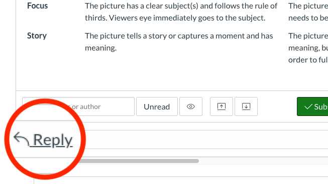
I have had numerous students confused about where to "submit" their discussion post replies to other students or to even join the conversation through a simple reply "button" icon vs. the text + arrow. The subscribe/d button is very visible when viewing the post as it is green and white, but even I had to really look for it myself in the beginning.
It would be nice if this could be changed. I had to create a tutorial with this photo for students to see where to start their reply without adding to another replier's post.
This widget could not be displayed.
Labels
This widget could not be displayed.
This widget could not be displayed.

