Your Community is getting an upgrade!
Read about our partnership with Higher Logic and how we will build the next generation of the Instructure Community.
Having spent some time looking at the Canvas Style Sheet and "mastering" flexbox grids I set about transforming some course pages and admiring how the pages re-arranged themselves as I shrank the browser width. Since then I have been informed that the Style Sheet and the flexbox grids don't actually work in mobile devices so I have gone back to using tables (which apparently have accessibility issues) and plain old div tags. I seem to be reduced to just placing content elements in a vertical column to ensure that the coordinator can't mess things up and that mobile devices can operate effectively. Are others at this sort of impasse or am I missing something? Any help in orientating me as to what is and isn't possible or worthwhile in terms of page design and what's on the horizon in terms of development and feasibility will be appreciated. In the meantime I am relying on engaging videos and embedding content through i-frames.
thanks,
George.
@george_hatsidim Thank You for posting this prompt. Since you're aiming for a responsive design that will work well on mobile devices, I've shared the discussion with the Canvas Mobile Users group.
Hi George,
You can try creating an unordered list and giving it appropriate styles so that it can be responsive.
Hi Sean,
not sure exactly what you mean here, do you perchance have an example? Perhaps a screenshot with the code?
An unordered list means bullet points doesn't it? Not sure how that would look in terms of general formatting.
thanks,
George.
I'm not sure how mobile-friendly this is, but I created a nice, browser-responsive set of sized items using:
display: inline-block;
The full styling for my class is:
DIV.xxx {display: inline-block; vertical-align: top; width: 120px; text-align: center; padding: 15px 10px;}
In my application, I have an 80x80px image with text centered below it, and the whole thing is also a link ("Click this icon" concept). I placed 8 of these DIVs on a content page. In my maximized browser, they make two rows of 4. As I change the size of the browser, they automatically move to make additional rows with less columns. I'm probably missing a couple of useful style options as I'm not fully versed in all css. I love W3Schools Online Web Tutorials for all things code & web pages.
Hi Aaron,
I have much less understanding of css so maybe you, or someone else, can help me understand. Canvas has a style sheet that we can reference through their style guide as per Canvas LMS (Correct me when I go astray). This style guide is not able to be utilised on mobile devices as I understand it i.e. there are some limitations with mobile devices in this respect. So does that mean you create your own style sheet and then somehow reference it within the Canvas environment? Sorry it's so basic a question and not sure it makes sense to you but just trying to understand the possibilities, limitations and workarounds for using style sheets with Canvas. thanks.
@george_hatsidim , your Canvas administrator should have the ability to upload a single, custom CSS stylesheet as part of the branding/theme for your institution. The entries on that stylesheet can then be used by anyone in your institution. Do be careful to make certain your entries are unique from any that Instructure has already built. For instance, I preface mine with "ewc_".
Oh, and a style sheet can be applied at any "sub-account" level as well. So, you might be able to have styles that fit your particular department or college or school, depending on how your Canvas instance is set up.
Embedding content via iframes AND using the redirect tool (to display entire pages/sites in Canvas) is the only kind of content development I do. I need real content development tools, and I don't consider Pages to be ready to prime time (not for the kind of content I want to create anyway).
But that's okay: iframes are great, and the redirect tool is great.
That way I can develop content on the open Internet, and use other people's content, while also contextualizing it in Canvas. It works! 🙂
Yes I like iframes too, although some of my colleagues think it fails the accessibility test. At this stage I have created content in Adobe Animate and used iFrames to embed. No hassles with basic interactivity but I have been warned by others that there may be certain types of interactivity that are blocked even though it is an iFrame. What types of content do you typically use? Is it interactive or you are mainly concerned with layout? Have you found or heard of limitations to embedding content with iframes? Thanks for your reponse.
I link to the external version when I embed; the iframe is really just a convenience for students who prefer to have the Canvas navigation available to them. So, for example, my announcements are an embedded blog, and I provide a link above the iframe to pop it out into a real browser tab:
Daily Announcements: MLLL-3043 Myth-Folklore - Spring 2018
And I set a blog-wide default to open all links in new tabs anyway. That way, in case I have a link in there that is http instead of https it will still open as expected. 🙂
I have no fixes, but I am hoping that this is one of the things that will be addressed in the rolling updates of the Student app!
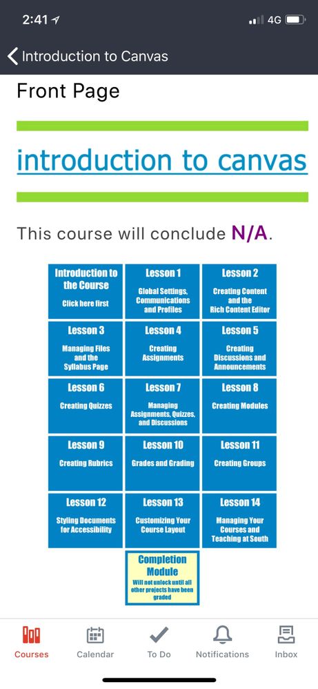
Hello George -- I had this same problem myself and wrestled with it for awhile, but ultimately found that there is no solution. Canvas does not support mobile web access (it's not responsive), and the Canvas Student app does not consistently read custom HTML/CSS so there is no use trying to do fancy responsive formatting.
You were right, you just have to stick everything in one vertical column and let the app do the reformatting as it likes.
One of the reasons I have been very happy using blogs as my main content development platform (and my students all blog too!) is that Blogger and other blogging platforms are very mobile responsive. If my students are reading the class announcements blog on their phone, it defaults to mobile automatically, and that INCLUDES the iframed presentation of Blogger blogs, so a student looking at my course homepage blog (iframed) on their phone, will see the Blogger mobile view automatically, which suppresses the sidebar, etc. And that's fine: I love the sidebar and put a lot of content there, but it is all 'extra' because I know it is not going to show on the mobile view unless students seek out the browser version (which works fine on some phones, not so fine on others); Blogger has a "go to web version" button at the bottom of the mobile view. Very handy... because I don't have to do anything! The platform does it for me. 🙂
I think that's great that you found a workaround that is pedagogically useful and also fits in with the technology. Unfortunately it won't be for everyone (given the extra workload and learning curve), so as someone who supports academic staff I will note it as an option but await a canvas based solution (which may be some way away by the look of things).
This is true. There is limited support for CSS in the Canvas Student app, and you can't simply copy the web CSS file over and expect everything to work. The CSS file for Canvas Student app needs to be fairly basic and doesn't seem to support many bells and whistles. Of course, this all requires an admin to install and maintain the CSS file and leaves very little for the end user to do. A lot of this is how the mobile app gets it's Pages data from the API. I'm curious to see if future development allows for a better process to use styles without creating an inferior presentation on mobile.
We ended up taking a bulleted list and using this code at the front and each of two column breaks. Our thought was since it was a list it should at least be accessible. The columns aren't exactly collapsible for mobile, but it avoided the accessibility issues that come with using tables to format.
<div style="float: left; width: 33%;">
Oh and make sure the last column use 34% or your text will creep up the last 1% on the right.
Sounds interesting.
Let me see if I understand correctly, you split the text and images into a 3 column layout much like a Newspaper? So the text shrinks on mobile devices but the columns aren't collapsible?
Not sure if that solves much, I would have thought maybe two columns would work better but then maybe I haven't understood you.
Thanks Kalli,
there are instances I would want to use that type of layout. I'll keep the code in a file on my desktop of "useful tips and codes for Canvas layout".
best,
George.
Hi George--
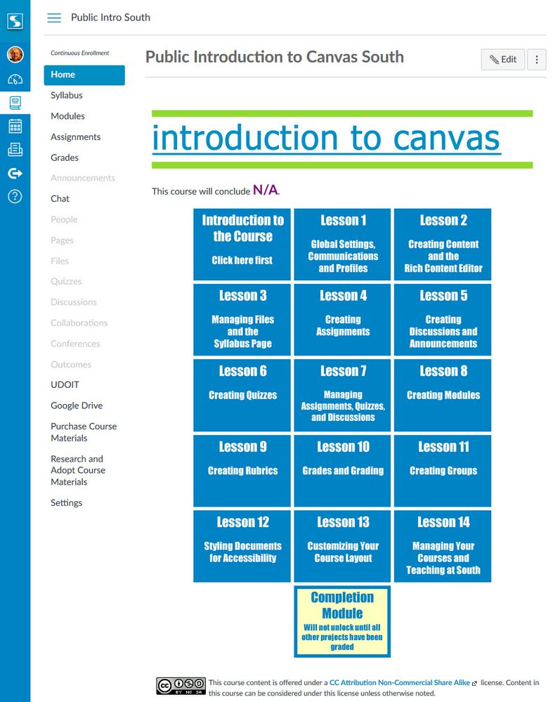
I have done a little monkeying with inline CSS and divs to create a responsive grid. It uses images, but you could use nested divs, as well, for larger text elements. It's the same basic idea that @kbink is using, above. The example below is not a table, even though it looks like one. It's images with borders. The images are links to modules and the text in the image is the alt text for the image. It's not the greatest, but it does address the accessibility problem with tables. The images function like a list of links, so it's easy to tab from one to the next. They also resize, since their widths are set as percentages, which means they work for mobile. You can go here to view the full code and more about how this example was built.
Interesting workaround, thanks for sharing.
We have had a bit of success with getting our templates to render correctly on both the mobile web browser and the Canvas Student App. We have loaded a bunch of css and javascript in our subaccount master files. The only thing that we have had issues with is our tabbed template. The tabs render fine in the mobile browser but just fall back to bulleted lists in the Canvas Student App. If you want to see a comparison of the different versions, I have created a video that can be found at:
Hi orwinr,
Thanks for the video. It's always nice to see what this looks like side by side, especially with the mobile app. Two questions:
Good work!
Hi @rseilham ,
I will have one of my colleagues test the app on iOS to see how it fares. I believe it should fare well as the gal that created the templates and the code is an iOS user.
As far as the CSS and JS, we are sticking to pretty simple stuff and after looking at things, we aren't actually using any extra JS code other than the built in code triggered by the "enhanceable_content" class we use to create the tabs in our most complex template. We know at some point this will be going away and hope to have a different solution in the future.
To get our two column layouts to work and respond to the mobile devices we use the Bootstrap Grid classes. To accomplish what you see in the video, we use the following code to split the screen into center based content and the right side menu:
<div class="col-xs-12 col-md-9 ischool-content"></div>
<div class="col-xs-12 col-md-3 ischool-sidebar"></div>
This Bootstrap code is what makes the menu collapse to below the content on both the app and the mobile browser. We use a variation of this same Bootstrap code to get our 3 column course schedule page to collapse to a single column on both the app and the mobile browser.
You can see all of the underlying html and css code at: https://docs.google.com/document/d/1Ig4lZovLpi-QW8L68mXshri4Se3rA4a_pwVfc-eLSV4/edit?usp=sharing
Hope this helps. I should mention that my colleague, putrih is the person that did all the heavy lifting to figure out how to make this work.
I would echo Randy's approach...
I ended up writing our own responsive grid for our institution fully in CSS. We utilize that. I would consider using Instructure's though as bootstrap is solid.
Thanks for the throughout explanation. This is one of the best I've seen in the community when it comes to the Canvas Student app and I'll be sure to point people to this when they have questions. A lot of this was pioneered by KennethWare, and this is one of the best implementations I've seen outside of that.
Go back to one point, so are you using a mobile JS file or not? That wasn't 100 percent clear. Thanks again.
Hi @rseilham ,
Thanks for the vote of confidence. As far as using a JS file, we don't use a js file for any of the tools we currently use in regards to site layout. We are only using some js code in trying to get the open source Safe Exam Browser to work.
Hi orwinr , did you have any luck with safe exam browser and and Canvas?
Hi cknoph,
We found it to be a bit buggy and it didn't do what we wanted it to do. I can't be more specific than that as I don't remember all the details. Sorry.
Thank you for the reply, guess we have to wait for Lockdown Browser to release a new version.
Hi @rseilham ,
I followed through with my colleague, putrih, regarding issues in the iOS version of the Canvas Student app. She said that the iOS app works nearly identical to the Android app. Where I was wrong was in saying that Safari rendered the css correctly. Putri said that Safari's rendering is not good at all and would recommend using Chrome.
That's interesting, but definitely not unexpected. So I would guess mobile users will have to use Chrome instead of Safari.
To interact with Panda Bot, our automated chatbot, you need to sign up or log in:
Sign InTo interact with Panda Bot, our automated chatbot, you need to sign up or log in:
Sign In
This discussion post is outdated and has been archived. Please use the Community question forums and official documentation for the most current and accurate information.