Thanks again to everyone who found/shared the code for tabs. I love them.
So I've been playing around with tabs, accordions, and some of the other features mentioned here. Below is what I've learned.
Tabbed Panels
I'm still new to my screen reader (so maybe this is common practice and I don't know it) but I found that you can't use your keyboard's tab key to get to the links that opens the other tabs. In order to access the other tabs, you must land on the link of the first tab and then use the down key to access the other tabs (same is true for the accordion). To hopefully make things easier for screen reader users especially, I try to add a link to the bottom of my tabbed pane that takes the user back to the top of the tabbed panel. In the code pasted below, the links are whited out (style="color: #ffffff;") mainly because some professors may be picky and not want to have them at all.
Code for Panel
If you do multiple panels on a page or nest panels inside of panels, change the bold blue text.
<div class="enhanceable_content tabs">
<ul>
<li id="topofpanel"><a href="#fragment-1">PUT TITLE FOR TAB HERE</a></li>
<li><a href="#fragment-2">PUT TITLE FOR TAB HERE</a></li>
<li><a href="#fragment-3">PUT TITLE FOR TAB HERE</a></li>
</ul>
<div id="fragment-1">
<p>PUT THE CONTENT FOR THE FIRST TAB HERE</p>
<p><a style="color: #ffffff;" href="#topofpanel">Return to top of tabbed panel</a></p >
</div>
<div id="fragment-2" >
<p>PUT THE CONTENT FOR THE SECOND TAB HERE.</p>
<p><a style="color: #ffffff;" href="#topofpanel">Return to top of tabbed panel</a></p>
</div>
<div id="fragment-3" >
<p>PUT THE CONTENT FOR THE THIRD TAB HERE</p>
<p><a style="color: #ffffff;" href="#topofpanel">Return to top of tabbed panel</a></p>
</div>
</div>
I know that some folks (including myself were afraid that students would page through the Canvas course and not realize that there were tabbed panels embedded on the page, so I played around with some colors that would generate some attention.
Colored Tabbed Panel
Code for coloring
(Image below was created via Slack--Yay Slack for IDing colors!)

<div class="enhanceable_content tabs">
<ul style="background-color: #ffffb2 ;">
<li id="topofpanela" style="background-color: #d9ffb2;"><a href="#pfragment-1">Part 1: Get Assignment and Create Transcript File</a></li>
<li style="background-color: #ffb2ff;"><a href="#pfragment-2">Part 2: Add and Edit Transcript</a></li>
<li style="background-color: #b2ffff ;" ><a href="#pfragment-3">Part 3: Turn in Stage 1</a></li>
</ul>
<div id="pfragment-1" style="background-color: #ffd9b2;">
<p>Part 1: Get Assignment and Create Transcript File</p>
<p><a style="color: #ffffff ;" href="#topofpanela">Return to top of tabbed panel</a></p>
</div>
<div id="pfragment-2" style="background-color: #ffd9b2 ;">
<p>Part 2: Add and Edit Transcript</p>
<p><a style="color: #ffffff;" href="#topofpanela">Return to top of tabbed panel</a></p>
</div>
<div id="pfragment-3" style="background-color: #ffd9b2;">
<p>Part 3: Turn in Stage 1</p>
<p><a style="color: #ffffff;" href="#topofpanela">Return to top of tabbed panel</a></p>
</div>
</div>
Classier panel
Classy (gray) panel code

<div style="border: 2px solid #c4c5c7;">
<div class="enhanceable_content tabs">
<ul style="background-color: #c4c5c7;">
<li id="topofpanelb" style="background-color: #ffffff;"><a href="#fragment-1c">Track 1: Build on YouTube Autocaptions</a></li>
<li style="background-color: #ffffff;"><a href="#fragment-2c">Track 2: Transcribe from Scratch</a></li>
</ul>
<div id="fragment-1c">
<p>content</p>
<p><a style="color: #ffffff;" href="#topofpanelb">Return to top of tabbed panel</a></p>
</div>
<div id="fragment-2c">
<p>content</p>
<p><a style="color: #ffffff;" href="#topofpanelb">Return to top of tabbed panel</a></p>
</div>
</div>
</div>
Tabbed Panel Appearances
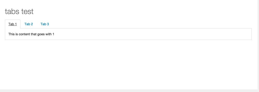
So, the tabbed panel examples in this post do not appear the same way that they would in the course. They do however, appear the same way as they would on a mobile device...

Figure 1: How tabbed panels appear in Canvas from desktop browser

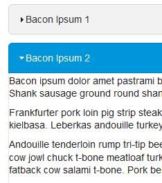
Figure 2: How panels appear in Android Canvas app (appearance is similar in iOS Canvas app)
I think someone in a different thread hypothesized that adding a percentage width to the tabs would fix the mobile display, but, when I tried, it didn't.
In addition to appearance, the links for the tabbed panel do not work correctly in the iOS app. Instead, the links open the browser version of Canvas on your Apple device.
In Android, the links work fine.
Moving Forward
Because we really like the tabbed panel's organizational capabilities, we are looking into alternately embedding tabbed panels built with third party content. Nothing has come of it yet, but if that changes, I'll update you.
Accordion
As said earlier, if you are a screen reader user and you are on a page with an accordion element, using the tab key on the keyboard will not get you to the next accordion panel. In order to access the other panels, you must land on the link of the first Accordion item and then use the down key to access the other Accordion items (same is true for tabbed panels). Like with the tabbed panels, I try to add links that allow screen reader users to more easily return to the top of Accordion elements. In the code pasted below, the links are whited out (style="color: #ffffff;") mainly because some professors may be picky and not want to have them at all.
Code for Panel
If you do multiple panels on a page or nest panels inside of panels, change the bold blue text.
<div class="enhanceable_content accordion">
<div id="topofaccord">PUT TITLE FOR ACCORDION TAB 1 HERE</div>
<div style="padding: 10px;">
<h3>Content 1</h3>
<p>paragraph text</p>
<p><a style="color: #ffffff;" href="#topofaccord">Return to top of accordion</a></p>
</div>
<div>PUT TITLE FOR ACCORDION TAB 2 HERE</div>
<div style="padding: 10px;">
<h3>Content 2</h3>
<p>paragraph text</p>
<p><a style="color: #ffffff;" href="#topofaccord">Return to top of accordion</a></p>
</div>
<div>PUT TITLE FOR ACCORDION TAB 3 HERE</div>
<div style="padding: 10px;">
<h3>Content 3</h3>
<p>paragraph text</p>
<p><a style="color: #ffffff;" href="#topofaccord">Return to top of accordion</a></p>
</div>
</div>
Accordion Appearances
The biggest drawback to using accordions is that the panel size is dictated by the pane with the greatest amount of content. So, if you have 1 sentence in the first pane and then you have 5 paragraphs in the next pane, the first pane will be big enough to contain the five paragraphs:
Demonstration of Accordion size differences
The other drawback (which you will notice is pretty common among these elements) is that it does not display correctly in mobile. In the video above, we saw how the accordion appears in the browser version of Canvas. Below is how it appears in the Canvas app on Android:

Pop-up Dialog
I think this feature could be very useful, particularly in how-to lists. I want to use this item to hide steps in my instructions that many students may find demeaning (for example, detailed instructions on how to use right click or shortcut keys to copy and paste content). It is screen reader accessible. Screen reader users can use the tab key to reach the close button on the dialogue and their focus should be back on the link that opened the dialogue.

(sorry that the image didn't include an example of how I'd use it in the how-to list, but that is how it looks in the desktop browser)
When using this tool, consider adding instruction on how to resize the pop-up for slightly easier viewing.
Unfortunately, like the other useful elements, this element isn't mobile friendly.

- In Android app (shown above), the dialogues are visible and the links act the same way that same-page links do
- because of this, I strongly advise putting the dialogues below the links
- consider leading your dialogue section with an unlinked dialogue that contains a section title and explanation for why Android users see this content differently).
- In iOS, the links take you the the browser version of Canvas. There the links will act normally.
- Consider adding a warning to iOS users so that they aren't alarmed by having to login again and they know to switch back to the app once they finish viewing the page
Draggable and Sortable Elements
These element don't seem very useful to me, and, as far as I can tell, both are inaccessible to screen reader users.
In the Android mobile app, the Sortable List element is completely invisible, and the draggable item can't be moved.
Resizeable Element
As this element seems to only effect textwrapping and does not hide content as if in a frame, I'm not sure how this item could be used in a course, but I would strongly suggest that, if they do, they add a border around the element and provide instruction on how to adjust the resizeable element.
<div class="enhanceable_content resizable" style="width: 100px; border: 1px solid #000000; padding: 5px;">resizable</div>
This element cannot (as far as I'm aware) be adjusted by screen reader users; however, the screen reader can still access the content inside the resizeable element. However, in the Android mobile app, the lines used to grab the the element are not visible and the div is not resizeable.
Mobile Screen Readers
As most of this content does not display correctly on mobile devices, it wouldn't surprise me if mobile screen readers also read the content incorrectly. I'm really not interested in testing it out right now, so if someone wants to beat me to it, please do.


This discussion post is outdated and has been archived. Please use the Community question forums and official documentation for the most current and accurate information.