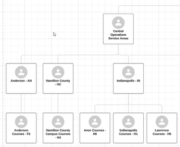
Subaccount Visualization (Using Lucidchart)
- Mark as New
- Bookmark
- Subscribe
- Mute
- Subscribe to RSS Feed
- Permalink
- Report Inappropriate Content
I've been working on a pretty big overhaul of our subaccount structure, and I wanted an easy way to visualize how it's currently laid out. I started to build it via LucidChart then realized it has the ability to import data and create a chart for you. I'm sure there's dozens of ways to do this but figured I'd share anyways.
(I don't know if this is a premium feature or if free users can use it as well.)
- Create a provisioning report of accounts in Canvas and download the CSV.
- Add a single row for your root account, with its id number in canvas_account_id and name in name.
- Create a new (blank) Lucidchart document.
- File -> Import Data; Choose Org Chart; "Import Your Data"
- Choose CSV format and upload the provisioning report you downloaded and added your root account to.
- Choose to identify "supervisors" (even though that's not really the case) by ID and select:
- Employee ID: canvas_account_id
- Supervisor ID: canvas_parent_id
- On the next page, you can map name to name. You may find a use for the other fields, but for now I left it at that.
- I chose "One org chart for my entire organization" although you might find a user for creating charts based on different fields.
It'll finish importing, and you'll have a quick visualization of your subaccount structure. I haven't played with too many of the other import options, but this was enough to get me up and running.
My next plan is to write some custom reports via the API to include data like which accounts have roles defined within them and add them as custom fields to help flesh this diagram out some. When I do so I'll share what I make.

