Templates: Responsive Design for the Mobile Web
- Subscribe to RSS Feed
- Mark as New
- Mark as Read
- Bookmark
- Subscribe
- Printer Friendly Page
- Report Inappropriate Content
The Information School, iSchool, at the University of Washington has been providing templates for our Canvas courses since about late 2012. We started using Canvas in fall of 2011. Our templates have evolved with the available technological advances and we have spent the last few months designing for the next iteration. One of my colleagues, putrih, has spent a great deal of time working on this new generation of templates.
Part of the design process was to do a detailed usability study with a number of our students from the various programs that we offer at the iSchool. We offered gift cards to the participants and then sat with them as they worked their way through two different versions of the next gen templates. By far, they preferred our "compact" design for the less complex courses. This design uses collapsible sections that work pretty well in most browsers both on the desktop and on mobile. Unfortunately, we haven't been able to get the javascript right so the collapsible sections work on the apps. We are working with @kenneth_larsen from Cidi Design Tools to help us figure out what is happening in the apps. Yes, Design Tools was used heavily throughout the coding process and really simplified the task in many ways.
The question that we always struggle with is whether to optimize our templates for responsiveness or make them work best in the app. There are pros and cons either way but we are currently leaning more to the responsive design that works in the mobile browsers. For what our students do on mobile, based on a survey from a year ago, I think our focus on responsive is better at this point. What are your thoughts about developing for the apps, mobile web or both?
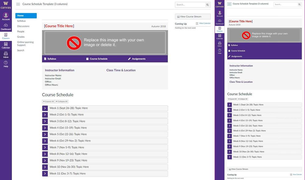
So, let's take a look at our "compact" template on both the Desktop and Mobile:
The image above show the desktop version of the template on the left and the mobile version on the right. The desktop version is shown in the Chrome browser and the mobile version is from Chrome on an Android device running Android 5.1 Nearly identical other than the purple menu wrapping and the course stream link loading at the bottom on mobile.
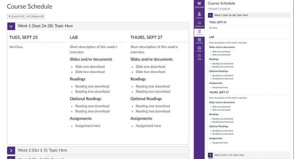
The next image shows "Week 1" expanded on both platforms, desktop on the left and mobile on the right:
You can see that the 3 column layout on the desktop collapses really well to a single column on the mobile side.
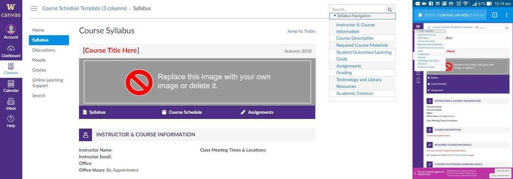
The next image show the comparison between the two platforms showing the menu on the syllabus page:
The last thing I will share is a two minute screencast of this template being used on my phone. It works really well.
I hope people find this post useful 🙂
You must be a registered user to add a comment. If you've already registered, sign in. Otherwise, register and sign in.


