Elevate K-12 Analytics Newsletter - July 2023
- Subscribe to RSS Feed
- Mark as New
- Mark as Read
- Bookmark
- Subscribe
- Printer Friendly Page
- Report Inappropriate Content
Product Highlight
Chart Types
Did you know that with Elevate K-12 Analytics you can create 22 different types of charts?
From Data Explorer, when you click on the window that you’d like to turn into a chart you can click “Chart Type” from the Actions menu. This opens up all the possible chart types. Only those that make sense for the type of data you are exploring will be able to be selected. You can experiment by clicking through the different options to create the chart type you find most meaningful. Below is a list of the available chart types.
- Column
- Stacked Column
- 100% Stacked Column
- Bar
- Stacked Bar
- 100% Stacked Bar
- Line
- Pie
- Area
- Waterfall
- Gauge
- Scaled gauge
- KPI gauge
- Scatter Plot
- Scatter Line
- Range Area
- Range Column
- Bullet
- Vertical Bullet
- Bubble
- Donut
- Box Plot
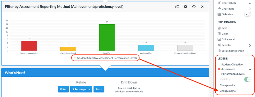
Another feature of creating charts that allows you to create something more meaningful to your district is altering the legend. In this exploration, we changed Student Objective Assessment Performance Levels to Student Qualification Level to make it more in line with the language used by the district.
If you have any questions or experience any issues, please contact our support team at analytics-support@instructure.com.
Product Update
July Release
Elevate K-12 Analytics Release notes for the July 6th release are now available. While we also had a release on July 20th, no updates were customer facing. Release notes archives can always be viewed in the Instructure Community.
The following bug fix was implemented.
-
Only positive values in the Projected Years Until Graduation box are allowed. Previously, negative values were allowed and saved.
You must be a registered user to add a comment. If you've already registered, sign in. Otherwise, register and sign in.


