🚧 Pardon Our Mess While We Renovate (Impact) 🚧
- Subscribe to RSS Feed
- Mark as New
- Mark as Read
- Bookmark
- Subscribe
- Printer Friendly Page
- Report Inappropriate Content
This week’s release is the start of a months-long “renovation” of sorts meant to improve the design and user experience of Impact to be more accessible, intuitive, meaningful, and cohesive with other Instructure products. In doing so, our goal is to save you much-needed time, energy, and sanity, so that you can be more efficient and effective in addressing your use cases with Impact! During this process, you may notice some areas of the application that are updated, while others are not. We are doing our best to roll this out in phases that make sense and are the least obtrusive to you all. With that being said, don’t be alarmed if you notice minor changes outside of the planned phases.
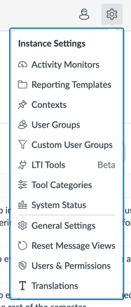
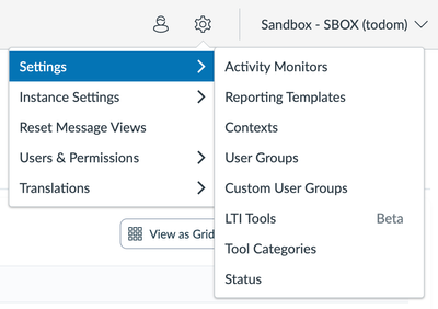
One such example is an initial update of the Settings menu which removes the previous icons to avoid conflict with icons elsewhere in the product and be more logical in regard to grouping. Visually, it will go from the image on the left below to the image on the right:
Below, you can read about the several planned phases to update components inside of the application to give a more modern, cleaner, accessible, and user-friendly look, feel, and overall experience.
Phase 1: End-User-Facing Messages
Expected Release: Q1
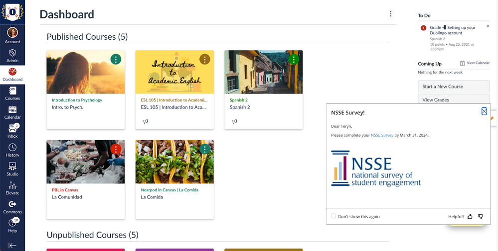
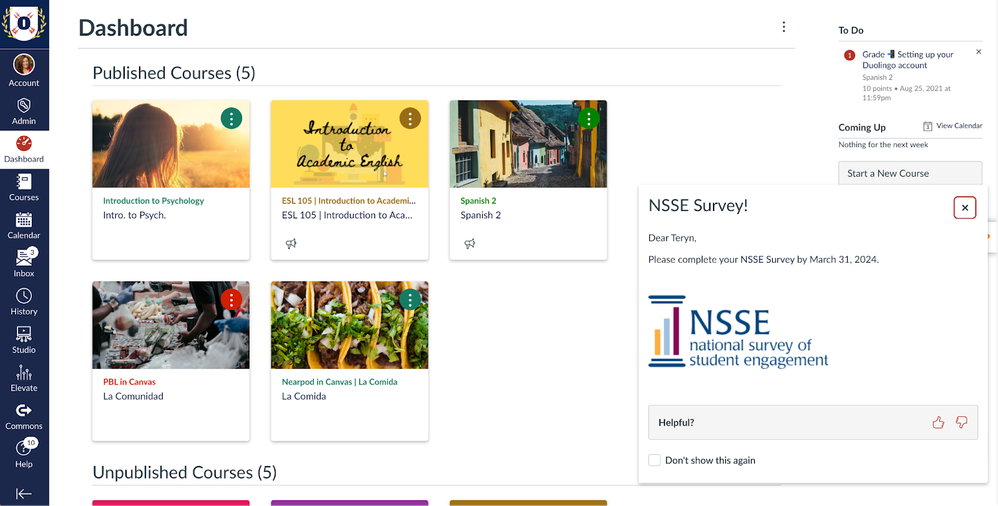
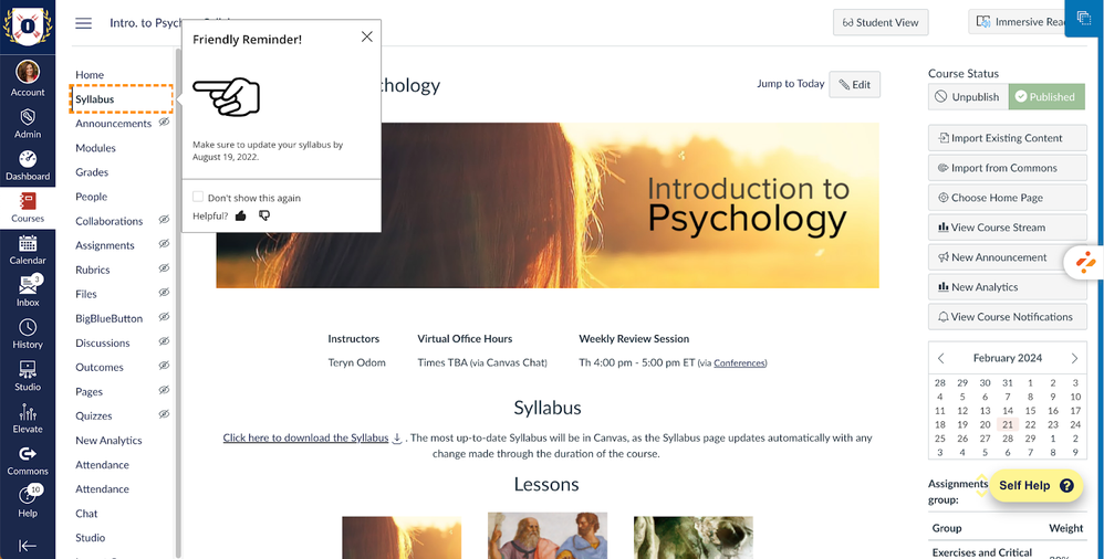
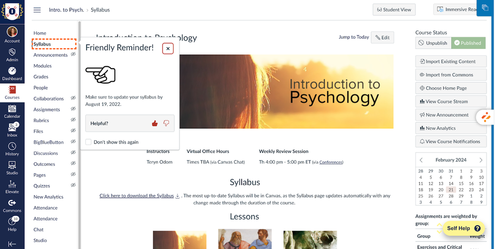
The first phase that will be unveiled in the next couple of weeks is the updating of end-user-facing messages. This is a mostly minor, aesthetic change that updates the design of messages, whether alone or contained inside of a campaign or as walkthrough steps. The core functionality and behavior of messages, campaigns, and walkthroughs will remain unchanged. Below are some example of old and new, so that you know what to expect:
Old Systray Message:
New Systray Message:
Old Hint Message:
New Hint Message:
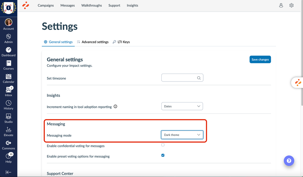
As you can see, the design isn’t too different from before. However, please note that due to this update and the fact that Canvas doesn’t currently have dark mode, we will be deprecating the dark theme messaging mode feature as shown below in Settings alongside this update.
Phase 2: Inline Editor
Expected Release: Q2
The second phase is the one that I am most excited about actually, albeit the most complex. It will not only modernize the Inline Editor visually, but it will be completely redesigned in a way that will be much clearer and more streamlined, all while making it quicker and easier for you to take action. Yay! The designs are almost done for this and I can’t wait for you all to see and experience it soon!
(Note: If you are interested in providing initial feedback on our designs, we’d love your input! Please comment and let us know your institution below and we'll reach out to you!)
Subsequent Phases
After the Inline Editor, the following phases are planned:
-
Phase 3: Settings (Q2)
-
Phase 4: End-User-Facing Support Center (Q2)
-
Phase 5: Support Center (in Dashboard) (Q3)
-
Phase 6: Campaigns (in Dashboard) (Q3)
-
Phase 7: Messages (in Dashboard) (Q3)
-
Phase 8: Walkthroughs (in Dashboard) (Q3)
We understand that change can be difficult and seek to keep you informed as to what is happening, when, and why. Just as a classroom renovation aims to create a more conducive environment for learning, we are updating the UI and UX of Impact to provide you with a smoother and more intuitive experience that will foster deeper and more meaningful engagement while saving you much-needed time and energy. We can’t wait to hear what you think!
The content in this blog is over six months old, and the comments are closed. For the most recent product updates and discussions, you're encouraged to explore newer posts from Instructure's Product Managers.


The content in this blog is over six months old, and the comments are closed. For the most recent product updates and discussions, you're encouraged to explore newer posts from Instructure's Product Managers.