Studio accessibility: Why did we make some changes recently?
- Subscribe to RSS Feed
- Mark as New
- Mark as Read
- Bookmark
- Subscribe
- Printer Friendly Page
- Report Inappropriate Content
Recently we’ve made some changes in Studio, and in numerous cases we referred to accessibility aspects when we were asked about the rationale behind a particular change. We changed stuff that may have felt unnecessary. We moved functions to a menu that seemingly had no previous problems (yeah, CC button I am talking about you...). And we usually did not give a better explanation than claiming the changes were simply to better support Studio in being accessible. All of those statements are the truth, but fixing an accessibility issue can often have an impact on a wider scope of the interface than just the issue itself. Especially, if we consider our design principles and future plans with a related feature, the fix suddenly becomes a bit more complex.
Accessibility is a pillar of our design methodology. An accessible Studio means that it is designed and developed so that everyone can perceive, understand, navigate and interact with it. An acronym gathers the four main guiding principles of an accessible product: POUR stands for Perceive, Operable, Understandable, Robust. Around the beginning of the year, we realized that Studio was missing some of the pieces on smaller screens to be fully accessible, and it’s not a POUR product (not the most fortunate pun, but at least it helps us remember it).
Luckily, we have the WCAG standard to better discover our shortcomings, and this time we had issues specifically related to screen sizes at a width equivalent to 320 pixels (which Canvas is perfectly designed for). We usually use the phrase ‘responsive’ for a product if it renders well on a variety of devices and window or screen sizes. Before I worked for Instructure, I thought the two things were different, but it turned out that making products look great on any screen size (which is called a responsive interface) is actually part of the accessibility mission.
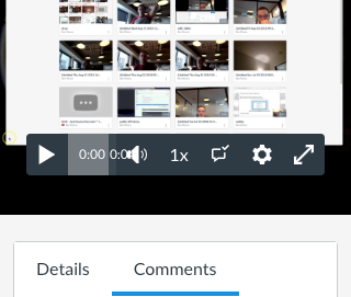
Think about a student who uses a laptop for learning a course and is visually impaired. She may either use the browser with an increased font size, or she may zoom that particular Studio page up to 400% to read all the content. Studio must render the same way as it was perceived on a mobile device (except, since your monitor is normally viewed in a landscape format, it will show much less content vertically). On a non-zoomed desktop view, you may easily access the captions toggle or the speed setting on the media player, but on smaller mobile devices—or in the aforementioned case—these functions did not leave enough space for the progress bar to appear properly.
When we design our products we are careful about consistency. Providing consistent user experience on various screen sizes is not only good for the end users but also helps maintain our products more efficiently. For example, two slightly different realizations of a feature may require two slightly different interfaces that both must work properly with screen readers and tab navigation.
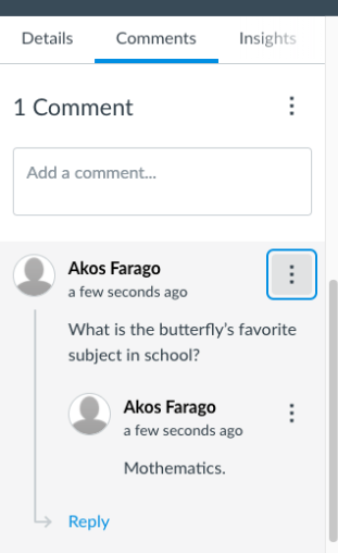
In some cases, standardized solutions exist. Recently, we moved the comment functionalities to the Options menu (three dots). This menu is a common interface component that you may be familiar with from many other products well used on a daily basis. Speaking of which, did you know in engineering circles, this menu is called the kebab menu and the horizontal variant is the meatball menu?
Another aspect where we need to be careful is how future proof our solution is going to be, which could pertain to accessibility shortcomings as well. For instance, we aim to work on a better captioning experience in Studio over the next year, possibly allowing users to control the size and the position of captions. We always aim to make future-proof changes so that we don’t have to make changes again later, so when we were looking for alternatives on how to solve the overlapped progress bar (refer again to the first image in this post), we had to think of our plans ahead.
Where would we allow to control the position of captions if there is a separate caption toggle on the media player? How is it going to be logical? Will that be accessible for keyboard-only users who are navigating with the Tab key? What other problems do we want to solve in the future that have an impact on the player’s appearance? These are just a few questions we had to touch upon about the captions toggle before addressing the seemingly not-related progress bar issue.
The last thing I’d like to mention is that we solve problems through iteration. Before we make a decision, we test it among ourselves internally. Designers sit down and carry out a pro-contra discussion on a change considering all the alternatives. In some cases, we meet teachers and admins and ask them about their opinion via a Zoom call. Accessibility experts strictly audit changes. And iteration doesn’t stop there. We also consume our own products—we put ourselves in your shoes in order to feel both the delightness and pain points of our products (this process is called dogfooding).
Sometimes we may not make the best decisions after all this effort, but that’s when your feedback becomes pretty much our number one resource so that we can iterate on our solution. In the example above, I wanted to shed some light on the difficulty of a particular change that may be trivial for the end user that can easily turn into a real headache for the product development team.
Even though we are now seriously considering restoring the CC button in the above example, it may come back with limitations in regards to the small screen sizes. New features have a fragile balance—we don’t want to make changes that we have to change again in favor of another feature later—existing functionalities (so we don’t break anything), and working towards a POUR product so Studio can make value for anyone in the future.
Thanks for reading!
The content in this blog is over six months old, and the comments are closed. For the most recent product updates and discussions, you're encouraged to explore newer posts from Instructure's Product Managers.


The content in this blog is over six months old, and the comments are closed. For the most recent product updates and discussions, you're encouraged to explore newer posts from Instructure's Product Managers.