General Accessibility Design Guidelines

erinhmcmillan
Instructure Alumni
Instructure Alumni
15
339340

Various state and federal laws have requirements aimed at making education accessible to as many people as possible. For instance, making sure that classrooms are wheelchair accessible would be an effort to comply with these laws and policies. Online classes need to be accessible as well. This document outlines some general best practices when designing a course for accessibility concerns. Additional help can be found at Creating Accessible Electronic Content.


Specific Canvas-related accessibility help can found in the Accessibility within Canvas document. If you have additional suggestions, please contact accessibility@instructure.com.
 

Layout and Design

Generally, the layout of a page should be simple, clean, and uncluttered. Navigation should be clear and consistent from page to page.


When adding content, keep content organized and chunked together in short paragraphs so users can scan your content easily.


Headings

headings.png

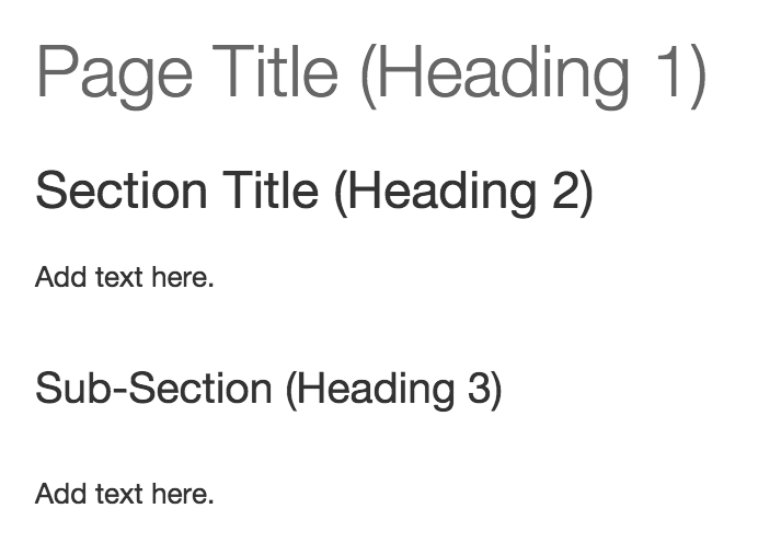
Headings should always include descriptive section headings. Section headings allow for a quick scan of the content for sighted and non-sighted users.


In Canvas, page titles are automatically generated at H1.


Images

Alternative (alt) text is required to provide a textual alternative to non-text content in web pages. This text will be read aloud to a person using a screen reader.


By default, Canvas includes the image name as the alt text, which should be changed to something more descriptive when embedding images. Alt text is not the same as the image title, which generates text when users hover over the image. Learn how to embed images in the Rich Content Editor.


Example Image

Default Alt Text (name of image): kids-tech-revised.jpg


Modified Alt Text: one boy and two girls sitting on a couch with a smartphone, tablet, and laptop.


Links

When adding a link, instead of pasting in the URL directly, attach the link to words that describe the link destination. This behavior will help everyone (whether they are screen reader users or not) understand where the link will take them.


Example Links

Bad Example


"Donald Tapscott, in his paper ''Growing Up Digital," http://www.ncsu.edu/meridian/jan98/feat_6/digital.html says these students..."


Listen to bad example audio from screen reader


Good Example


"Donald Tapscott, in his paper ''Growing Up Digital," says these students..."


Listen to good example audio from screen reader


Content Formatting

Users can view text contrast well when formatting with bold and italics, which help distinguish between important content items.


Example Canvas Color Ratios

If you choose to use color, utilize the WebAIM Color Contrast Checker to ensure adequate color contrast and accessibility friendly colors. The following are examples of Rich Content Editor Colors Contrast Ratios within Canvas:


Fail: (under 4.5)


  • Yellow Text: 1.07:1
  • Pale Green: Text  1.12:1
  • Orange Text: 2.14:1
  • Pink Text: 3.14:1
  • Red Text: 4:1


Good: (4.5 to 7)


  • Blue Text: 4.68:1
  • Dark Green: 5.14:1
  • Purple Text: 6.95:1


Best: (Over 7)


  • Burnt Orange: 7.43:1
  • Very Dark Gray: 12.63:1
  • Black text: 21:1

Tables

Tables should be used for data display, not layout. Headings should always be included for columns and rows.


In Canvas, headings for table columns and rows can be changed in the Rich Content Editor. View the Creating Accessible Tables in the Rich Content Editor.


   Example Table HTML Code:

         Column

  • <th scope="col">Questions</th>
  • <th scope="col">Percentage of Total</th>

                Row

  • <th scope="row">Website</th>
  • <th scope="row">Website URL</th>


Videos

Videos should always have the option to view captions.


For external videos, check with the video provider for caption availability. Learn how to Caption YouTube Videos owned by you.


For videos created or uploaded into Canvas, Canvas uses a tool called Amara to sync your script with a video. Learn more about captions in the Canvas Instructor Guide - Rich Content Editor.


Content File Formats

There may be times an instructor wants to deliver content in other file formats not native to Canvas. Here are tips to ensure accessibility of some of the most popular file formats.


Microsoft Word

General accessibility guidelines apply to designing a Word document.

PowerPoint

General accessibility guidelines apply to designing a PowerPoint document. Use the built-in accessibility checker: File > info > check for issues > check for accessibility.

  • Additional guidelines and links:
    • Use slide layout templates whenever possible.
    • When you can’t use a template, use one with the slide title only.
    • Write presenter’s notes in the provided area.
    • Apply ALT text to images.
    • Add captions to the slide or presenter’s notes for complicated images (e.g. diagrams or maps).
    • If embedding video, caption the video and ensure the player controls are accessible.
    • If embedding audio, include a transcript.


Portable Document Format (PDF)

Portable Document Format (PDFs) should be created as accessible documents. Most commonly, PDFs are created from Word documents. If you do not have the original source file for a PDF document, you can tag the PDF to help with accessibility.

Additional Resources

Significant contributions to this guide were made by:


  • John Raible: Instructional Designer for the Center for Distributed Learning at the University of Central Florida
  • Nancy Swenson: Instructional Designer for the Center for Distributed Learning at the University of Central Florida
15 Comments