Jim,
There is a new Analytics feature that should be available tomorrow (October 29th) which might do some of what you are asking if you have a course with Cross-listed sections. I've played around with it a little in beta and you are able to select multiple sections to data points of assignment grades in a different color for each section. It's still beta and a work in progress so perhaps we'll get more of what you are looking for in the future.
Canvas Release: Analytics Beta (Course Grade)
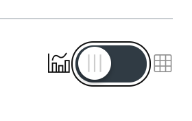
Kona also mentioned pulling data via APIs. For people like me who don't work much with APIs, you can also do a bit with copy/paste and data. On the course analytics page there is a button on the top right corner to display the raw data.

Switching to that view you can get the raw numbers used to make the pretty graphs and copy/paste it directly into Excel. It will take a little time, but doing so for each teacher you want to look at could provide an easy way to then visualize the data in Excel or even something more powerful such as SPSS.
Hope that helps,
Rick


This discussion post is outdated and has been archived. Please use the Community question forums and official documentation for the most current and accurate information.