[ARCHIVED] Five-Star Design: Destination: Remote Instruction
- Mark as New
- Bookmark
- Subscribe
- Mute
- Subscribe to RSS Feed
- Permalink
- Report Inappropriate Content
Five-Star Design: Destination: Remote Instruction
Name: Chontel Delaney and Karen Pinto
Institution: Saint Joseph’s University
Course: Destination: Remote Instruction
Audience: This course was designed for faculty
PROCESS
When your institution or course needed a solution, what were the "must-haves" or goals for its design?
This course needed to be a self-paced, asynchronous resource, that helped faculty quickly transition their traditional face-to-face courses to a remote learning environment, familiarize faculty with the learning management system, and demonstrate how to incorporate universal design principles and Ignatian pedagogy into a course.
Is there a review process for course design at your institution? If yes, explain how it impacted your design decisions.
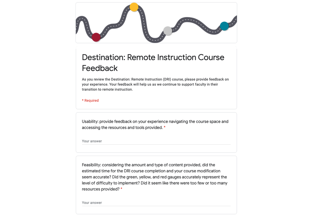
At Saint Joseph’s University, we design courses based on the Quality Matters (QM) higher education rubric. One of the foundation documents for this course was the QM Emergency Remote Instruction (ERI) Checklist, which is an abbreviated version of the QM higher education rubric. With that in mind, we completed several rounds of review. Our design team created one module, completed an internal review, and shared it with the stakeholders of the project. After receiving and incorporating their feedback, we proceeded to build the remaining three modules. At the end of the development process, we completed a technical review using the Accessibility Checker, Link Validator, and reviewed the course through Student View in Canvas. Finally, we sought feedback from two faculty committees regarding their user experience and content feasibility. These steps enabled us to identify and address any issues before we published the course with confidence.
In what capacity is this design utilized at your institution? How is it shared, distributed, and/or celebrated?
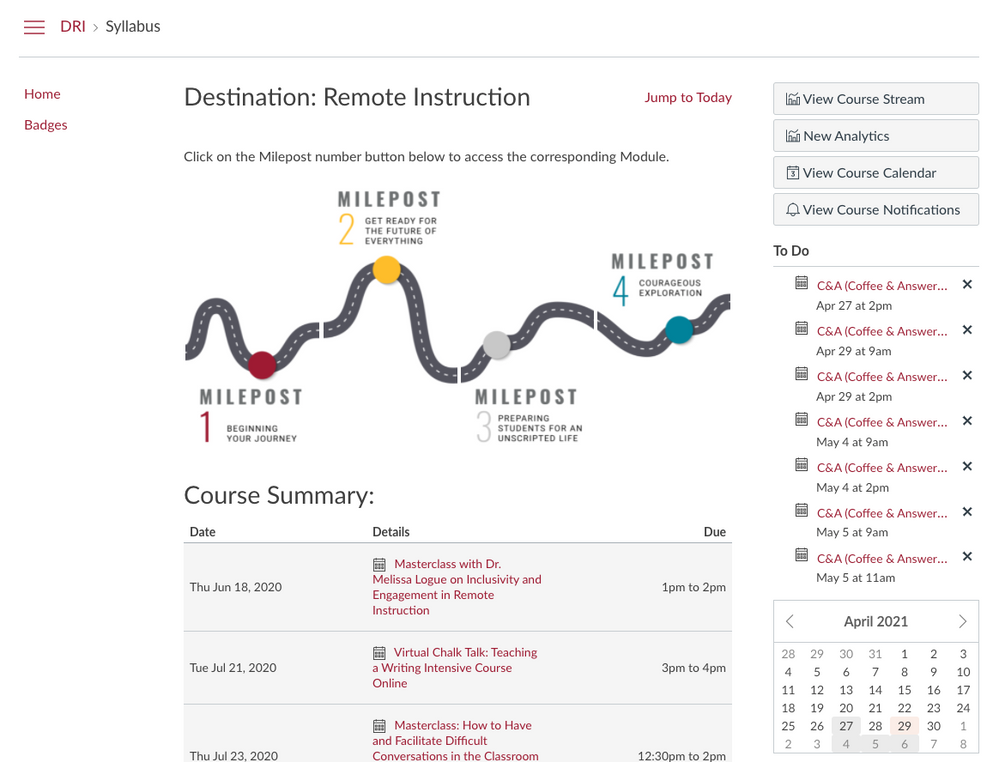
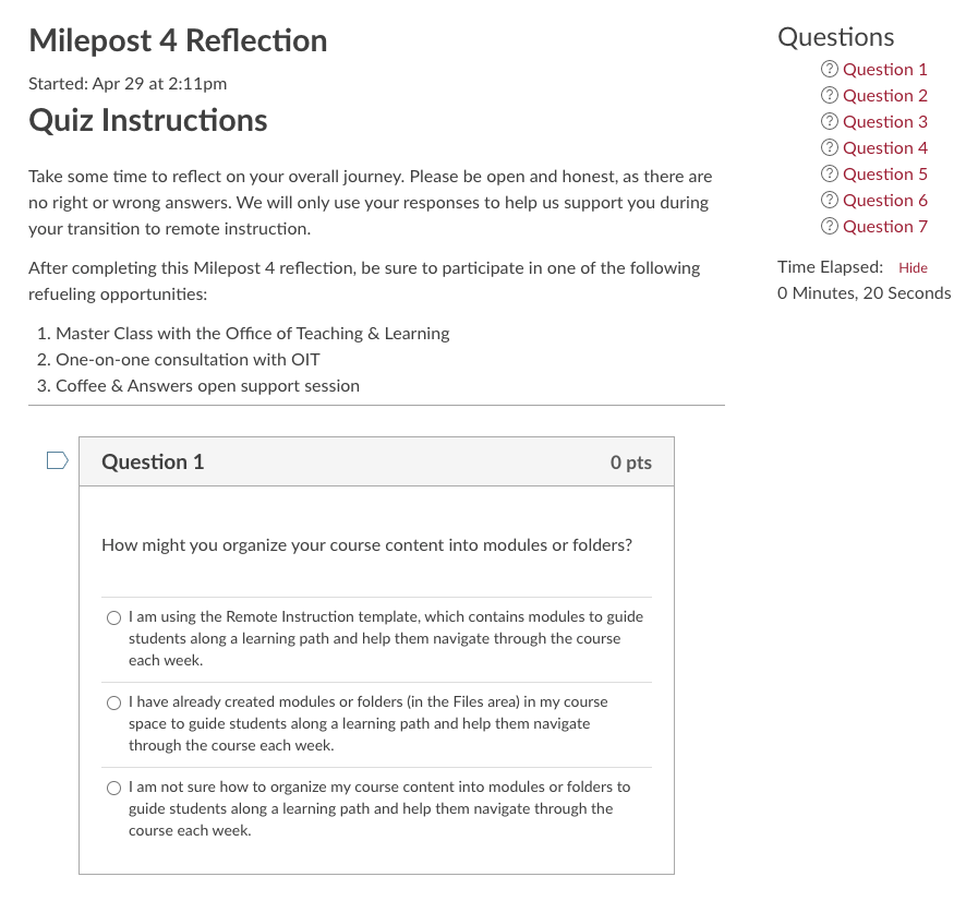
The Destination: Remote Instruction course utilizes the Syllabus area in Canvas as the homepage. To streamline the course navigation, the course menu has been simplified to only include Home and Badges. Using the Syllabus area allowed the learners to access the four mileposts on their journey to remote instruction as well as see and join scheduled live sessions. The live sessions were facilitated by faculty on topics related to remote instruction.
Overall, what did you learn in the design-process process?
The toughest part of the process was determining how to bring together the QM Emergency Remote Instruction (ERI) Checklist, universal design principles, Canvas how-to’s, and Ignatian pedagogy into a course without completely overwhelming our learners (faculty). At a few points in the process, we also became overwhelmed by the amount of content we had at our fingertips. That’s when we determined it was paramount that we create a clean, simple, and consistent user experience. “A cluttered space is a cluttered mind” became our mantra. We created an organized space by using tools of design including iconography, color coding, typography, etc. to avoid information overload.

SPOTLIGHT
Which aspects of this course design do you identify as the strongest or most effective? Why?
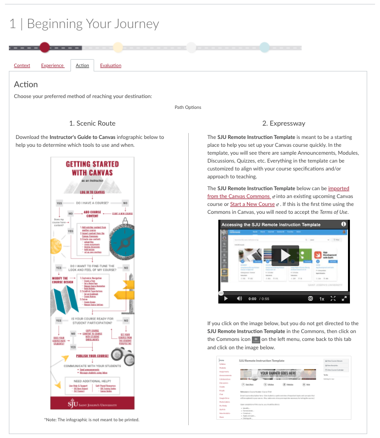
The course provides the faculty members with options. In this course, the learners have a “choose your own adventure” style of navigation. These options allowed the learners to experience the course and apply the information based on their preferences. Some instructors opted for the “Scenic Route,” which allowed them to meticulously review the checklist of recommendations and learn about the tools and strategies to implement the recommendations. While others chose the “Expressway” option, which provided a template Canvas course to help instructors set up their space quickly. We even heard from faculty, who chose both options. They let us know that this gave them the best of both worlds! 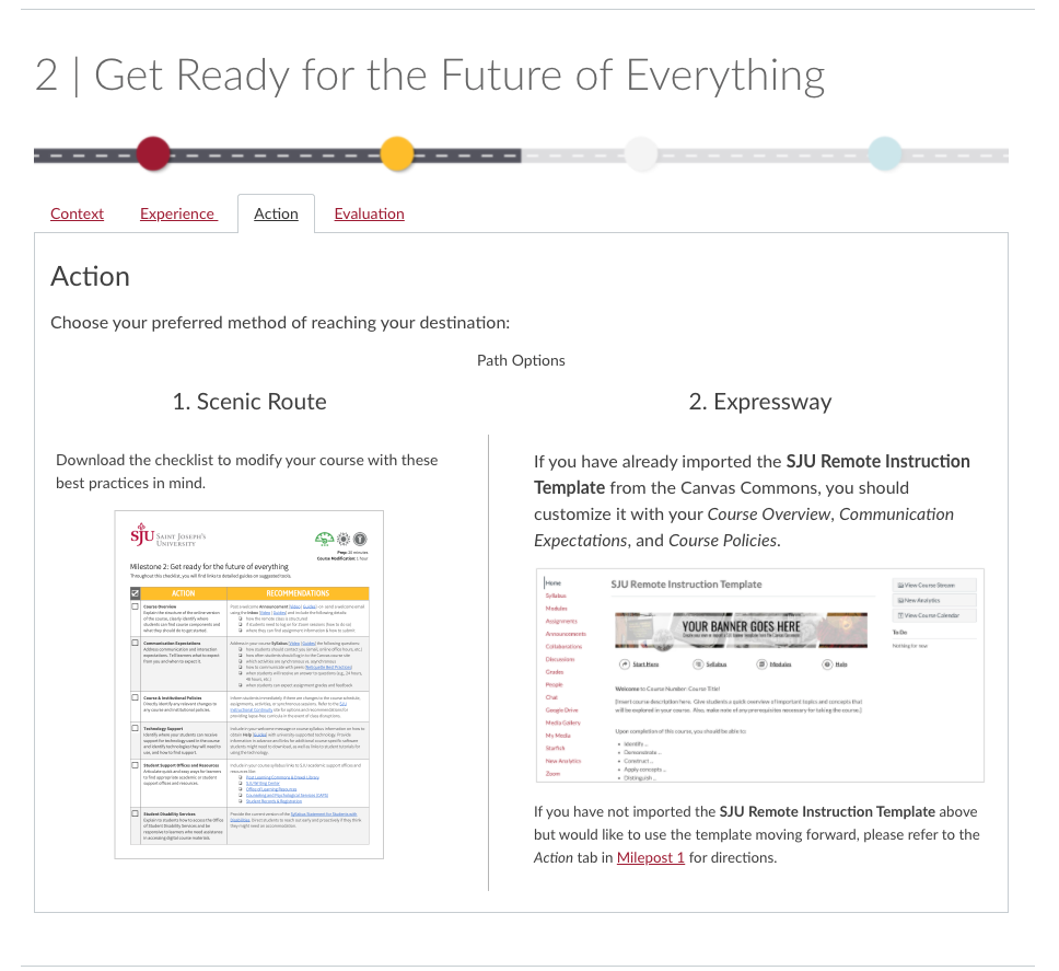
Which tools and resources did you use as you created assets for your design?
Adobe Spark Video
Unsplash
Google Docs
Badgr
Canva
Adobe Illustrator
Adobe Stock
How did your design decision help you increase the engagement of and/or improve the learning experience for your students?
Simplifying the course menu and utilizing the Syllabus area allowed faculty to focus on the course content and not get distracted by the technology. This course helped faculty to experience Canvas from the students’ perspective.
Selecting a theme (going on a journey) and carrying out the theme throughout the entire course helped to engage the learners. Taking the learners on a journey from traditional instruction to remote instruction, naming the modules mileposts to tie in the theme, and allowing the learners to select their desired route: scenic or expressway.
What do you find to be the most important aspects of Instructional Design or UDL in this course?
This course presents faculty with a plethora of ways to transition their traditional courses to remote learning. Each option is clearly identified as applying UDL principles, Ignatian pedagogy, and the level of difficulty to implement similar practices in their own course(s). The resources included in the course take into account the varying abilities of all of the learners, in this case, faculty members. These indicators help the learners select which resources are best suited for their skillset.

ADVICE
When beginning a new design or updating a design, what are three things you recommend designers do to improve the end-product?
Three things that we recommend designers do to improve the end-product are to design with the learner in mind, keep their needs, motivations, and hindrances at the center of the design process. Next, we all know the importance of identifying clear measurable objectives, but it is important that these goals are relative to the learner. What is the learner feeling, doing, seeing, thinking as a result of this course? Finally, our learners are short on time, seek authentic and efficient communication, and feel the stress of the current climate; therefore, it is our responsibility to create a meaningful space to engage. Open drop-ins, one-on-one appointments, workshops are student-centered opportunities for dialogue and enable the learners to be vulnerable. With these three recommendations, we are encouraging learners to bring their whole self into the learning process.


This discussion post is outdated and has been archived. Please use the Community question forums and official documentation for the most current and accurate information.