[ARCHIVED] Five-Star Design: Ensuring a Smooth Transition
- Mark as New
- Bookmark
- Subscribe
- Mute
- Subscribe to RSS Feed
- Permalink
- Report Inappropriate Content
Name: Kara Heichelbech
Institution: Indiana Online
Course: Teacher Resources and Student Content Courses (Ex: AP Calculus)
Audience: Teachers and Students
PROCESS
When your institution or course needed a solution, what were the "must-haves" or goals for its design?
As we were transitioning over to Canvas, it was imperative to us that our design be simple, easy-to-use and functional. We didn’t want teachers or students wasting time hunting for information.
We also needed our courses to be highly interactive and engaging - we wanted to go beyond “watch a video, complete a worksheet” activities.
Is there a review process for course design at your institution? If yes, explain how it impacted your design decisions.
We are a very small team at Indiana Online, but boy are we mighty! Our instructional design team develops all of our courses following the Quality Matters K-12 Course Design Rubric, as well as utilizes the National Standards for Quality Online Courses. Both of these documents provide great material to assist in developing quality online content.
For the design, we showcased our brand colors and created a few different templates that our team voted on. We then thread the brand colors, images and our logo throughout the course.
In what capacity is this design utilized at your institution? How is it shared, distributed, and/or celebrated?
Our design is used for every single course we create at Indiana Online, from our Professional Learning and Teacher Resources course for adults, to our 100+ courses for students. We have a template that our instructional design team uses, and the entire design team knows our brand colors and format to follow. The quick links in every course provide students easy access to important information. Using a consistent design also allows students to quickly find information no matter what course they are in.
Overall, what did you learn in the design-process process?
Our biggest takeaway, especially after gathering feedback from various stakeholders, was we needed a simple, clean, and consistent design that didn’t distract from the learning process.
SPOTLIGHT
Which aspects of this course design do you identify as the strongest or most effective? Why?
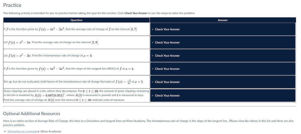
While we think our overall design theme is one of our strongest attributes, we know that our interactive activities are our strongest asset. Throughout our courses, we provide engaging checks for understanding using integrated tools, such as HTML5 Code, H5P, and Articulate, to not only provide student interactives, but to also allow for teachers to check in on student learning.
Which tools and resources did you use as you created assets for your design?
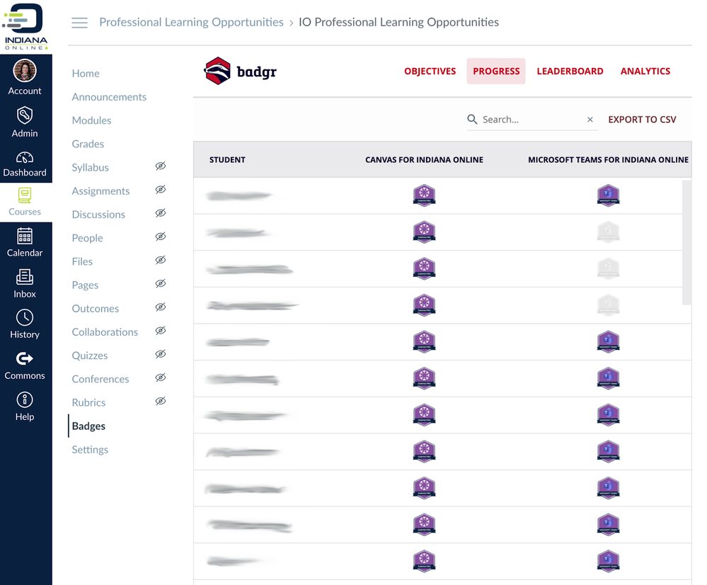
We used many tools in our design and course development, but one of our favorites is Badgr. We are using Badgr to track the professional learning of our close to 300 teachers, as well as their leadership and years of service.
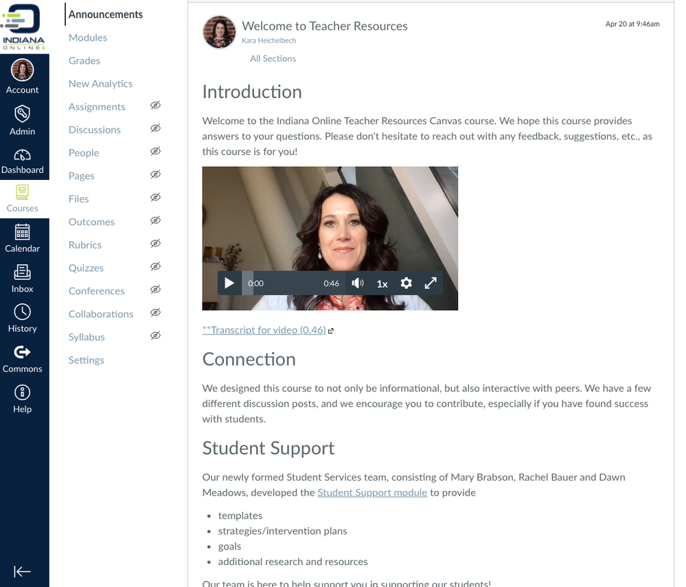
Another feature we are excited to implement is Global Announcements. We plan to use Global Announcements to communicate important updates to our teachers and students, especially during our quickly paced summer school session.
How did your design decision help you increase the engagement of and/or improve the learning experience for your students?
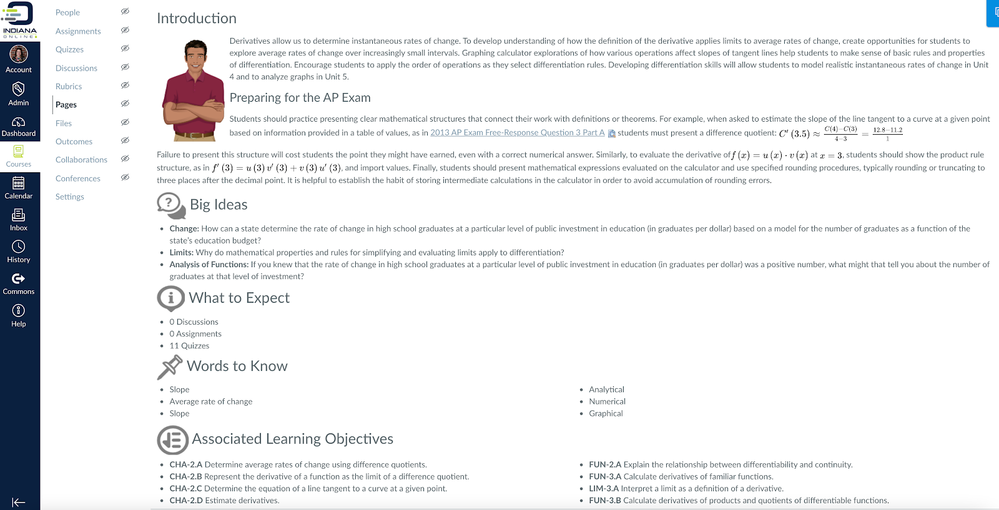
We are currently in the launch phase of Canvas (we will be fully implemented with over 25,000 students this summer), but we can already tell that the Syllabus, To-Do, and Canvas Inbox will be instrumental in engaging with students and ensuring a great learning experience for them. Additionally, our lesson overview pages really set the expectations for each lesson.
What do you find to be the most important aspects of Instructional Design or UDL in this course?
Accessibility. Our courses meet accessibility guidelines, and we are striving to ensure our teaching staff follows accessibility guides for announcements. We know our teachers do not have the design experience or the necessary tools for complete accessibility, but we are committed to teaching them and providing options so that accessibility can be met in every way in every course.
Following the Quality Matters Rubric, K-12, course/module assessments and lessons are tied to course/module objectives. Our instructional design team verifies this alignment using a course map when working with course developers.
ADVICE
When beginning a new design or updating a design, what are three things you recommend designers do to improve the end-product?
Designing from a blank slate is both exciting and overwhelming! Our advice, and our mantra, really, is keep it simple, clean, and consistent. And always design with the end user in mind.


This discussion post is outdated and has been archived. Please use the Community question forums and official documentation for the most current and accurate information.