Hi Ben!
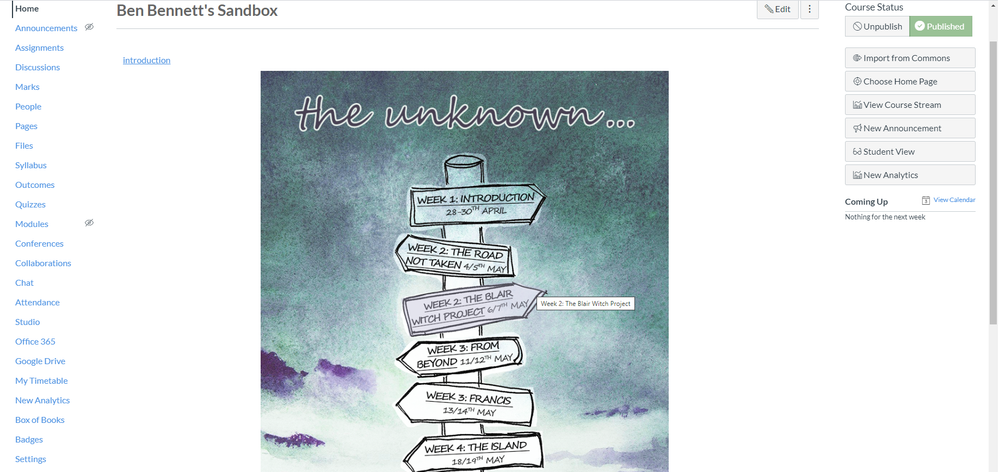
Great screenshots!! I wanna take your course 
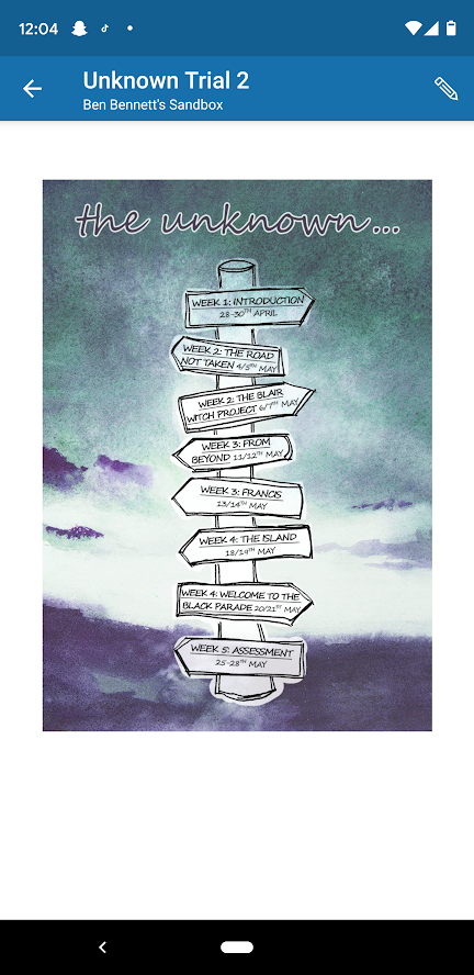
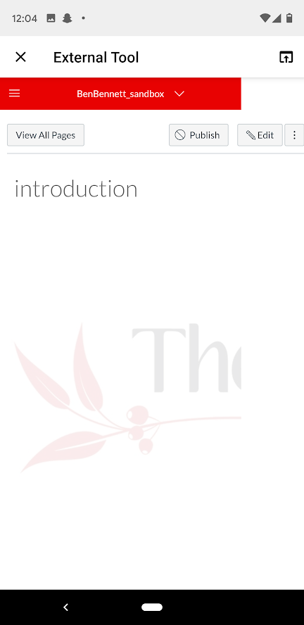
It's a pity the mobile version of the image map loads as external tool, but as you say students can still get to the content. What happens on a tablet? How do screen readers manage the image map?
The only other option would be to have a different mobile screen homepage that had the pure/natural links maybe with each signpost as a separate image arranged in a single div column so that they still stack on top of each other.
In the past, I've created mobile (and screen reader) friendly homepages by duplicating the homepage with minor differences letting the screen width determine what content is shown. I put the mobile code first on the page because it's also usually more screen reader/keyboard navigation friendly.
<div id="mobile-view" class="hidden-desktop">
{Stuff for the mobile view}
</div>
<div id="desktop-view" class="visible-desktop visible-tablet" style="display:none;">
{Regular image map navigation}
</div>
Check out RocketTheme - Documentation for more on the different screen-width classes. and by the way the screenreader-only class DOES display in mobile, so you could plop that in there as well.
<p class="screenreader-only">This is the content that will only come up on a screen reader & mobile</p>
Hope these ideas inspire some more ideas for you,
Stay home, stay healthy,
Cheers - Shar 
p.s. I've been known to hide stuff on the desktop just for the mobile user to see - like instructions telling them to head to a browser to submit an essay or even a secret code word (in a sci-fi/fantasy course)


This discussion post is outdated and has been archived. Please use the Community question forums and official documentation for the most current and accurate information.