Hello!
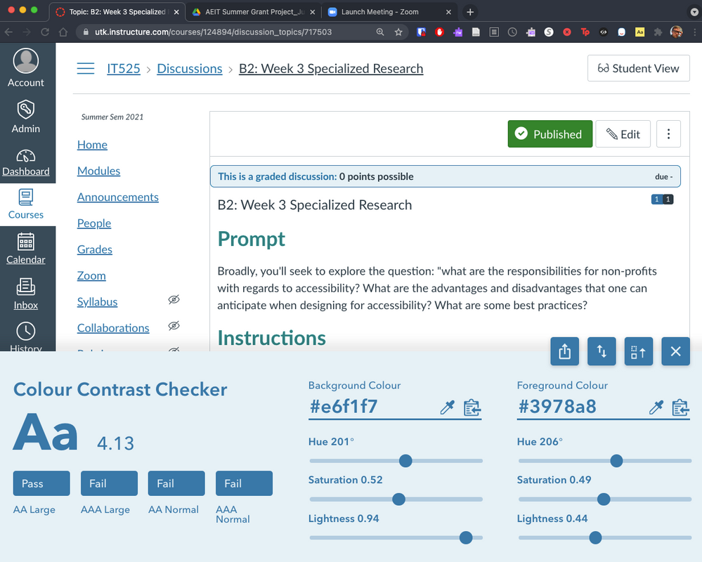
I note that Canvas system messages have insufficient color contrast for accessibility (by system messages, I mean the type that appear as alerts at the top of the screen in blue boxes, for example on group discussion boards).
Specifically, the colors are #2289c5 on #e5f2f8 or very similar. This has a contrast ratio of 3.37/1, which is considered inaccessible by all criteria except for at the WCAG AA level for large text (which doesn't apply to those messages, which are in standard size text).
This is a system code, and it is the default HTML Boostrap coding. However, I would love to see this changed for accessibility. Doing so could be accomplished by changing the text from blue to black or at least navy... the contrast ratio should be at least 4.5/1.
Any ideas?


This discussion post is outdated and has been archived. Please use the Community question forums and official documentation for the most current and accurate information.