Some CSS related to the New UI
- Subscribe to RSS Feed
- Mark as New
- Mark as Read
- Bookmark
- Subscribe
- Printer Friendly Page
- Report Inappropriate Content
Several people have asked for my code that I've used to mess around with the new UI.
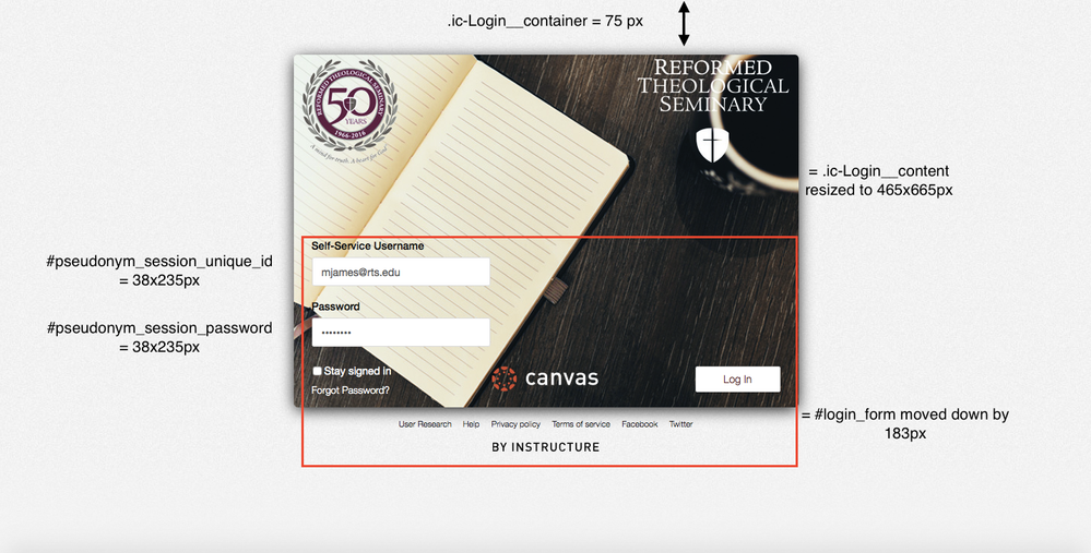
Here's a screenshot of what some of the code affects based on the code below:
Here’s a copy and paste of most of my important CSS tweaks related to the new UI. Anything in “/* */" is a description of what the code does. Please note that I have not played around with formatting the login page for mobile yet. This code is for browsers.
/*format background (image, color, etc.)*/
body.ic-Login-Body{
background-size: auto;
background-attachment: fixed;
}
/*position the main login box area; This code sets it 75 pixels from the top*/
.ic-Login__container{
margin-top: 75px;
}
/*login box* We changed the size to 465x665 to accommodate the size of our background image/
.ic-Login__content{
background: url(“INSERT HTTPS LINK TO IMAGE HERE") no-repeat !important;
height: 465px;
width: 665px;
box-shadow: 0 4px 20px -2px #000000;
padding: 0px;
}
/*Hide Canvas header logo*/
.ic-Login__header{
display: none;
}
/*username login box*/
#pseudonym_session_unique_id{
height: 38px;
width: 235px;
}
/*password login box*/
#pseudonym_session_password{
height: 38px;
width: 235px;
}
/*position entire login form (username, password, stay signed in, forgot password, log in button)*/
#login_form{
margin: 183px 0px 0px;
}
/*Forgot Password? link*/
.ic-Login__link{
color: #FFFFFF !important;
}
/*Stay Signed In link*/
label[for=pseudonym_session_remember_me]{
color: #FFFFFF !important;
}
/*add Canvas image at bottom container*/
.ic-Login__actions-timeout{
background: url("INSERT HTTPS LINK TO IMAGE HERE") no-repeat 65%;
}
You must be a registered user to add a comment. If you've already registered, sign in. Otherwise, register and sign in.


