Are You Losing Students to Poor Course Design?
- Subscribe to RSS Feed
- Mark as New
- Mark as Read
- Bookmark
- Subscribe
- Printer Friendly Page
- Report Inappropriate Content
How often do you view your course through the eyes of your students?
Is your course organized in a logical manner? Can students easily find the content they need?
Is content placed into modules? Are titles of content explicit, pointing to lesson, topic, or week?
If not, your course might be a stumbling block to learning.
What elements must be present for an efficient course design in Canvas?
Syllabus
- Have a clear syllabus posted, with expectations, contact information, and rules and procedures.
- Make sure the syllabus is an actual page. Do not simply add a link and cause the student to have to chase down information that should be readily available.
- Make the syllabus publicly visible.
Set Your Home Page
Give students an anchor page. Whether you choose the syllabus, activity stream, assignments, or the modules list, choose something to show that the course is professional and consistent.
Modules
Modules are like units of study. Organizing content in order of the how you teach it does two things. 1. It gives the class structure and 2. helps both teacher and student find content easily. A student shouldn't have to click multiple times and search for several minutes to find an assignment or quiz that needs completion. You are the expert--organize your course to support how you teach and what you want students to know. However, keep in mind the purpose of the course is to be student-focused.
Organize your modules by
- theme or topic (The Renaissance, Factoring Whole Numbers, Leadership in 18th Century Literature),
- by week (Week One: Drawing, Week Two: Shading with Pencil), or
- by content (Presentations, Videos, Quizzes, Articles, Assignments, etc.).
Indent content that nests under topics and use headers to separate content within a module (even blank headers create space).
Clear Titles
 Having all of the quizzes in a course titled "Unit Quiz" can be confusing and lead to frustration, especially if clear dates have not been set. Make sure all content (assignments, pages, quizzes, discussions) points students to the topic or week or date. Be consistent with naming patterns so students easily find work. The work itself should be rigorous, not the finding of the work. Finding content shouldn't feel like conquering a labyrinth.
Course Flow
Decide how you want students to flow through your course. Do you want to gamify the course? (Excellent tips from Travis Thurston Admin, Gerol Petruzella, @Cijaye DePradine) Do you want to offer a lot of choice? Do you want students to progress in order and complete certain tasks to complete the module? These decisions will impact your organization and your use of prerequisites or badges in a course.( @jward 's fantastic resource.)
Look at Your Course Through Students' Eyes
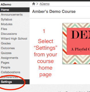
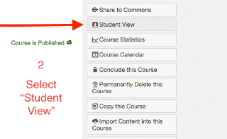
Take a look at your course from a student perspective, literally. Follow these steps:
Using Student View allows you to check for faulty links, posting mistakes, or incorrect formats and messy organization.
Other Considerations
Think of the many types of learners in your courses. Include a variety of material (articles, games, content pages, webquests, performance activities, etc. to engage all levels of learners. For students who need extra assistance, posting helpful videos or recording lessons can provide the support they need outside of tutoring. For students who want to move ahead or dig deeper, providing extra material for enhanced learning opportunities can help them stay focused and engaged when they easily become proficient with the material.
Even though Wright is talking about architecture, his point is relevant to educators. If we strive for student-centered classrooms, then our course design will reflect that focus. ![]()
Happy Designing!
You must be a registered user to add a comment. If you've already registered, sign in. Otherwise, register and sign in.


