Beginner's Accessibility with the Rich Content Editor
- Subscribe to RSS Feed
- Mark as New
- Mark as Read
- Bookmark
- Subscribe
- Printer Friendly Page
- Report Inappropriate Content
Updated 1/23/2020 with new RCE information
Introduction
A new year and a new semester is a time of renewal. As you refresh and revise your courses for the coming semester, please consider making your content more accessible.
I hope you've heard that word, but here's what you really need to know about accessibility: it's about making your content easy for everyone to understand. Yes, there are laws that require accessibility, before you get a student needing it, for those that are differently-abled. But really, making content easy to understand benefits everyone.
This blog will cover really easy things you can do with the Canvas Rich Content Editor that will make your content much clearer and at the same time, more accessible.
This image below are two images, the current* and the new rich content editor. The 4 circled icons that have functions that will help you create accessible content in Canvas.
Current Rich Content Editor
New Rich Content Editor
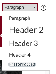
Headings
Headings are the easiest way to start making your content clearer. In the past, you may have simple bolded the font of a heading and made it large. Stop doing that! Instead use the rich content editor and choose the heading level. What this does it is allows a student that uses a screen reader to interact with the content the same way a sighted student would, all through the miracle of the background coding you don't have to know.

- You should use the Headings in order - In Canvas, the list starts with Heading 2, because Title and Heading 1 are already used in the standard Canvas layout.
- Sample Headings could include: Overview, Introduction, Instructions, Examples, Grading.
- When you hit enter after a header, the next line is automatically set to paragraph so you can start entering content.
When you set headings correctly this gives all students:
- chunked content that is easily scanned.
- a quick overview of the type of content on the page.
- a way to organize the content they read so they better understand and retain it.
- an easy way jump to the section with the content they need.
It is true, the format for heading 1 comes standard, and it may not be exactly what you want. You can let that go. What you loose in control you gain in consistency and accessibility. (Ok, once you set the heading, you can change its font, but what a lot of extra trouble! Just be sure you set the heading level first and try to be consistent throughout your Canvas site. This is why using the standard font for each heading is just easier.)
Lists
To further clarify your content, you should consider if a list is better than a paragraph. When the answer is yes, use bullets for a list with no sequence and numbers for a list where sequence matters. You may have been doing this, but having you been using dashes or asterisks or typing in the numbers yourself? Use the rich content editor instead.
When you are ready for a list
- click the list icon that matches your needs
- type a list item
- Hit enter and continue entering items
- At the end of the list simply hit enter again or click the list icon to return to paragraph formatting.
If you have already typed a list, highlight all the list items and choose the bullet list icon or the number list icon depending on your needs.
Here's what lists get you:
- Organized, easily read content.
- Content that is easy to rearrange. When you move an item in a numbered list, the list renumbers itself.
- Automatic indenting for nice white space.
- Hit tab while in a list item and the numbering or bullets will change.
- Clearly ordered sequences.
Again, using the rich content editor creates background information that will allow sight disabled students to interact with lists in the same way as sighted students, so the lists are useful to everyone.
Images with Alt Text
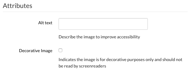
Ever have an image not load and wonder what it was? Alt text would have saved your day. For some students, alt text is essential. The best time to add alt text is when you are adding images to your content.
- Click the image icon in the rich content editor.
- Find your image.
- Create alt text for your image or designate it as decorative.
- Note for the new RCE: Once inserted you click on the image and click the options button to insert the alt text.
- In the current RCE: If you already have an image, select it and hit the image icon to add alt text.
Wow, I made that sound easy, but alt text takes practice. The text you put in should answer this question: What is the content conveyed by the image? So it isn't necessarily a description, but the point of the image. Here are some other guidelines:
- It should not be file names with things like ".jpeg" at the end. At least remove the ".jpeg".
- Keep it under 125 characters. Longer descriptions should be part of the accompanying text.
- Do NOT use the phrases "image of ..." or "graphic of ..." to describe the image.
- Context matters. Only you as the content creator really know the point of the image, so you get to decide the alt text.
Just know that having alt text is so essential for some students that you should make an attempt. With practice, it will get easier. WebAIM Alternative Text analyzes the same image several ways so you can see some examples that will help you improve your use of alt text.
Accessibility Checker
The last icon circled on the rich content editor image above is the stick person which takes you to the accessibility checker. This will review the content on the page, identify what may need improvement and even give you some guidance on how to fix issues.
A Final Word
Please do not think that Canvas is the only place where you have tools to improve your accessibility; they are in every content creation program! Hopefully you will now recognize the headings, lists, and image icons in everything from Google Docs to Microsoft Powerpoint. Make accessibility just a part of how you work, and your content will be better for everyone.
*Please note that this image is from the University of Minnesota Canvas Rich content Editor. Yours may appear slightly different but should have many of the same features. For more on accessibility, check out Accessibility.umn.edu.
You must be a registered user to add a comment. If you've already registered, sign in. Otherwise, register and sign in.


