Remove "New Window Icon" that is inserted when using the sidebar
- Subscribe to RSS Feed
- Mark as New
- Mark as Read
- Bookmark
- Subscribe
- Printer Friendly Page
- Report Inappropriate Content
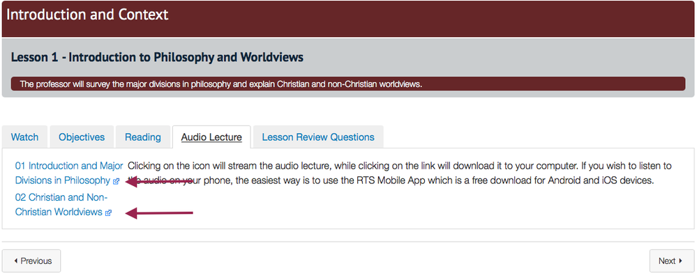
One of my favorite features of Canvas when it comes to designing a course is the Sidebar that lets you insert all sorts of content into a content/wiki page. However, one annoyance that I have is that if you use the sidebar to insert documents (both Word and PDF) or media such as audio files, the result when you save the page is that a what I call "new window icon" gets automatically added to the content page. Here's a screenshot of what I mean.
If you have several items on a page and several pages in a course, I personally get tired of seeing that icon. In my mind, it serves no purpose since it's just a download link which is also accomplished by clicking on the link itself. So i set out to try to figure out a way to remove that icon.
The Long Way Method
You can go into each content/wiki page and for each item that has that icon, you can go into the html editor and remove the phrase "instructure_file_link" from each item and save the page. Below is a screenshot of what I mean. This method was going to be very time consuming for me as each page could have 4-10 places where that phrase would have to be removed and a course could have 12-18 pages so at a minimum I was looking at having to make 48 deletes per course and could possibly have up to 180 places to make that deletion.
The Short Way Method
Add the following to your global or account CSS file:
/*remove new window file icon from linked files*/
a[title="View in a new window"]{
display: none;
}
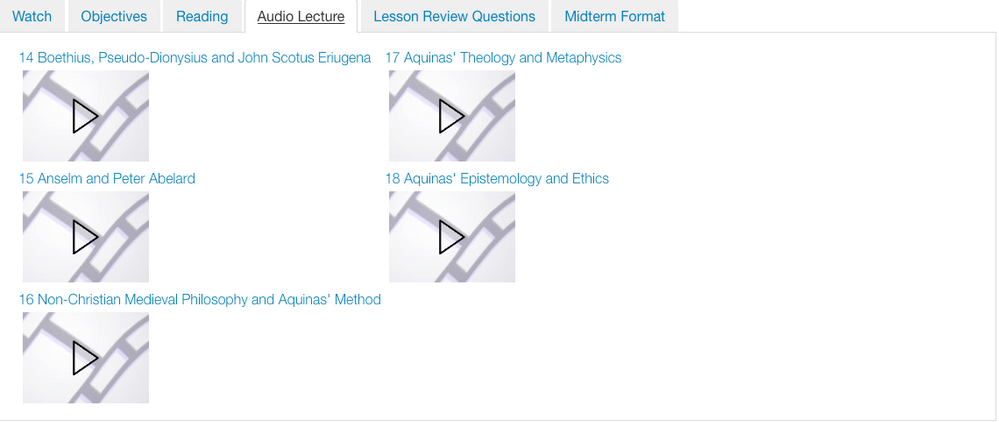
Why does this work? Well, when you add a document or media file from the sidebar, 2 or 3 things get added for that item: the download link, a preview document icon (if Word or PDF), and the "new window icon" that I want removed. Each of these 2 or 3 things has its own html formatting and styling that gets automatically added. Unique to the "new window icon" is that 'title="View in a new window"' gets added only to that "new window icon." So by targeting that attribute in my CSS, I can target only that icon and the download link and preview document icon are not affected. Here are some screenshots of documents and audio files that have been added via the sidebar and the above css applied in the theme editor.
But what about accessibility? Since I'm targeting the "title" attribute, the "alt" attribute is not affected for images, and you can still add title text using the "title" attribute as long as you don't use the exact phrase "View in a new window" You could use "VIEW IN A NEW WINDOW" and not affect the document as seen below. Heck you could probably just add a period to the text you add and it would still show. The phrase that is targeted in the above CSS is case sensitive so you can make any change to have the same text appear just in a slightly different format.
But what about mobile? I've tested my course on both an iPad and Android devices and nothing was affected. Everything in the course displayed as it should and opened just fine in the Canvas app.
I also tested this using mobile browsers (Safari on iPad; Chrome on Android) and it displayed just like the browser, with the annoying icon removed. w00t!
What if I've forced a link to open in a new window via Command/Control-K? Here's the good news. Those links are not affected because using that method does not add "title="View in a new window"" to the HTML code. So those links will appear as normal and will still open in a new window.
Two Words of Caution/Recommendation
1.) Don't try to hit the "target="_blank"" attribute in your CSS as that will affect links you've forced to open in a new window using the Command/Control-K method.
2.) I have tried to be as thorough and detailed as possible in testing this. However, I still recommend that if you want to try this for yourself, use your beta/test instance first and go through the entirety of your course to make sure nothing disappeared. Courses are going to be different in their design and in the features they use, so test this for yourself before implementing it. ![]()
You must be a registered user to add a comment. If you've already registered, sign in. Otherwise, register and sign in.


