Rethinking Page Design: Your Gateway to Learning
- Subscribe to RSS Feed
- Mark as New
- Mark as Read
- Bookmark
- Subscribe
- Printer Friendly Page
- Report Inappropriate Content
November Teacher Appreciation Event: Rethinking Page Design: Your Gateway to Learning
• About our event
• Considerations for Rethinking Your Page Design
Shout out to my fellow Instructional Designers who contributed to this blog post, @Jennifer_Leimer, @shalon_farris, and @Laurie_Norris. We have loads of Canvas expertise and are passionate about design, pedagogy, and best practices. Let us share how to elevate your fully-online, hybrid/blended and face-to-face courses for learners ranging from preschool through post-secondary and everything in between.
We utilize the Canvas Community on a regular basis to position instructional design resources! We understand the impact and power of the Instructional Designers' space within the Community and want to give back. We are excited to collaborate and share tips and tricks about our Canvas Design Best Practices.
We’ve all experienced that feeling of being lost...like when we step onto a college campus for the first time, enter a new shopping mall, or exit an airplane into a new airport. We have that uneasy feeling of not knowing where to go or what to do. Our first reaction is to find our way. We naturally look for a directory, a map, or a guide to help point us in the right direction. With all the other changes and uncertainty surrounding our students, there should be no question about where to go and what to do in their online classrooms. This brings us to our topic of discussion: Rethinking Page Design - Creating a Gateway to Learning. The goal of this conversation is to provide educators with tips to ensure that their courses are organized in a way that students have a clear understanding of what to do when they enter a course along with a well-defined pathway to the learning materials. In this discussion, we will explore some characteristics of a well-designed course homepage and discover why overview pages are important and what should be included in them.
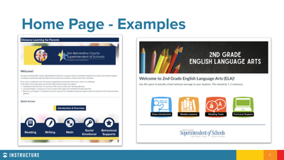
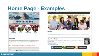
- Is Inviting and Welcoming: The course home page provides your students with their first impression of your online environment. When you think of a course that is inviting and welcoming, the key features include a brief welcome message, an inviting color palette, and a course description or overview. Consider adding a course welcome video. A welcome video on the course home page helps humanize the course and kick starts the relationship-building process between the educator and the student.
- Includes Visual Elements: Use visual elements to grab your students’ attention. Images, graphics, and videos are a great way to clearly organize and present information. These elements can help illustrate important information that students need to know or action that they need to take. Be sure to consider accessibility when adding graphics or media. For more information about accessibility in Canvas, take a look at this great blog post: General Accessibility Design Guidelines.
- Provokes Action with Clear Instructions: The instructions on the course home page should be very clear and should outline exactly what students should do and where they should go next. Be clear and concise so that students don’t get lost in the verbiage.
- Provides Quick and Easy Navigation: Students should be able to navigate to their content in 3 clicks or less. Be sure that all of the images, buttons and links have a purpose and help streamline access to the learning materials. Hide links on the course navigation menu that aren’t being used to minimize confusion.
Example Homepages
Whereas the home page serves as the course introduction and welcome, the overview page introduces the “Why,” the “What,” and the “How” of the course.
Key elements of an overview page:
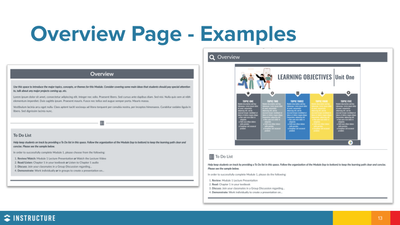
- Clear Learning Objectives: Learning objectives are an important component because they help connect the learning materials, activities and assessments in a way that gives each a purpose. Learning objectives help both the teacher and the student to relate the content to the desired outcomes of the course. Objectives should be presented in a visually appealing manner that segments the information into easy to comprehend chunks using a bulleted list, table, or infographic.
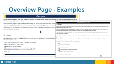
- To-Do List: As the gateway to learning, a great way to highlight the path students should take in the course or module is to provide a detailed To-Do List. Providing the expectations and requirements for each learning module will help add structure, reduce anxiety about what’s to come, and help develop a sense of accomplishment for students. The To-Do List should be presented as a numbered list or checklist that identifies the tasks to complete.
Example Overview Pages
Always try to look at your course through the lens of a new student. Pretend you don’t know anything about your course, you’ve never read the syllabus, and this is your very first time in an online course. Do you know where to go, what to do, and how to do it? Do you want to be in your class? Do you have a clear path? Do both your course home page and your overview page provide a “Gateway to Learning?” In the words of Mr. Norbert Tracy, former teacher of American Government at my high school in Long Beach, MS, keep it “Nice, Neat, Clean, and Complete!” He had several quotes that stuck with me and my classmates over the years. This one was referring to essays, but those words hold true too as it relates to course design.
Follow us for our full event! We can't wait to continue sharing with you!
Please comment below. We’d love to hear from you!
Our Instructional Design team offers templates, consultation, badging services, course evaluations, workshops, and more. If you would like to learn more about our services, please contact your CSM or @deonne_johnson, Manager, Learning Services, via djohnson@instructure.com
You must be a registered user to add a comment. If you've already registered, sign in. Otherwise, register and sign in.


