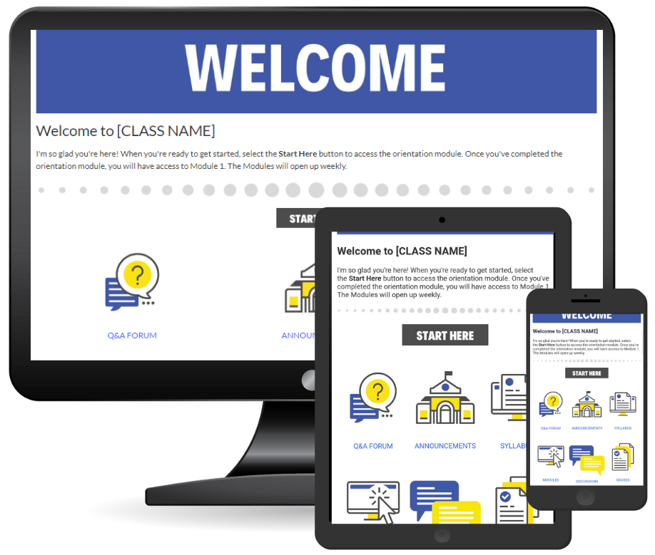
Mobile Friendly Home Pages
- Subscribe to RSS Feed
- Mark as New
- Mark as Read
- Bookmark
- Subscribe
- Printer Friendly Page
- Report Inappropriate Content
Designers can spend hours on creating the perfect home page for a course, setting everything up just how they like it, then guess what, the student viewing it is using the app. How does that home page look on the app, chances are it scaled differently, or something moved.
Creating a solid template and then adjusting the template to the needs of the course is a great way to make sure your homepage looks sharp across all devices, because when you find out students are primarily using their phones, you better engage them the same way as you would on the desktop.
Here are a couple of mobile friendly CanvasLMS homepage templates I finished up.
Feel free to download in the Canvas Commons:
Welcome Page | Purple & Yellow color scheme: https://lnkd.in/gmWUaHG
Welcome Page | Red & Blue color scheme: https://lnkd.in/gba4FtD
Many more to follow ![]()
instructional_designer instructional designers higher ed instructional design
You must be a registered user to add a comment. If you've already registered, sign in. Otherwise, register and sign in.

