Student-Directed Home Pages
- Subscribe to RSS Feed
- Mark as New
- Mark as Read
- Bookmark
- Subscribe
- Printer Friendly Page
- Report Inappropriate Content
Today, the first day of a new semester, I asked each of the classes I teach, "What would your ideal home page look like?"
During the five years our school has had Canvas, I've done a fair bit of designing because I've taught 10 different semester-long courses. Because I've actively sought design feedback from students before, I had a general idea of what students would say. This semester, I wanted to fully include the class in this process and not just ask a student here and there throughout the term. With this change, I hoped to create a list of key components so I could customize a home page for each unique group of students. (This is possible because I teach each of the five courses only once during a day.)
What made me the most excited about this extra step is that the resulting page would be helpful to their learning and not just something that I thought was well-designed.
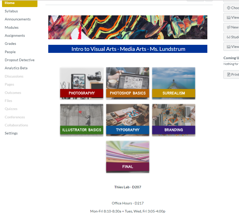
After some amazing organic collaborative conversations, I learned that every group wanted buttons that lead to specific modules. From that view, they can see the content for the entire module and jump around as needed. They did not want a fancy button that led to the Syllabus, Assignments, or Discussions. ONLY buttons that went to the modules. Why? They felt that the left-hand course navigation was there and that it was silly to repeat it in the middle. Students want to keep things simple and they are aware of design redundancies. They know where to go, so place the essentials in the place that warrants the big visual. It will help them get to their learning activities more efficiently!
Because the students asked to keep many of the items in the left-hand course navigation active, I will continue to use the Content Selector passionately. The more I can link the course's activities and resources together that way, the more connected the students' navigation will be, no matter how they arrive at the item.
This all made sense to me (and aligned with my hopes, luckily)!
With more conversation, each group was very drawn to a concept like this -- module labels, color-coding, and access to most frequently visited "subsections" of Canvas so they can navigate in multiple ways depending on what they're doing:
Now, I have some work to do! It's always fun to design with a goal in mind. This semester, the goal is bigger because more people are invested, and I think that's pretty awesome.
If you asked a group of students about their ideal home page, what would they say? Each institution is so unique, I would find it fascinating to hear how different groups of students would organize their learning.
You must be a registered user to add a comment. If you've already registered, sign in. Otherwise, register and sign in.


