Font-size Is More Than The Size Of The Font
- Subscribe to RSS Feed
- Mark as New
- Mark as Read
- Bookmark
- Subscribe
- Printer Friendly Page
- Report Inappropriate Content
tl;dr The meaning of larger or smaller text can be lost on users who use assistive technologies if authors don't use the right features like Headings. What are some reasons you change the font-size so we can be sure we're providing the most accessible way to present that information?
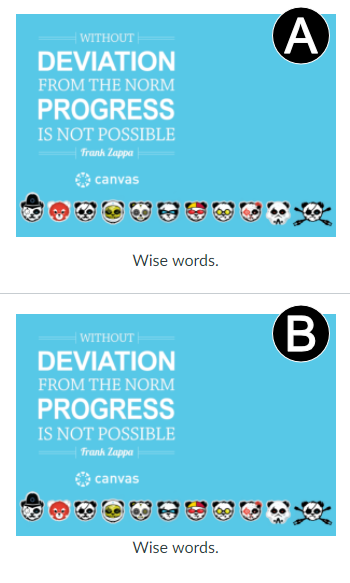
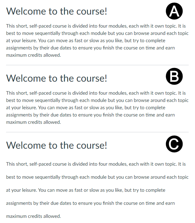
Recently, I was talking to a group about how they use various features of the RCE and two things caught my attention regarding the font-size picker. One of the them was "I make text smaller under an image, usually for a caption or attribution." And the other was "I break long pages up into sections with larger titles to separate each section." These are both good affordances for laying out content, but unfortunately they both run afoul of making the content as accessible to screen reader and keyboard-only users.
Let's examine that first use case: "I make text smaller under an image, usually for a caption or attribution." The "official" way to do this is using a "Figure Caption". Canvas doesn't support adding Figure Captions through the UI, but it's definitely something on my radar now! Figure Captions also don't have broad screen reader support just yet (screen readers read the text, but don't do anything fancy with it) but it does make for a nice layout. Most important to understand: Figure Captions do not replace alt text on images!

The case of the "bigger section titles" may be familiar to many of you. Most people at least have an idea of how Headings work, but Headings don't just change the font-size (and add some Gestalt-friendly padding). Headings also have structural meaning that assist keyboard-only and screen reader users navigate content, the same way the larger size and spacing helps sighted readers. The folks at IU and Princeton have a couple of my favorite guides for explaining and showing why you should care about using Headings correctly.

So, how about you? Are you excited for a future where we support Figure Captions? Did the links above help you understand Headings? Do you use the font-size menu to embiggen or enshrinken your text? And if so, why? Share your use cases in the comments below!
The content in this blog is over six months old, and the comments are closed. For the most recent product updates and discussions, you're encouraged to explore newer posts from Instructure's Product Managers.


The content in this blog is over six months old, and the comments are closed. For the most recent product updates and discussions, you're encouraged to explore newer posts from Instructure's Product Managers.