After an outage on September 1, the Instructure Community is now fully available, including guides, release notes, forums, and groups. If some styling still looks unusual, clear your cache and cookies.
Turn on suggestions
Auto-suggest helps you quickly narrow down your search results by suggesting possible matches as you type.
- Community
- Canvas
- Canvas LMS
- Canvas LMS Blog
- Columns Without Tables: code-snippet
Columns Without Tables: code-snippet
G_Petruzella
Community Champion
- Subscribe to RSS Feed
- Mark as New
- Mark as Read
- Bookmark
- Subscribe
- Printer Friendly Page
- Report Inappropriate Content
Tables - I really don't like them. I find them unwieldy to manipulate and style, plus they're really not accessibility-friendly as commonly employed. But they've always seemed the only way to solve certain visual alignment problems: for example, creating three aligned columns. I've only recently realized that I don't need a table to create columns! Huzzah!
The key to columns... is the <div> tag.
Example: I want the "header" of my Syllabus page to contain some contact info, divided into two columns, with a 3rd column for a right-aligned graphic. I start just by typing out the fields and inserting the image, so they're stacked vertically:
<p><strong>Instructor:</strong></p>
<p><strong>Class Location:</strong></p>
<p><strong>Class Meeting Times:</strong></p>
<p><strong>Contact Information:</strong></p>
<p><strong>Office Location:</strong></p>
<p><strong>Office Hours:</strong></p>
<img style="float: right;" src="/courses/372229/files/66518610/preview" alt="FYE 2015 logo" width="60%" data-api-endpoint="https://mcla.instructure.com/api/v1/files/66518610" data-api-returntype="File" />
But now, I 'frame' each chunk of content with its own <div>, setting the float attribute so they'll run side-by-side when possible, and setting the width attribute to get the relative sizes I want, as follows:
<div style="float: left; width: 35%;">
<p><strong>Instructor:</strong></p>
<p><strong>Class Location:</strong></p>
<p><strong>Class Meeting Times:</strong></p>
</div>
<div style="float: left; width: 35%;">
<p><strong>Contact Information:</strong></p>
<p><strong>Office Location:</strong></p>
<p><strong>Office Hours:</strong></p>
</div>
<div style="float: right; width: 30%;"><img style="float: right;" src="/courses/372229/files/66518610/preview" alt="FYE 2015 logo" width="60%" data-api-endpoint="https://mcla.instructure.com/api/v1/files/66518610" data-api-returntype="File" /></div>
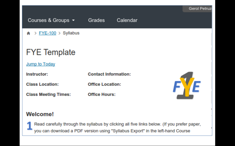
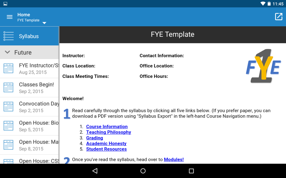
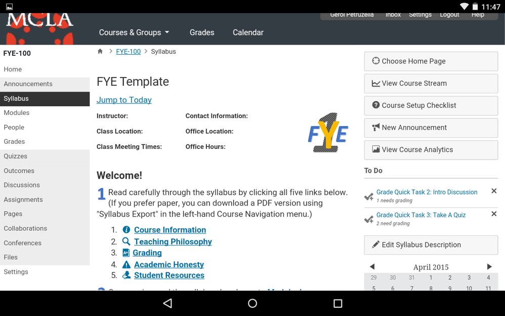
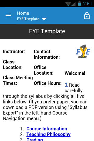
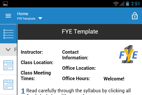
It looks like the screenshots below. (**EDIT 04/24/15: added screenshots from Android tablet, both Canvas App and mobile browser. HT Deactivated user.)
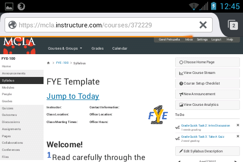
**EDIT 04/27/15: added screenshots (below) from Android phone, both Canvas App and mobile browser (Firefox). Note that the browser view on a phone does reduce text size within <div>s significantly.
Labels
14 Comments
You must be a registered user to add a comment. If you've already registered, sign in. Otherwise, register and sign in.
Gerol Petruzella
Community ChampionAbout
Director of Academic Technology
North Adams, Massachusetts, USA
Bio
Ancient Greek philosopher/linguist; academic techie; enthusiast of sundry pursuits, including eudaimonia, accessibility, cannoli, and kayaking. I can see the weasel after the storm (a classical in-joke).
Badges
 Community help
To interact with Panda Bot, our automated chatbot, you need to sign up or log in:
Sign inView our top guides and resources:
Find My Canvas URL Help Logging into Canvas Generate a Pairing Code Canvas Browser and Computer Requirements Change Canvas Notification Settings Submit a Peer Review AssignmentTo interact with Panda Bot, our automated chatbot, you need to sign up or log in:
Sign in