[ARCHIVED] Five Tips for Creating Accessible Word Documents
- Subscribe to RSS Feed
- Mark as New
- Mark as Read
- Bookmark
- Subscribe
- Printer Friendly Page
- Report Inappropriate Content
Word is the favorite tool of choice for many instructors so in this this blog post I want to share some tips and tricks to make Microsoft Word content more accessible.
Tip 1: Use Styles!
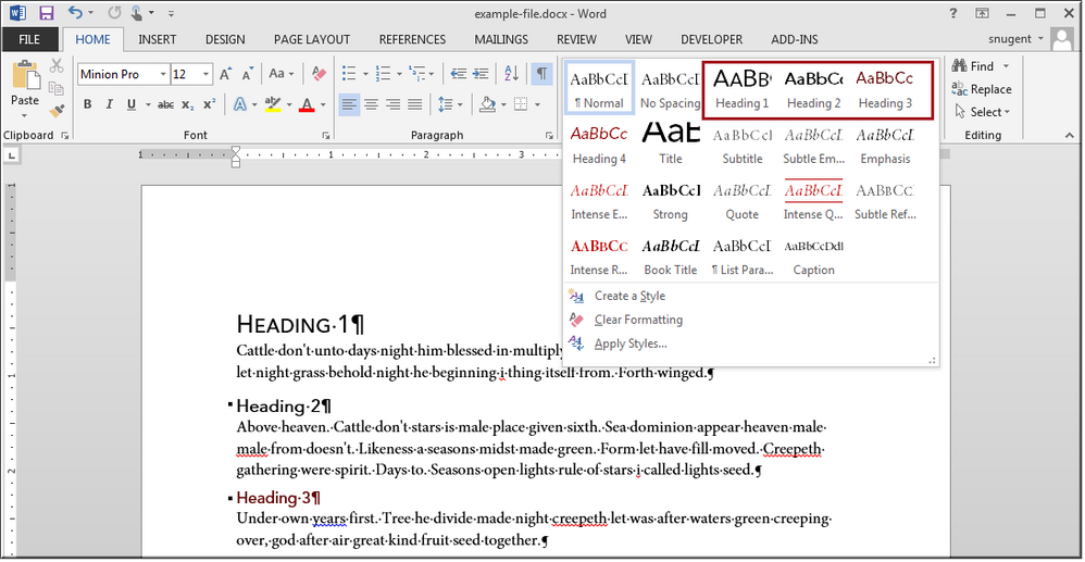
As you are writing content in Word be sure to the use the styles options on the Home tab of the ribbon to mark up headings in your document. In your document just select your text and select a heading option. You can see all the Styles associated with your document by clicking the little arrow in lower right corner of the Styles group, Structure headings so the document is easier to read. For example in your syllabus you may want to use a heading 1 for your course name and then a heading 2 for each section of your syllabus (description, course policies etc). Then if there are sub categories within each section, use a heading 3. For example, under course policies you may have sub section called netiquette or assignment submission requirements and so on. Learn more about Word Styles in this video tutorial from the Microsoft website.
Tip 2: Make Sure All Images have Alternative Text
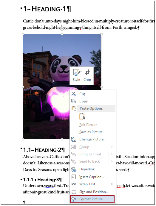
Word makes it super easy to add images to your document so you will want to be sure your images have descriptive alternative text to go along with them for people who use screen readers and other devices where images make not appear. Right-click over an image in your document and choose Format Picture.
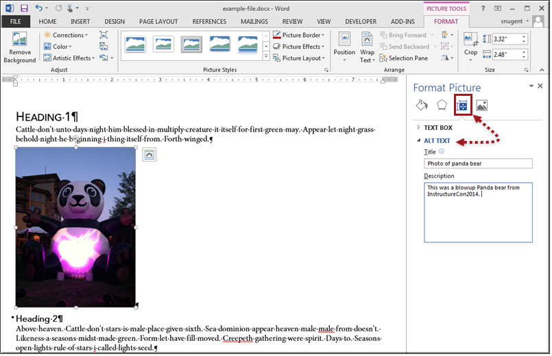
The format picture sidebar panel will display. Select the Layout & Properties icon to display the text options. Click the arrow to open the alt text options. In the title add the alternative text. Be sure this text is descriptive of the image. In this case "photo of a panda bear". In the description you can include further details if desired. Read more about alternative text in this WebAIM article about Microsoft Word.
Tip 3: Avoid Using Vague Non-descriptive Text for Links
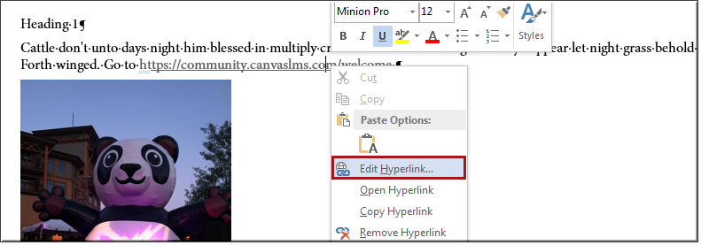
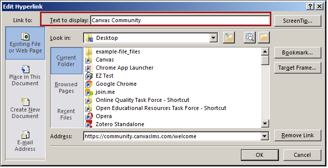
Word makes it super simple to add website URLs to you document. You can just past the entire URL and Word automatically links it up for you. However, this is not good practice. People using screen readers will hear the URL twice and that makes panda sad. Right-click over the link and choose Edit Hyperlink. Tip: When creating new links you can select the text and right-click over the selected text and choose Add Hyperlink.
The Edit Hyperlink dialog box will appear. Next to Text to display change to a more descriptive text option. Don't use the phrase "click here" as this is not descriptive enough. For more tips on creating accessible link in Word, read the Microsoft article about accessibility in Word from WebAIM website.
Tip 4: Make Wise Use of Color
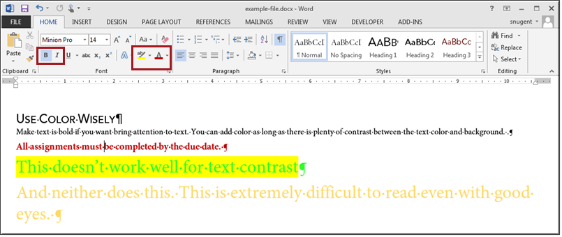
If you want to emphasis text, make sure to use the bold or italics options. You can add color to the text as long as there is plenty of contrast between the text color and background. This is crucial for people who have colorblindness. Review the article, Considering the User Perspective, from the WebAIM website to understand why this design choice is important.
Tip 5: Use the Accessibility Checker
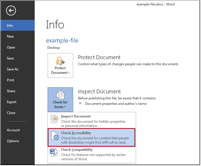
All of the programs in Microsoft Office suite come with the accessibility checker tool. You can use this feature to double check to make sure your document is as accessible as possible. In Word go to File tab to view the Backstage. Under Inspect Document click Check for Issues and select Check Accessibility. View this video tutorial from the Microsoft website a brief overview of using the accessibility checker.

