Hi @james10 ,
Placing text in an image is easy... but isn't friendly to some users. :smileygrin:
I think the simplest way would be to try the following...
The native grid system in Canvas is currently based off this, https://getbootstrap.com/docs/3.3/examples/grid/
Which states:
Mixed: mobile and desktop
The Bootstrap 3 grid system has four tiers of classes: xs (phones), sm (tablets), md (desktops), and lg (larger desktops). You can use nearly any combination of these classes to create more dynamic and flexible layouts.
Each tier of classes scales up, meaning if you plan on setting the same widths for xs and sm, you only need to specify xs.
It looks like you are trying to get a little off center position between the two columns... so I scrolled down the page and found the first example under Mixed: mobile, tablet, and desktop. For this post, I'll be consistently using the example on the page directly below that page heading.
I prefer Chrome for the next few steps, but they are similar in any browser.
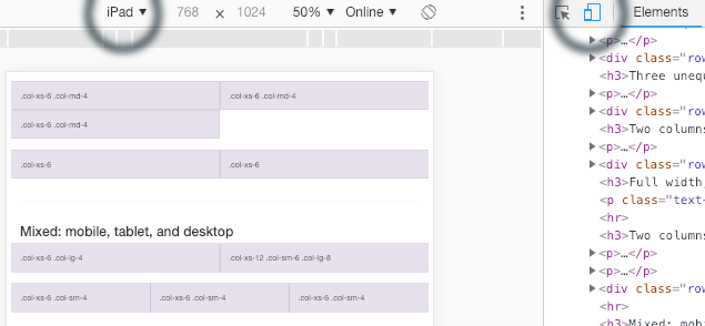
If you right click that area of the screen and choose Inspect (Element), you'll see the following.

Now, within the inspector, if you find the <div class="row"> that highlights the one we want on the left, Right Click that and choose Copy > Copy Element. This will get you the HTML you can use within Canvas. I think you want the reverse, with a wider (text) column on the right, so I've switched that here.
<div class="row">
<div class="col-xs-6 col-lg-4">.col-xs-6 .col-lg-4</div>
<div class="col-xs-12 col-sm-6 col-lg-8">.col-xs-12 .col-sm-6 .col-lg-8</div>
</div>
- Copy this HTML into the Canvas RCE
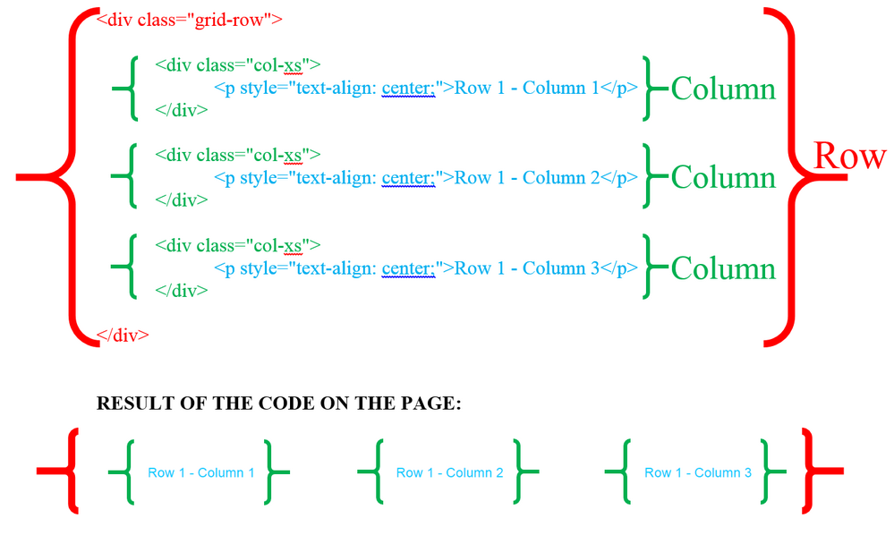
- You'll also need to change the class of the div to "grid-row", as Canvas has changed the default.
- Then, replace the .col-xs-6 .col-lg-4, with your image content
- (note the .class-names, for the example text, not the the actual classes between class="")
- Next, replace the .col-xs-12 .col-sm-6 .col-lg-8, with your text content.
- Within the right side, you can continue using any of the RCE text features like Headings, Bold, Lists etc.
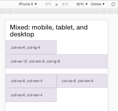
You can then test your page in the Canvas Apps for mobile and tablet. It should look the same on laptop and desktop browsers.
You can also play with the responsiveness directly in your browser, on this Bootstrap Grid System page. Within Canvas in the browser it gets tricky, because the viewport is larger than the sub/nested Canvas content area.



This discussion post is outdated and has been archived. Please use the Community question forums and official documentation for the most current and accurate information.