[ARCHIVED] Help with replacing an image to retain 'responsiveness'
- Mark as New
- Bookmark
- Subscribe
- Mute
- Subscribe to RSS Feed
- Permalink
- Report Inappropriate Content
Hoping someone can help...
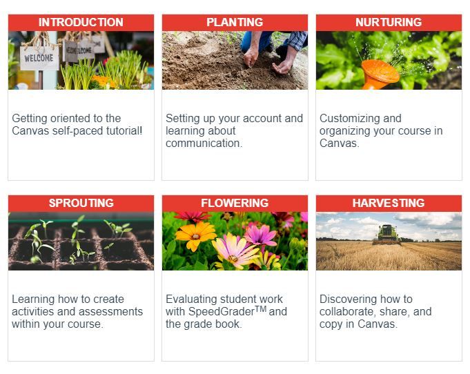
I am trying to get a 'responsive' Front page in all the courses at my school. As a template, I would like to use the Front page of the Growing with Canvas course available in Commons, in particular, the table part shown below. (I guess it is a table...)
Problem is, I don't know how to replace the images in a way that still makes the image stay within that 'cell'.
Here is an example where I have replaced the 'agriculture' images in the Growing with Canvas course by selecting the existing image and then uploading the image I want.
Looks ok until I change the width of the screen/monitor....The images are no longer 'responsive' and don't resize to stay within the table cell.
I have tried looking at the html code but really don't know what I'm looking for! I have put the page in Canvas Commons. The link is here. if someone would be kind enough to look at the code OR, tell me how to replace the original Growing with Canvas course images with different images so as to not lose the image's ability to resize nicely within the 'cell'.
The code is here just in case something jumps out at you!
Many many many thanks!
All the best
Suzanne
Solved! Go to Solution.
- Mark as New
- Bookmark
- Subscribe
- Mute
- Subscribe to RSS Feed
- Permalink
- Report Inappropriate Content
Suzanne
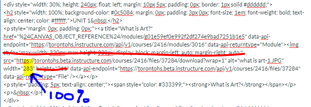
I've just played with the page that I imported from Commons. By setting a width of 100% to each of the images it worked as you want it to. I've done a screen grab below but you will have to enable flash to view it sorry.
This image shows what I suggest you delete from the code for each image and where you need to add the 100%.
I hope that helps.
Cheers
Tina


This discussion post is outdated and has been archived. Please use the Community question forums and official documentation for the most current and accurate information.