Somewhere in the depths of my home office, or perhaps in my school one, I have a little book, based on research, that talks about all sorts of aspects of typography. I can't even remember what it's called (something like Communicating, Not Making Pretty Shapes. The author measured the comprehension rates among groups reading all sorts of text types, such as serif versus sans serif, caps versus upper and lower case, white on black versus black on white, and on and on it goes. He concluded, if I remember correctly, that there is a penalty on comprehension of blocks of text written in all caps, which we should best save for small bursts. I'd love to have the book here to be able to supply you with a quote and the figures. If I find it later, I might scan the relevant section and add it as a reply to this post.
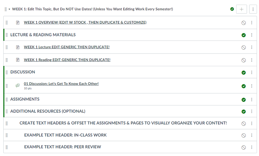
Reading through this fascinating thread, I can see good points on both sides. I fall somewhere in the middle. For headlines and BRIEF points of emphasis, caps can be a boon. For anything more than a few words, though, they become more difficult to read and comprehend, and we can lose our readers. I feel it's easier to differentiate between words in upper and lower case, and our letters have been designed that way, with ascenders and descenders and all.
Thanks for an entertaining and informative discussion, everyone. Cheers!


This discussion post is outdated and has been archived. Please use the Community question forums and official documentation for the most current and accurate information.