@tina_busch
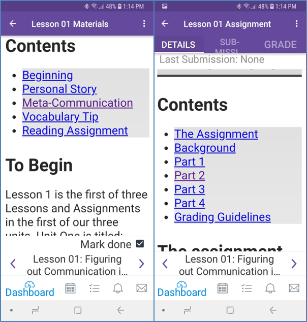
This is sage advice that more people should heed. Too many people want it to look a certain way because it appeals to their personal style preferences or looks good on their 27" wide-screen monitor. They forget to test it in mobile to see what it looks like there. I'll throw a shout out to my friend @kmeeusen here because he's a big advocate of Universal Design for Learning (and he could use the points).
As for the question at the end, I want to share some thoughts.
Canvas could implement tabs and accordions in the mobile app if they wanted. However, they were never officially supported for the web version in user created content, there were just some people who were using the enhanceable_content class to do things. Those enhanceable_content items were accomplished with jQueryUI widgets and Canvas is moving away from jQueryUI. It's large and not as accessible as the InstUI library they built for React JS.
If a school wants to support those items like tabs, then it is up to the institution to implement the custom JavaScript and load the external libraries and come up with their own classes. If that sounds like a lot of work, it is. But it's also in agreement with what the VP team said on Wednesday's session at InstructureCon 2018 -- that they discourage people using the custom JavaScript for things. It's also a problem for people who want to use InstUI within Canvas. The greatest, most accessible React library out there would cause problems if someone tried to use it to manipulate the DOM within Canvas. But hey, if you want to write an LTI using, go for it, it's the best out there. That's kind of the message they're sending. And it's consistent, it's just not what people who want to do extended things want to hear.
We should probably step back and ask why they don't support tabs in mobile and why they're deprecating the unsupported feature in the web version. I don't know the definitive answer to this -- okay, I've heard the definitive answer on the deprecation, but not on the lack of support for tabs in mobile. I've got a couple of guesses based on things I've read.
I hope that research shows that it's better for students to have all of the information out there rather than having to click on a tab to find something. Based on research, they've probably learned that it is better to have shorter content (and more pages) rather than taking a lot of content and masking that behind tabs so it appears shorter. Some could see tabs as a way to accomplish the lack of folders within the modules or pages. Canvas could also implement those features as well, but haven't chosen to. Maybe because it's a bad idea.
It could also be the complete lack of support for anything not obtainable through the Rich Content Editor. Canvas doesn't have any predefined templates or styles for people to choose from. There's no predefined CSS for APA, MLA, Chicago, Turabian, or other style guides, that people can apply if they want. It's up to each individual college to define those. In some ways that's beneficial because they're not sending a lot of extra CSS markup that isn't getting used. They could still use some optimization in that area; part of that is getting rid of jQueryUI.
On the other hand, it sure would be nice if I could just add class="booktabs" (or whatever I wanted to call it) to my table definition and it would add a thick line at the top and bottom of the table, a thinner line below the header, left align everything, and add some horizontal padding to each cell. But as awesome as that is, someone else would want it without the lines at the top and bottom and to only left-align the first column while right aligning everything else. Everyone would want something just a little different and that's why it's up to the account / subaccount to decide what styles they're going to support. That is the same philosophy they're taking with JavaScript. If the school wants to support tabbed content, they need to do it themselves.
One thing that has largely been missing in the Community are the results of the vast amount of research that they do. They guides tell you how to do things, but not why. They don't always tell you the best way or even how Canvas intended items to be used.
There are a couple of places that are out there that I've stumbled across. There may be more in the Community and I'm just missing them.
To go back to what I wrote early and why I hope decisions are based on research is found in that first item. There, a 1-star (essential) item is: Content is "chunked” into manageable pieces by leveraging modules. The second one also has an essential item: Chunk content into smaller parts (2000 words max) and use the module tool to organize Canvas Pages into a table of contents. Tabs don't do that. Tabs let you get cram an enormous amount of material into a small space, but it's still way too much content. It's not using modules to organize, it's taking things out of modules, which makes it harder for people to find.
It really is by design that they don't want to make it easier for us to make it harder for the students.
I got a slogan stuck in my head and so I'm trying to figure out how to use it in this context. I may veer off-course a little and look at the bigger picture of why Canvas doesn't do things. Hopefully I can make the analogy enough that the link to the video at the end makes sense.
Canvas is a product and it's not going to do everything for everyone. Like an automobile manufacturer, they've put together a base product that has some stock options that you can choose from. You can choose colors (Theme Editor) and some options (Features), but other things just aren't available.
There is also an aftermarket available, which is where external tools, apps, LTIs, and Canvas partners come in. Institutions are welcome to apply custom modifications to their Canvas product through JavaScript, just like a car enthusiast can trick out their ride. Canvas would prefer you make the modifications by using standards like the REST API, just your like car manufacturer probably prefers modifications that use an existing plug rather than requiring you to cut four wires and add your own harness.
Just like a car manufacturer isn't going to support alterations to the car they sold, Canvas isn't going to support alterations you make to their product either. You may have relied on a certain bolt being 2 cm longer than it needed to be so you could attach your 80,000 lumen LED light bar across your front bumper and make your car no longer street-legal. That doesn't bind the manufacturer into using that bolt -- a quality control person might say we're wasting 2 cm of metal and that add's up to $3.1M a year in extra expenses -- and poof, it's gone. Canvas said that loading the jQueryUI library is wasting bandwidth and costing us in accessibility, so we're going to get rid of it. At least they warned us ahead of time.
If you want to add your own classes that accomplish the same functionality, then Canvas has given you the wiring harness (global JS and CSS) so that you can plug in your custom modifications. Canvas has decided that tabs are one of those things that you need to add yourself if you want to use them.
People want Canvas to be like Burger King, where you get to have it your way. They are okay with hold the pickles and the lettuce, special orders don't upset us. But even Burger King silently acknowledges that if you want to add kelp to your Whopper, you're going to have to take care of that yourself.
Note that I'm not trying to start a broccoli incident with kelp fans. I was looking for something that I thought Burger King wouldn't put on a Whopper and every search seemed to turn up where Burger King had sold that at one time or another (bananas, A1 steak sauce, pepper jack cheese, tacos, ...)


This discussion post is outdated and has been archived. Please use the Community question forums and official documentation for the most current and accurate information.