The Instructure Community will enter a read-only state on November 22, 2025 as we prepare to migrate to our new Community platform in early December. Read our blog post for more info about this change.
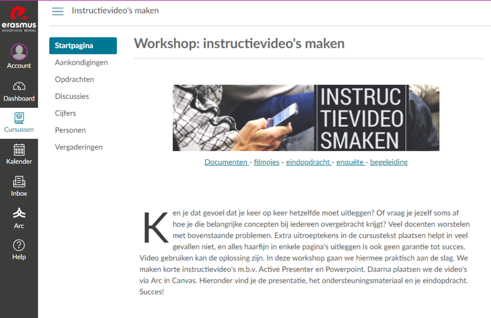
I've created this simple template based on information I read in some other posts.
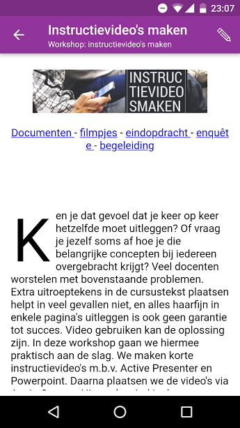
The header image is created with https://www.canva.com/ . I just gave it a width of 80% so it will also look good on a mobile device.
<img width="80%" src="https... />
I added headers to the page (they are below the fold), centered them and added ID's.
<h3 id="doc" style="text-align: center;">Documenten</h3>
The links below the header image do link to these ID's.
<a href="#doc">Documenten </a> - <a href="#film">filmpjes</a> - ...
I added a drop cap to the introduction paragraph.
<span style="font-size: 90px; float: left; line-height: 80px; padding-top: 8px; padding-right: 8px; padding-left: 3px;">K</span>
That's all. It does look good on desktop and mobile. Navigating is quick because it's just scrolling on the same page.
How do you design your front page? Would you recommend this template to a beginner?
Hi Tobe,
This is a great example of a minimalistic homepage for Canvas. Would you be able to list all the page code you used for this template please?
Thanks!
This is the page code. I've highlighted the custom code that I added.
<p style="text-align: center;"><img src="https://ehb.instructure.com/courses/5090/files/123639/download?wrap=1" alt="" width="80%" height="139" data-decorative="true" data-api-endpoint="https://ehb.instructure.com/api/v1/courses/5090/files/123639" data-api-returntype="File" /></p>
<p style="text-align: center;"><a href="#doc">Documenten<span> </span></a>-<span> </span><a href="#film">filmpjes</a><span> </span>-<span> </span><a href="#opd">eindopdracht<span> </span></a>-<span> </span><a href="#enq">enquête<span> </span></a>-<span> </span><a href="#beg">begeleiding</a></p>
<p style="text-align: center;"> </p>
<p><span style="font-size: 90px; float: left; line-height: 80px; padding-top: 8px; padding-right: 8px; padding-left: 3px;">K</span>en je dat gevoel dat je keer op keer hetzelfde moet uitleggen? Of vraag je jezelf soms af hoe je die belangrijke concepten bij iedereen overgebracht krijgt? Veel docenten worstelen met bovenstaande problemen. Extra uitroeptekens in de cursustekst plaatsen helpt in veel gevallen niet, en alles haarfijn in enkele pagina's uitleggen is ook geen garantie tot succes. Video gebruiken kan de oplossing zijn. In deze workshop gaan we hiermee praktisch aan de slag. We maken korte instructievideo's m.b.v. Active Presenter en Powerpoint. Daarna plaatsen we de video's via Arc in Canvas. Hieronder vind je de presentatie, het ondersteuningsmateriaal en je eindopdracht. Succes!</p>
<p> </p>
<p style="text-align: center;"><a name="doc"></a></p>
<h3 style="text-align: center;">Documenten</h3>
<p style="text-align: center;"><a href="https://ehb-my.sharepoint.com/:p:/g/personal/tobe_baeyens_ehb_be/EdI5RrO_a3lLif14zAnw2hkBGmjnkKpP-Xn...">Presentatie (online)</a> <br /><a class="instructure_file_link instructure_scribd_file" title="StudioBinder-Storyboard-Template-6-Frames-Portrait.pdf" href="https://ehb.instructure.com/courses/5090/files/123078/download" data-api-endpoint="https://ehb.instructure.com/api/v1/courses/5090/files/123078" data-api-returntype="File">Storyboard (pdf)</a></p>
<p style="text-align: center;"><a name="film"></a></p>
<h3 style="text-align: center;">Filmpjes</h3>
<p style="text-align: center;"><strong>PowerPoint</strong></p>
<p style="text-align: center;"><a href="https://ehb.instructuremedia.com/embed/37f80e8e-d064-44d7-97c3-2ee75a064c83-3726">PowerPoint presentaties opnemen</a> </p>
<p style="text-align: center;"><strong>Active Presenter</strong></p>
<p style="text-align: center;"><a href="https://ehb.instructuremedia.com/embed/fbeec579-628a-4074-9da0-85daa31b33b0-4245">Instructiefilmpjes maken met Active Presenter</a></p>
<p style="text-align: center;"><a name="opd"></a></p>
<h3 style="text-align: center;">Eindopdracht</h3>
<p style="text-align: center;"><a title="Instructievideo's maken: Eindopdracht" href="https://ehb.instructure.com/courses/5090/assignments/6165" data-api-endpoint="https://ehb.instructure.com/api/v1/courses/5090/assignments/6165" data-api-returntype="Assignment">Instructievideo's maken</a> (resultaat inleveren)</p>
<p style="text-align: center;"><a name="enq"></a></p>
<h3 style="text-align: center;">Enquête</h3>
<p style="text-align: center;"><a href="https://docs.google.com/forms/d/e/1FAIpQLSdiLlNdIZaHUAWd5THp40Oo7hqqzvWkoTjFLXKO2qAtfEaYIg/viewform?...">Wat vond je van de workshop?</a> (anoniem)</p>
<p style="text-align: center;"><a name="beg"></a></p>
<h3 style="text-align: center;">Begeleiding</h3>
<p style="text-align: center;">Nog vragen? Wil je eens aan de slag gaan maar denk je dat je hulp kan gebruiken? Stuur een mailtje naar<span> </span><a href="mailto:tobe.baeyens@ehb.be">tobe.baeyens@ehb.be</a> om een afspraak te maken. </p>
Thanks so much Tobe.
I am really digging this design, and am aligning it with some of the styles we have been using for a "same cup of coffee" approach to our course design.
However, the anchors do not seem to work in the iOS Student app. Testing via web and Android Student app work perfectly. Any idea why that might be?
No. I don't know what the problem is. I guess the web viewer in iOS doesn't support anchor tags in this way.
Thank you for sharing!
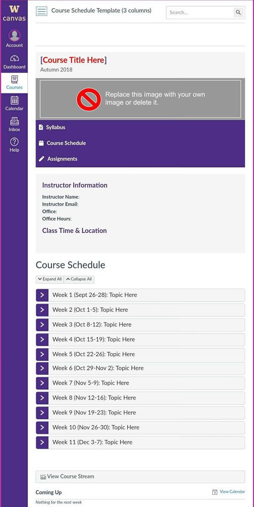
Hello @tobe_baeyens . We just finished a usability study with some of our students to better inform us about the redesign of our templates. Based on their feedback we are just about to release our new templates for use in fall of 2018 (Northern Hemisphere :-)) Students really liked a single page that had all of the information. One of my team members, putrih, has spent hours building out our minimal template. It uses expandable sections that appear to work well on iOS/Safari and Android/Chrome browsers. Unfortunately, we haven't been able to get the javascript to work on the Canvas apps, but the pages degrade quite nicely, but are really long without the expandable sections. The first image below is on my Android phone using Chrome and it just shows the course home page.
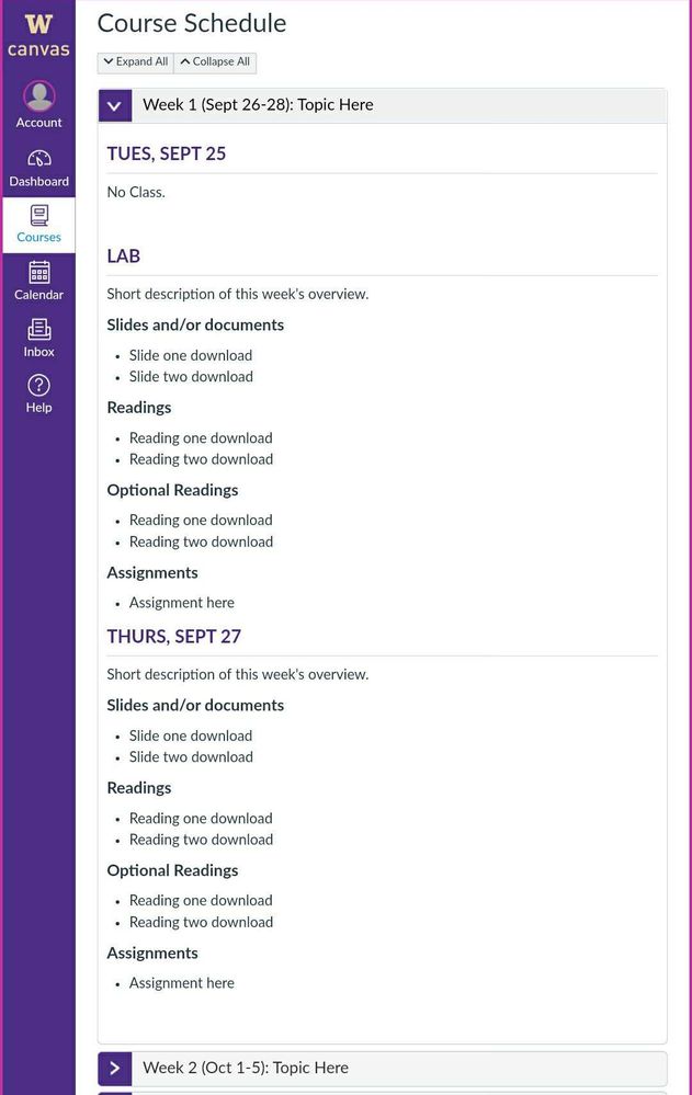
The next image is of the first section expanded:
I have just posted a blog about this over in the Canvas Mobile Users Group. You can find it at: https://community.canvaslms.com/groups/cmug/blog/2018/06/28/templates-responsive-design-for-the-mobi...
Community helpTo interact with Panda Bot, our automated chatbot, you need to sign up or log in:
Sign inTo interact with Panda Bot, our automated chatbot, you need to sign up or log in:
Sign in
This discussion post is outdated and has been archived. Please use the Community question forums and official documentation for the most current and accurate information.