Hi Tracie Bosket,
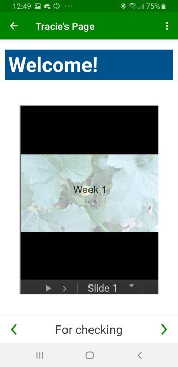
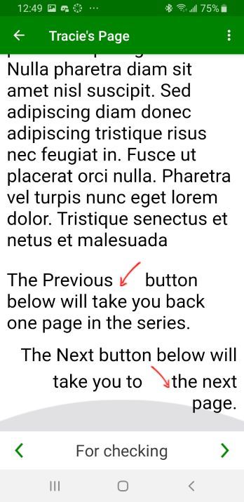
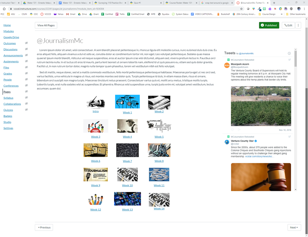
Yes, the tables do affect accessibility! And as you noticed when you looked at the page on mobile, the Previous and Next buttons are displayed differently. Rather than pointing out the buttons, I usually call the buttons by name and indicate that they take one through pages in the module.
I was just looking through Course Evaluation Checklist v2.0 and the section on Accessibility takes one to the WebAIM: Creating Accessible Tables article. You mentioned wanting the table sections stacking in the mobile view, that's how layout tables are also read by a screen reader. Here's another resource about Layout Tables.
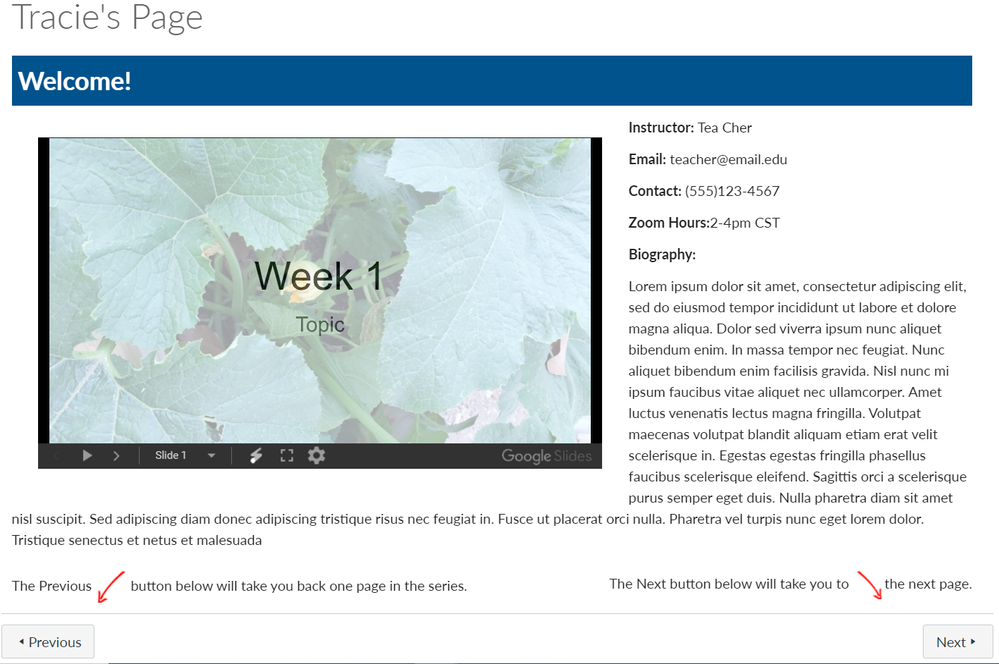
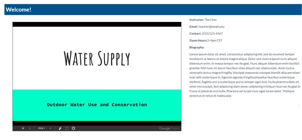
At any rate, I used your code then doctored it up a bit. My screen is not nearly as wide as yours so I took the embed size of the slides down to 640px. You had some extra divs around the slides and bio info so I removed those and put in some responsive styling for the slides section so that it will resize to keep the text at the side on smaller/tablet size screens. I also took out your table at the bottom and made more divs which are set up to stack on mobile screens. (I still recommend taking out that instruction altogether especially if this page is the first in the course or not even in a module.)
Desktop:
Android Mobile - long scrolling because of the text:
And here's your code (line-breaks added for readability):
<h2 style="padding: 7px; background: #01538d; color: white;"><strong>Welcome!
</strong></h2>
<div id="Slides-side" class="col-md-7" style="margin: 30px; float: left;
overflow-x: auto;"><iframe src="https://docs.google.com/presentation/d/e/2PACX-
1vQb2Xd6K003VEFOZqxIhW9rJPqCXtkGxRmnWNAEx--
hKD9HikLKLju6x6i1kFOJA1HSX7reBY5dE7_p/embed?start=false&loop=false&
delayms=3000"
width="640" height="376" allowfullscreen="allowfullscreen"
webkitallowfullscreen="webkitallowfullscreen"
mozallowfullscreen="mozallowfullscreen"></iframe>
</div>
<div id="Instructor-side">
<p><strong>Instructor:</strong> Tea Cher</p>
<p><strong>Email:</strong> teacher@email.edu</p>
<p><strong>Contact:</strong> (555)123-4567</p>
<p><strong>Zoom Hours:</strong>2-4pm CST</p>
<p><strong>Biography:</strong></p>
<p><span style="font-weight: 400;">Lorem ipsum dolor sit amet,
consectetur adipiscing elit, sed do eiusmod tempor incididunt ut labore et
dolore magna aliqua. Dolor sed viverra ipsum nunc aliquet bibendum enim. In
massa tempor nec feugiat. Nunc aliquet bibendum enim facilisis gravida. Nisl
nunc mi ipsum faucibus vitae aliquet nec ullamcorper. Amet luctus venenatis
lectus magna fringilla. Volutpat maecenas volutpat blandit aliquam etiam erat
velit scelerisque in. Egestas egestas fringilla phasellus faucibus scelerisque
eleifend. Sagittis orci a scelerisque purus semper eget duis. Nulla pharetra
diam sit amet nisl suscipit. Sed adipiscing diam donec adipiscing tristique
risus nec feugiat in. Fusce ut placerat orci nulla. Pharetra vel turpis nunc
eget lorem dolor. Tristique senectus et netus et malesuada</span></p>
</div>
<div id="navigationTips" class="grid-row between-md">
<div id="leftside" class="col-lg-6">
<p>The Previous <img src="https://xxx.instructure.com/courses/
400/files/188279/download"
alt="Arrow-BackButton-Red01.png" data-api-
endpoint="https://xxx.instructure.com/api/v1/courses/400/files/188279"
data-api-returntype="File" />button below will take
you back one page in the series.</p>
</div>
<div id="rightside" class="col-lg-6" style="float: right; text-align:
right;">
<p>The Next button below will take you to <img
src="https://xxx.instructure.com/courses/400/files/188278/download"
alt="Arrow-NextButton-Red01.png" data-api-
endpoint="https://xxx.instructure.com/api/v1/courses/400/files/188278"
data-api-returntype="File" />the next page.</p>
</div>
</div>
I, like others in the community, enjoy doing HTML layouts and always looking for creative ways to get content across.
Happy New Year! 
Cheers - Shar









This discussion post is outdated and has been archived. Please use the Community question forums and official documentation for the most current and accurate information.