ID Horror Stories: Put Poor Design to Rest
What’s Included in This Post?
• Research that supports good instructional design
• Tips on how to design your courses to meet the needs of your learners
• Examples of what good instructional design can look like in Canvas!
EEEEKKKK! Have you ever felt like designing a Canvas Course can be daunting? Developing a well-designed course experience can be unnerving as you navigate the spider web of instructional best practices. As flustered as we may feel in course development, we must all consider the amount of cognitive load we are putting on our learners.
In our traditional classrooms, we inherently consider the capacity at which our students retain information. With the recent developments in our educational models, it’s more important than ever to bring these considerations into our online learning environments. According to Sweller’s Theory of Cognitive Load, humans only have a certain amount of working memory, which can overwhelm the brain when too much information is presented. This can cause a person to shut down and ignore the content provided.
Do you feel goosebumps form as you think about designing your course for appropriate cognitive retention? Let’s explore some ideas and lay your fears to rest.
Headings
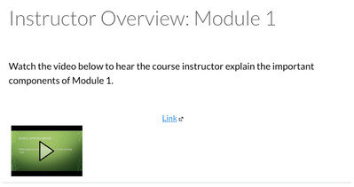
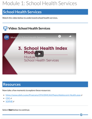
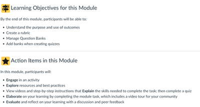
Our courses can sometimes be chilling for learners because they experience a cognitive overload as they process the amount of content on a page. Headings can be a great way to organize your content in a course, without giving your learners nightmares! It’s common to see a teacher’s entire lesson plan on one singular page in a course, rather than chunks of information. In the before and after below, you can see how adding headings makes it easier to process the content on the page.
Before & After
 Before: Headings
 After: Headings
PRO TIP:
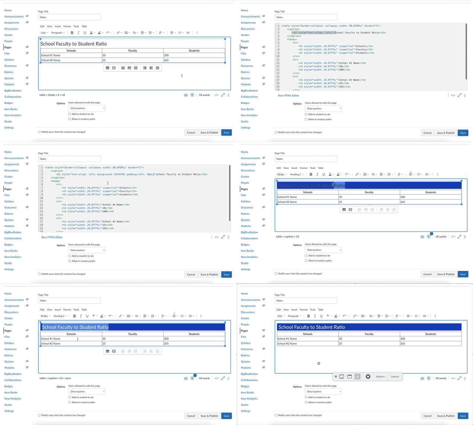
- Use the text styles to format your headings.
- For the headings you see below, we recommend the use of the Heading 2 style.
- Go into the HTML and add the style section to the Heading2 code: <h2 style="color: #ffffff; background: #3278BC; text-align: left; padding-left: 5px;">Heading Here</h2>
Color
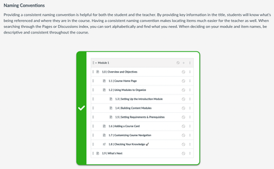
We see that color can sometimes be as blinding to learners as the sunlight is to Dracula. You’ll want to ensure that your color enhances rather than distracts from the value of your content. Similarly, it’s important to remember that color cannot be the only way meaning is conveyed to a learner. In the before and after below, you can see how adjusting color clarifies the cognitive noise on the page.
Before & After
 Before: Color
  After: Color
PRO TIP:
Choose colors that complement one another.
Images
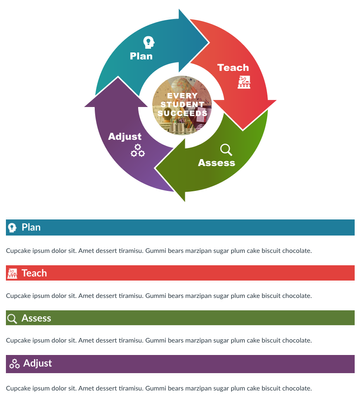
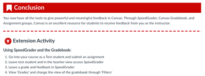
Just as each ingredient of a witch’s brew serves its purpose, so should every element on the page in your course. Images, especially, should be used intentionally; whether as nonlinguistic tools or to enhance the meaning of the lesson’s content. If an image does not add to the value of a specific topic or component of the lesson, your learners may experience the difference between a deadly poison and a love potion. In the examples below, you will notice the designer used an icon to send a visual message to the learner, while also relaying the information through text. In the next example, you can see that the image helps support the information taught on the page.
Examples
 Example: Icons
 Example: Image with Information
PRO TIP:
Images may need alt text to describe what is shown in them if they bring context to the page. Use the W3 An alt Decision Tree to help you decide if you need to add alt text to your image or if you should set your image as “decorative.”
Lists
The post-trick-or-treat-bucket-dump is just one example of what our learners feel when looking at a content page with little organizational structure (except, maybe, without the drool). Naturally, we search for bullets and visual hierarchy to help lead our brains into processing the information. Lists help to reduce cognitive load by organizing content in a manner that is approachable and simplified for learners. Take a look at how we use lists in the examples below.
Examples
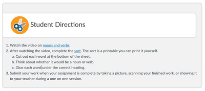
 Example: Unordered List
 Example: Ordered List
PRO TIP: To make an accessible list, use the list feature in the Canvas RCE. Keep in mind the difference between ordered and unordered lists. Ordered lists are meant for procedural instructions, indicated by a numerical or alphabetical bullet. Unordered lists are meant to provide information without sequence.
Overall Course Tips
To get to the skin and bones of good course design, you can easily implement these quick strategies and give your course new life for your learners.
Final Thoughts
Now that we’ve unraveled the web of cognitive load in course design, you are ready to brew the most powerful course that would keep even the Boogeyman away. So, carve those pumpkins, park your brooms at the door, and invite all your ghoul-friends over because it’s time to celebrate boo-tiful course design!
Please comment below. We’d love to hear from you!
Our Instructional Design team offers templates, consultation, badging services, course evaluations, workshops, and more. If you would like to learn more about our services, please contact your CSM or @rosina_marie, Manager, Learning Services, via rmonteiro@instructure.com
