Improve Threaded Discussions with CSS

ephraimross1
Community Contributor
28
10216

I was asked to share this little code-snippet I developed to improve the threaded discussions on Canvas (thanks  @Chris_Hofer ). You may have noticed that Canvas' current threaded discussions aren't actually very threaded. But, that's ok, because Canvas also makes it surprisingly easy to fix the situation with some simple edits to the global CSS.

Let's dive right in and give you some code to play with. I'll show you two different models, and you can play from there.

Approach One

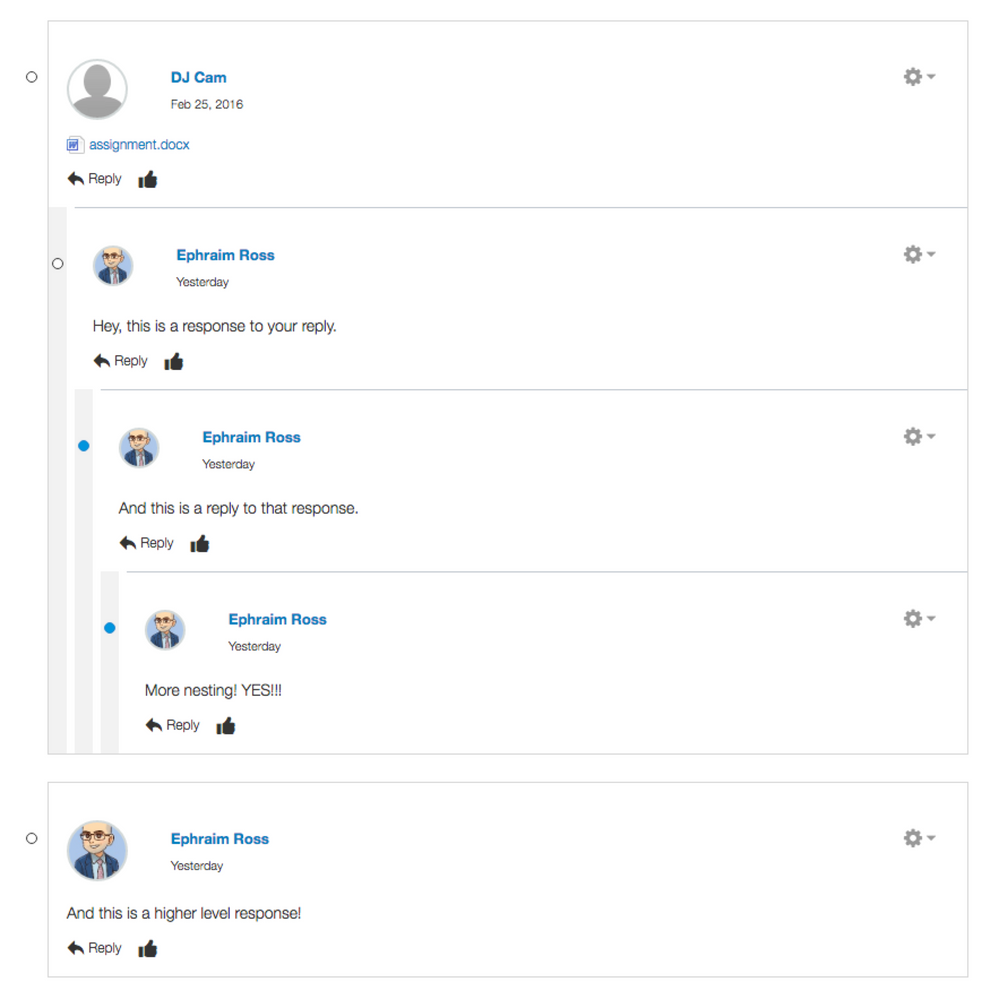
If you add the following, you should get a proper visual 'threaded' cue (see below):

.replies {

padding-left: 7px;

border-left: solid #f2f2f2 16px;

}

.discussion-read-state-btn {

  top: 32px;

}

div.entry-content {

  padding-left:0px !important;

}

Topic_ PEL Discussion-1.png

Approach Two

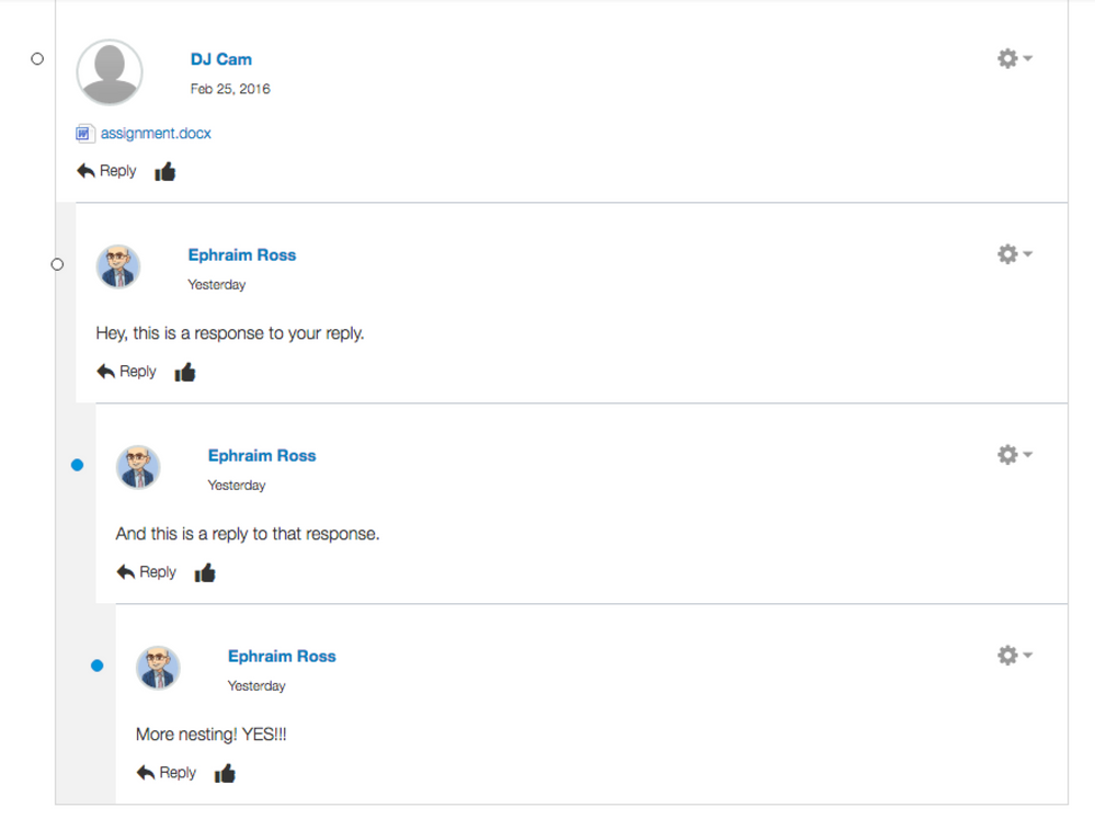
I personally prefer this next example in many ways. In the example above, I like that the read/unread radial indicator toggle is centered visually on the grey bars. That is not the case in the following example (although I suspect with some further tinkering with the css you could make this work).

.replies {

padding-left: 0px;

border-left: solid #f2f2f2 16px;

}

.discussion-read-state-btn {

    top: 32px;

}

div.entry-content {

  padding-left:0px !important;

}

Topic_ PEL Discussion-2.png

These were created pretty quickly this morning, but they're pretty easy to play around with (you can change the colors, width, padding, etc.). Note that lines 10-12 are important, however, and that without them your threads will quickly get too indented as Canvas injects a padding of 30 pixels into each successive layer of response.

If you create any fun variations please share, I'd love to see what you're using at your institution -- especially if you find any good improvements. Cheers.

28 Comments
Stef_retired
Instructure Alumni
Instructure Alumni

 @ephraimross1 ​, thank you for sharing this valuable--and most welcome--enhancement to the discussions UI! I've shared your blog post with the Canvas Admins​ and Canvas Developers​ groups, as the members of those groups work frequently with adding custom code to the global CSS.

MattHanes
Community Champion

This is excellent! To center the read/unread buttons in your second example, you can just change the .discussion-read-state-btn {} part of your code to add left:-25px !important; so it would look like this:

.discussion-read-state-btn {

    top: 32px;

    left:-25px !important;

}

That worked for me in Chrome. I haven't tried the other browsers yet.

cfranklin
Community Explorer

Where do you add this code?   Thank you!

Cynthia Franklin

Chris_Hofer
Community Coach
Community Coach

You can add it to your global CSS file if you are an Admin for your school's Canvas instance.

Chris_Hofer
Community Coach
Community Coach

Looks good in both Firefox 44.0.2 and Chrome 50,  @MattHanes ​.

MattHanes
Community Champion

This looks really good!

threaded2.jpg

Jeff_F
Community Coach
Community Coach

Eternal gratitude! 

We are testing and so far our evaluation team hasn't been able to break it.  As you can see we went with light grey and a space to create a visual separation.

greybar.jpg

ps.  bored with the customary text generator?  Try... Bacon Ipsum - A Meatier Lorem Ipsum Generator

ephraimross1
Community Contributor
Author

Haha, Bacon Ipsum, I love it. When you really need some text fat that sizzles. And glad the threaded CSS is working out! We're using the same style currently on ours Smiley Happy

ephraimross1
Community Contributor
Author

I almost went with a similar color to the one you're using here. I couldn't decide if it was distracting to not, so I just went with the light gray in the meantime. Curious to see whether you still like it after a few months and maybe I'll reconsider that little pop of color  Smiley Happy

MattHanes
Community Champion

Well I'm the only one in my school district that knows how to edit it so they are just going to have to suffer my design decisions :smileydevil:

ephraimross1
Community Contributor
Author

So much power! haha

ephraimross1
Community Contributor
Author

"No... the color isn't customizable."

alexander_kark1
Community Novice

Thanks a bunch! I rolled the change out to our instance yesterday. I went with a darker shade of grey.

AmalShah
Community Participant

Hello:

New Canvas user/admin here. I want to add this code, but I don't see a way to access the Global CSS? I can upload custom CSS using the theme editor, but that does not work. I realize this thread is over 2 years old so...is this still working for anyone?

Thanks!

robotcars
Community Champion

I just found this cool thing cause you raised a dead thread. :smileygrin:

Testing and it seems to work. I am going to bring this up for inclusion with our team.

You are correct that you would be adding this to the Uploaded CSS file in the the Theme Editor.

How do I create a theme for an account using the Theme Editor?

Often referred to as Global CSS/JavaScript.

You said it's not working?

AmalShah
Community Participant

Hi Robert:

Glad you found this! Smiley Happy 

If it's working for you then I must definitely be missing something. I am copy/pasting this code into Notepad and saving it as a .css file. I then upload this file through the theme editor, hit preview, save, and apply. I go into a discussion forum in one of the classes and don't see any changes. I'm trying this out on our test server before trying it out on our live/production server.

You mentioned I would be adding this to an uploaded CSS file in the Theme Editor. I didn't see any CSS files already uploaded into the theme editor....the fields for the JS and CSS files were empty.

robotcars
Community Champion

Make sure the discussion your testing on is 'threaded'.

AmalShah
Community Participant

THAT worked! You sir, are a hero. Thanks so much!

robotcars
Community Champion

Nifty! You helped us too, by rediscovering this gem of an idea!

I've shown a few teachers here these changes and they like it. I'll probably add this to production after some tinkering next week.

AmalShah
Community Participant

Sounds good...I think we will do the same before going live. The whole reason I was even looking for something like this was because some of our instructors were having trouble discerning the replies and replies-to-replies in their discussions...especially when their students really engaged with what was being discussed and the number of posts increased.

robotcars
Community Champion

Yep. I'm really surprised this isn't a default. I'm working from a few directions to improve discussion engagement, so showing the hierarchy of the thread replies seems important for students to keep track of what's going on.

canvas18
Community Member

We found this post about a year ago when we first started testing Canvas.  It received really great reviews in our A/B test courses. 

I absolutely agree that discussions need to be improved, so any other ideas would be greatly appreciated.

Sylvia_Ami
Community Contributor

Just wondering how this customization is working for people.  @ephraimross1  @MattHanes ‌,  @Jeff_F ‌, and  @AmalShah ‌ are you still using this? Have you had to make any modifications due to new releases/code changes? Do you still like the format? Is there anything else you wish you'd customize?

Jeff_F
Community Coach
Community Coach

 @Sylvia_Ami ‌ - we deployed the second approach using a light shade of grey and have had no problems with the modification.   Perhaps worthy of a note, we are rather selective in implementing such customization so as to not incur unnecessary maintenance overhead.  But even if there were a little overhead, it would be worth it in this case as we felt the visual separation is necessary.

AmalShah
Community Participant

Hi  @Sylvia_Ami ‌,

We went with the 1st approach and have been using it successfully without any interruption or issues (re: nothing broke with routine updates/maintenance). Overall, we're happy with the way the code differentiates initial postings from replies and don't feel the need to customize it further (at this time). 

MattHanes
Community Champion

I'm still loving it and haven't had to change the code at all since we implemented it. 

Sylvia_Ami
Community Contributor

Thank you so much  @Jeff_F ‌,  @AmalShah ‌, and  @MattHanes ‌. Your information is very helpful. I know that improving the layout for Discussions is way down on the Road Map for Instructure so I am considering moving ahead on my own and using this suggested customization. It's good to know that this is still working for you and has minimal maintenance after over two years.

I think it's amazing that I can post in the Canvas LMS Community‌ and get such quick and valuable responses. Thank you everyone!

Jeff_F
Community Coach
Community Coach

@ephraimross1 , @MattHanes  - I am curious what your approach for this is for the discussion redesign. We are looking at implementing this CSS below which is shared by @cesbrandt on this page here:

https://community.canvaslms.com/t5/Discussions-Announcements/Not-happy-with-Discussion-Redesign/m-p/... 

---

[data-testid="discussion-root-entry-container"] [data-testid="notHighlighted"] > * > [class*="css-"][class*="-view--flex-flex"]:first-of-type > [class*="css-"][class*="-view-flexItem"]:first-of-type:has([class*="css-"][class*="-view-flexItem"]),
[data-testid="discussions-split-screen-view-content"] [data-testid="notHighlighted"] > [class*="css-"][class*="-view--flex-flex"]:first-of-type > [class*="css-"][class*="-view-flexItem"]:first-of-type:has([class*="css-"][class*="-view-flexItem"]) {
border: 1px solid #c7cdd1;
border-radius: .25rem;
padding-top: .75rem;
}


Perhaps of note, we are not seeing the same indents depicted in the shared image posted on the above linked thread.  Ours stop at the depth of 3 as shown below.

---------

discussion-redesign-with-CSS-border.jpg