jlewenstein
Community Member

On my Canvas dashboard, my course "logo" looks faded. How do I restore its clarity?

Hola Canvas,

First of all, thank you for your support.  You guys are great.

I begin a new semester this coming week.

I have a great Canvas curriculum planned.

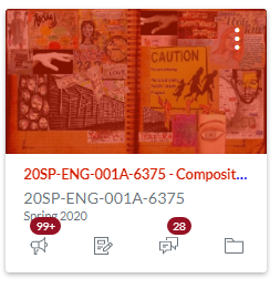
But, when I look at my dashboard, my course "logo" looks faded.

This is happened before; however,   I can't remember how to restore the clarity and the color.

Below, I provide a SNIP of how one logo appears on my dashboard.

Underneath, I provide a copy of the original. 

Do you have any suggestions? 

Please let me know.

Paz,

JL

336326_Canvas Dashboard - faded image - English 1a.PNG

336327_canvas dashboard - tortilla curtain banner.jpg

0 Kudos
4 Replies
ddaniels
Community Novice

Hey, Jay -

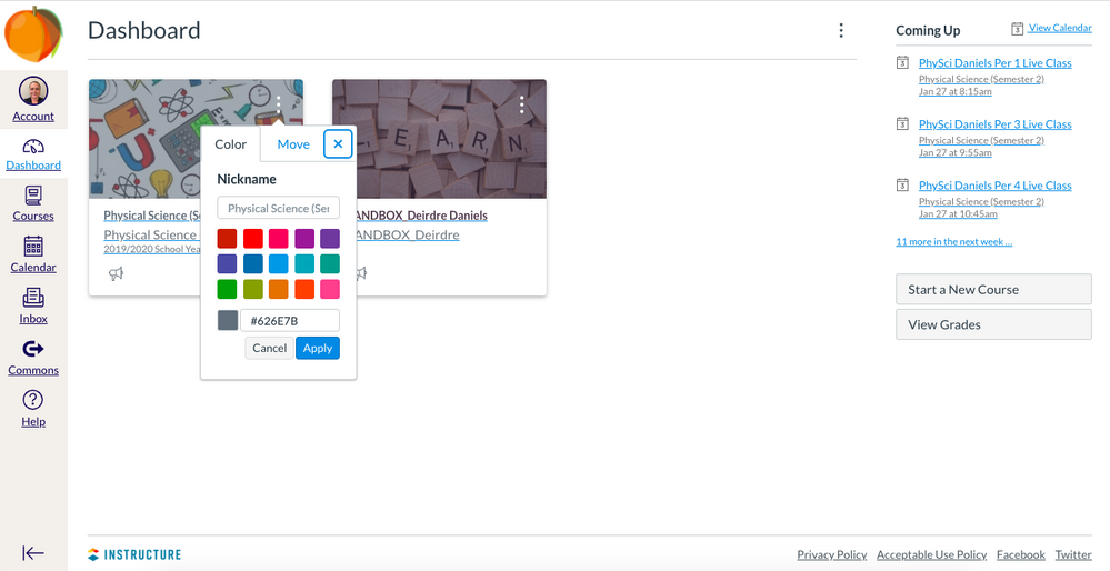
It's a cover overlay that is set up on the main page. You can click the three vertical dots to change that overlay! Hope that helps!

336329_pastedImage_1.png

0 Kudos

Wow! Thank you for your response.

I found the three dots, but I'm not confident in what to do next.

Here is what I found:

Do I need to look up an appropriate code to enter into the box? What color do I choose to produce more clarity.

Please let me know. Thank you for all you do!

Paz,

JL

0 Kudos

Sooooo...you're going to have to choose a color. #f0f0f0 can make a pretty solid color, but it still will appear less clear. Or try #FEFDFD. You can also look up different HTML codes to use here: https://htmlcolorcodes.com/.

In all, my suggestion would be #embracethecolor! 

Stef_retired
Instructure Alumni
Instructure Alumni

 @jlewenstein ‌, you can also remove the color overlay from all of the cards on your dashboard by following the instructions in the View Color Overlay section of https://community.canvaslms.com/docs/DOC-12880-4152719653  This setting will only affect your view of the course cards; other people enrolled in the course would still choose a color for the card or disable the overlay at their discretion.

0 Kudos