Upcoming Canvas Changes
Feature Option Enforcement: January 18
On January 18, 2020, the following feature options will be enabled for all institutions:
For more information, please see Upcoming Canvas Changes.
In this Canvas release (September 21), the navigation menus have been updated for improved accessibility. Noted updates have also been included for APIs and Live Events.
Feature Options
External Tools (LTI)
Release notes describe upcoming Canvas functionality and are subject to change.
|
Feature OptionsThe following feature options are addressed in this release:
|
Updated Features |
This feature is used in conjunction with an existing feature option in Canvas. Please view the content below for additional details. For more information about feature options, please see the Canvas Release Notes FAQ.
Location to Enable Feature | New Gradebook |
Configuration Details | |
Affected Canvas Areas | New Gradebook, SpeedGrader |
Affects User Interface | Yes |
Affected User Roles | Instructors |
Feature Enhancement Ideas | |
Specified Tag for Feature Ideas | gradebook_new |
Summary
SpeedGrader can be filtered by student group via an option in course settings. When this feature is enabled, SpeedGrader will only load submissions from a selected group when the submission is accessed via the New Gradebook or the assignment details page. Note this feature is currently not supported when a submission is accessed from the Dashboard, or a discussion or quiz details page (old quizzes).
Change Benefit
This feature is designed for large courses and helps manage submissions for an instructor or TA. Filtering submissions by student group also improves SpeedGrader loading times more efficiently than filtering submissions by section.
Affected User Roles
Instructors
The Course Settings page displays an option for large courses to require viewing SpeedGrader by student group.
When this setting is enabled for the course, SpeedGrader requires a student group to be selected in the Gradebook filter before submissions can be viewed. The SpeedGrader link is grayed out until a student group has been set.
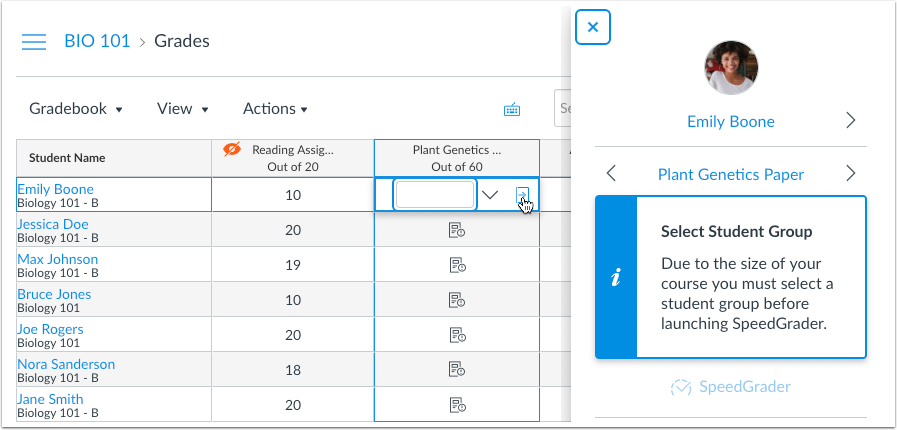
The Student Groups menu displays all groups that exist in the course. If no groups exist, groups can be created in the course People page.
Note: Selecting a student group does not apply to group assignments unless the assignment requires students to be graded individually.
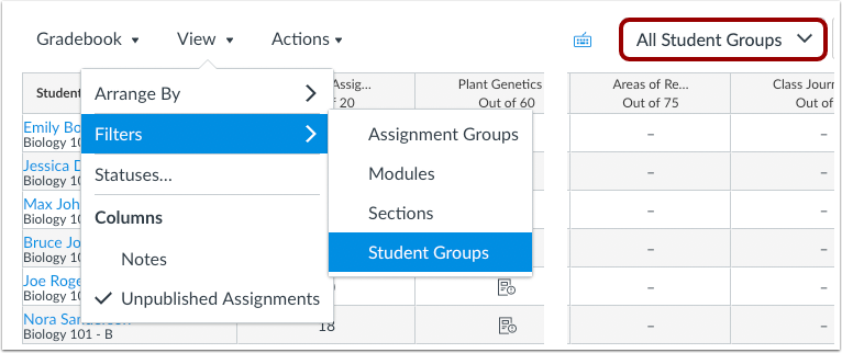
The assignment page also allows a group to be selected. Once selected, the SpeedGrader link is no longer grayed out.
Notes:
This feature is used in conjunction with an external tool (LTI) in Canvas. Please view the content below for additional details. For more information about LTI tools, please see the Canvas Release Notes FAQ.
Location to Enable Feature | Assignments |
Configuration Details | |
Affected Canvas Areas | Assignments |
Beta Environment Support | Yes |
Affects User Interface | Yes |
Affected User Roles | Instructors |
Feature Enhancement Ideas | |
Specified Tag for Feature Ideas | New quizzes |
Feature Idea Contributions |
Summary
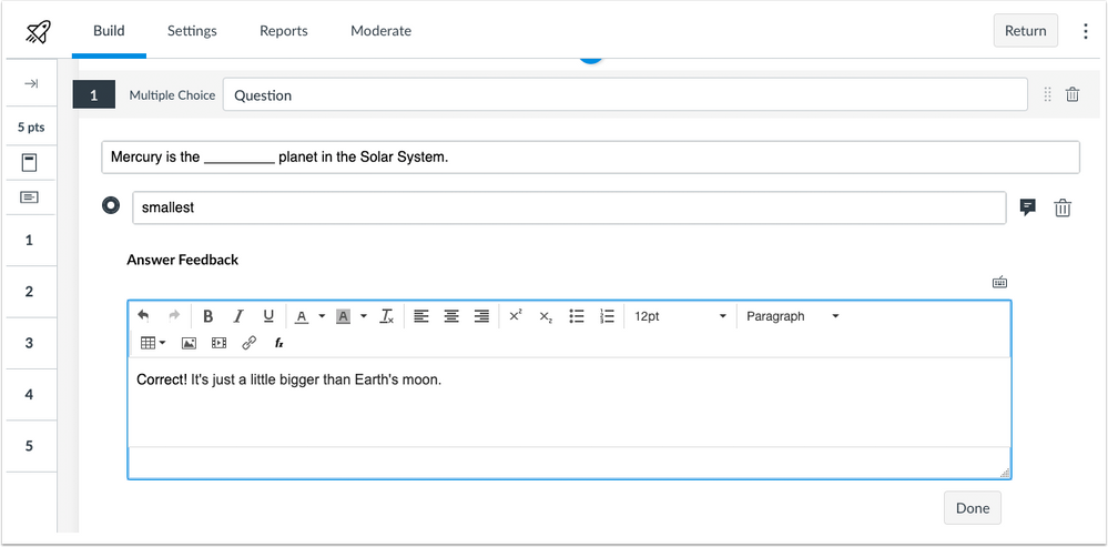
Multiple Choice Questions support individual feedback for each answer.
Change Benefit
This change allows students to receive specific feedback relating to each individual answer choice.
Affected User Roles
Instructors
When creating a multiple choice question, instructors can click the comment box next to each answer in the quiz question. Feedback can be entered directly in the text field.
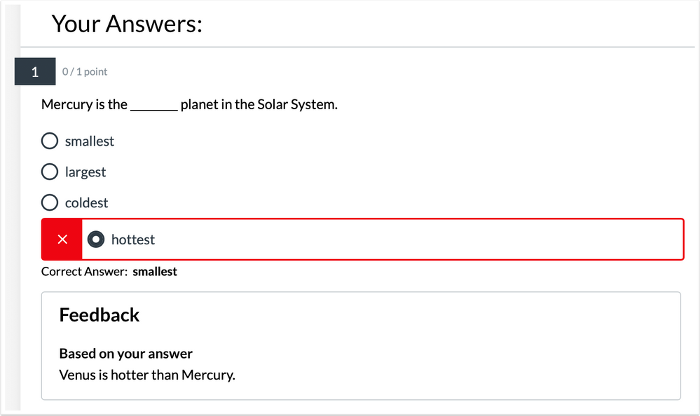
If students are allowed to view their quiz results, students can view the custom feedback for each of their answers.
Other Updates |
Feature Availability | Delayed until 2019-10-19 release |
---|---|
Location to Enable Feature | N/A |
Configuration Details | N/A |
Affected Canvas Areas | Admin, Course, User Navigation Menus |
Beta/Test Environment Support | Yes |
Affects User Interface | Yes |
Affected User Roles | All Users |
Feature Enhancement Ideas | |
Specified Tag for Feature Ideas | navigation |
Summary
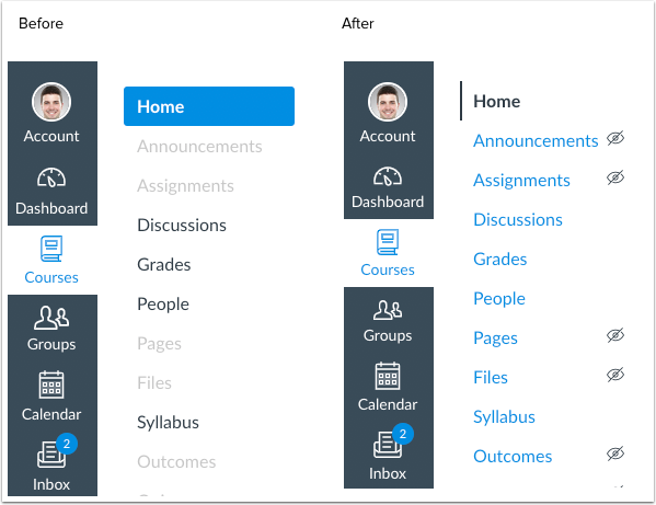
The Admin, Course, and User Navigation Menus have been updated to include color and visual indicators to define active menu items. Additionally, the Course Navigation Menu includes tooltip indicators to clarify inactive menu items. No functionality has been affected.
Change Benefit
This change helps improve accessibility in Canvas. Previously the inactive links displayed in light gray text with a light border, which did not fulfill contrast ratios. Additionally, active and inactive links only relied on color to convey information.
Affected User Roles
All Users
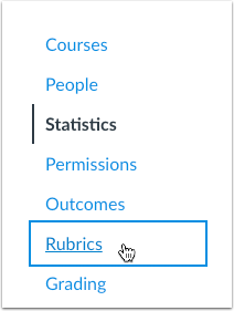
When a user accesses a supported menu, all inactive links are displayed in the account’s primary color. The active link is displayed in black and includes a vertical line. The hover state for a link includes an underline by default (when high contrast mode is not already enabled). When selected, the link displays a focus state with a 2px border.
Instructors & Admins
Default links that are not visible to students display the hidden visibility icon.
Note: No existing functionality has been affected with this change. Third party LTI tools are not included in the course sidebar unless they are visible in the course.
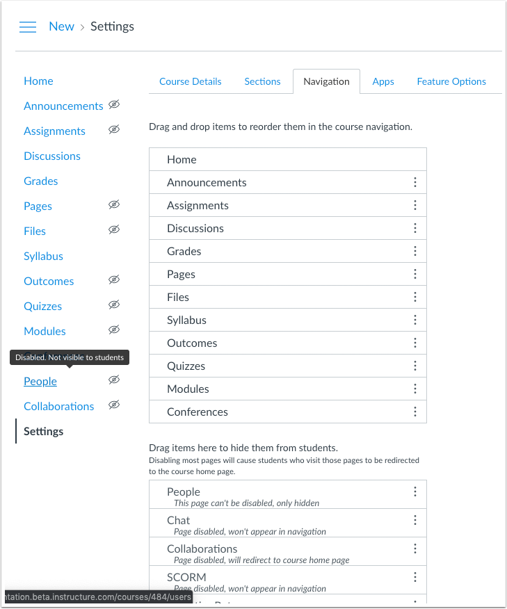
Pages are not visible to a student in one of two cases: a page contains no content, or a page is hidden via the Navigation tab in Course Settings. Tooltip content clarifies the hidden state appropriately.
Platform/Integration |
Adjustments have been made to the following APIs as noted in the API Documentation change log:
For users of Live Events, previous behavior of supporting all events has been deprecated. All events are being compressed to allow for smaller payloads. All data elements with null values will be omitted from events payloads.
Per API guidelines, this change provides a transition period for users to adjust custom applications in the production environment. However, this functionality will not be available in the beta environment. Existing functionality will be removed in the December 21 release and all events will be compressed by default.
For additional details about live events, please see Live Events: Event Type by Format.
Date | |
---|---|
2019-09-11 | Changed—Other Updates
|
2019-08-26 | Release Notes Published |
Hi, Ian,
We appreciate your feedback. The sidebar change isn't quite as monumental as Post Policies, though we have learned a thing or two from that experience!
Comments in the community are just one aspect of feedback that is passed on to our product team—in most cases a feature won't be pulled back unless our teams specifically receive feedback about functionality or other workflow impediments. In the case of the navigation menu, this change solves accessibility concerns that have existed for a long time, and I confirmed with our designer that extensive user testing was conducted to review various options and icons as part of the feature iteration. As you've noted, the eye icon is conflicting with behaviors in Post Policies, and the Post Policy icons are still being reviewed and refined to create a better user experience. The icon alone represents an item hidden in Canvas.
We recognize that some changes are a matter of preference, as have been widely discussed here. As with all features, our teams monitor how features are adapted in Canvas. Our teams are most interested in feedback when based on actual interaction with users in the production environment.
You're welcome to learn more about the feature idea process in What is the feature development process for Canvas? Our teams are also happy to consider feature enhancement ideas in the Ideas space, which is also part of the product process: How does the feature idea process work in the Canvas Community?
Thanks!
Erin
The icon alone might identify a hidden item in Canvas, but it doesn't sound like it will apply to every hidden item, as noted by @lezonl2 above. The inconsistency of its presence, when LTI navigation items are present in the menu will be confusing to users. I'll reiterate what Lisa had to say, as it is true for us as well -- "our faculty don't know the difference between a native Canvas navigation menu item and an LTI."
Could you shed some light on the "extensive testing process"? I'm not being cynical, I really want to know. Is this being tested with people who are new to Canvas? There seems to be a disconnect between the people designing Canvas, the people teaching Canvas, and the people learning Canvas. I suspect the issue is that it is being tested by experts.
Part of the process of learning a system is learning what to ignore. The current convention of a lighter text color for unused links is brilliant for this reason. It helps instructors know what is important. After the change a default course menu goes from 5 words (and 5 grey ones) to 10 words and 5 icons. There is already a high contrast UI in profile settings and I don't understand why the change is not being linked to that. Linda Macaulay posted an awesome menu style with a less light grey and asterisk to connote visibility. There are definitely other ways to achieve your accessibility requirements and there's no indication they are being considered at this point.
The Post Policy UI needs to be fixed before introducing another confusing change.
Hi, Ian,
Testing is usually done with a variety of audiences depending on the impacted user role—current instructors, students, admins. Usability testing isn't about finding experts who already know Canvas, but it's about seeing if a change is intuitive to an average user who uses the system. UX design and usability testing are key components in software development. Please reference the previous link I posted regarding the development process. If you'd be interested in learning more what happens behind the scenes and would like to join one of our design team members the next time they perform user testing, or if you would like to be part of our product team's research and user interviews, please let me know and I'd be happy to put one of them in contact with you.
Accessibility is also a mandatory requirement for Canvas features, and to maintain quality for all users, Canvas is committed to W3C's Web Accessibility Initiative. More information can be found in Accessibility within Canvas. As noted in the release notes, a feature cannot always rely on color only with accessibility concerns, which is why an icon is required. I'd also be happy to put you in contact with one of our accessibility experts if you would like to know more about that topic. (They're extremely passionate about what they do and love talking about accessibility!)
Thanks,
Erin
Our team is testing out the "Launch Speed Grader filtered by student group" and we have noticed that the option is not available in every course. Is their a reason why this feature would not be available in some courses?
Hi, Tyler,
I'm not able to answer that question adequately as there could be several reasons. Is the course active? Is the checkbox enabled in Course Settings? If the checkbox isn't showing at all, please file a case with Canvas support so they can investigate.
Thanks,
Erin
Hi erinhallmark,
I would be really interested in participating in Canvas's research and user interviews. Can you put my name forward?
Thanks
Bethan
I have found yet another place where the eyeball icon is used in an inconsistent way: the Announcements tool. See below for a screenshot from our beta environment. Please don't do this. September 21st is coming up.
That eyeball icon is also used on the discussion topic pages as well.
Hi Erin,
It looks the issue has been resolved. I will continue to monitor the issue in case it returns.
Hi there, I've been playing around with the large course feature and have noticed some inconsistencies. For the same course, I was sometimes getting prompted to switch on large courses, and other times I was not. It didn't seem to matter whether I accessed speedgrader from the home page or gradebook. Sometimes I'd be prompted, sometimes not. What is forcing that prompt to appear, or not? Also once I did get the large course prompt, and did switch it on in settings, the very next time I loaded speedgrader (from homepage), I was shown that prompt again, I followed the prompt to settings, and noticed the box was already checked.
Also, my institution is very much tied to using sections. Having to set up another set of 'groups' to increase speedgrader load time is an additional step, and can be especially time consuming for large courses. Is there already a plan for better performance of speedgrader when using sections? I'm new to this discussion so sorry if this has come up in previous feature releases.
Kirsten.
Hi, Kirsten,
Would you please DM me with a link to a course where you aren't consistently seeing the prompt?
To answer your question about SpeedGrader, our team has a planned project to overhaul SpeedGrader and create additional improvements there.
Thanks,
Erin
I saw that this morning but now I'm not seeing the information on the Course menu change anymore... where did it go?
Removed from the 09-21 update! Pushed to next month, hopefully with no eyeball icon.
I think I am not understanding how the Speedgrader / Groups is supposed to work, or it is also not working for me. At no point that I found am I being prompted to turn on Large Courses; I didn't see anything in the description that would lead me to expect it. This is what I did find:
If I have turned on the option to launch Speedgrader Filtered by Student Groups and
Is that expected behavior? That I only have the option to filter if I enter Speedgrader by why of Gradebook? And once I'm in Speedgrader, I cannot see what group I'm looking at? and I cannot change the group from within Speedgrader?
If that is expected behavior, I have to say, it will meet the need of very few of my users. I'm hoping it only the first iteration of this functionality.
Hey, Kirsten,
Thanks for helping me see what's going on here. Looks like we don't have the Dashboard links verifying against the group status. I'll investigate with the team tomorrow.
Thanks!
Erin
Hi, Valerie,
In re-reading your post (and also after looking at Kirsten's case), the information that you've noted is expected. The assignments page does the filtering for you; it won't let you advance to SpeedGrader until you have selected the group that should be loaded in SpeedGrader. This step is what helps SpeedGrader load more quickly, as filtering directly in SpeedGrader would require SpeedGrader to filter through all users in the course before displaying the group as intended. So fi you're able to click the SpeedGrader link in Assignments, you have the group selected already. And the group will already be selected after you've set it in one assignment. (Once you've set it in one assignment, the same group populates for all other assignments unless you change it.)
Again, our team has a future project to continue to improve behaviors within SpeedGrader. If you're interested in following this project, please see Canvas Studio: Speedgrader 2.0. You're also welcome to browse the existing SpeedGrader ideas and add your votes and use cases to any that seem relevant to you so that our product team is aware of what would best assist your users.
Thanks!
Erin
Erin,
In my sample course of 534 students and 35 groups (rigged to experiment with this feature), I have the box to open Speedgrader with Student Group checked. I have not selected a group in the Gradebook area. I go directly to Assignments. I click on an assignment and then Speedgrader. After Speedgrader loads for awhile, I have access to all 534 students. At no point am I prevented from going forward or told to select a group when I follow this path.
Is that expected behavior? To take advantage of this feature, must people start in the Gradebook?
Valerie
Hello,
I see that the release notes change log reflects that the “Navigation: Menu Visibility” update is being delayed until October. As reasons mentioned in my earlier comments, I am happy this update is being postponed due to some perceived confusion it may create for our faculty. THANK YOU FOR WAITING ON THIS UPDATE!
Since this functionality has been postponed, it is now confusing that we have so many comments that reference an update that we no longer have context for. Since we now only have one set of release notes, is there a way to see the previous version (I tried clicking the version number) or a way to note the change differently?
Thanks,
Lisa
Hi erinhallmark - this message is appearing in production?
I'll raise a support ticket now
Hi, Jayde,
I see this behavior has been noted as a case for the team to triage. Submit a case if you'd like to have it associated with the engineering ticket so you can receive updates on its progress.
Thanks!
Erin
Hi, Lisa,
I've always pulled the feature that has been postponed and nobody's ever commented on that, so if you're finding no reference to that feature is a distraction, I'll definitely revise how we manage these situations. Give me a bit and I'll put it back in. (The previous version link is a problem with our community provider who has not prioritized that fix.)
Thanks!
Erin
ditto
I've got to agree with this one. The behaviour for LTI's is different and even more noticable now than to regular nav items, this + the different meaning to the icon in the grade book is not ideal
erinhallmark —
Thanks for being responsive to the comments here.
Might you be able to share additional info or otherwise connect me to someone who can shed some light on the basis/rationale for these design decisions? While community feedback and UX are indeed important considerations, many in the learning sciences (and other fields!) have been doing some fascinating research that underpins related design principles and other evidence-based constructs. Are the design teams operationalizing evidence-based design principles and research findings from a particular field or guide? operating on heuristics? something else? Any additional information you can provide would be great context, in general, and might also be a meaningful contribution to these discussions — at least insofar as it has the potential to shift the conversation away from preference as a driver (as expressed here, as well as in A/B user testing) toward evidence-based design and development of learning environments.
More specifically, I've been tuned in to the discussions about the forthcoming changes to the course navigation. fwiw, I'd like to chime in with some words from Jef Raskin's book The Humane Interface: "Surprisingly, icons violate the principle of visibility. It is their meanings that are not visible. Use icons only in the few situations where research has shown them to be advantageous" (p. 173-174). (You can view part of the section on Icons in Google Books; alas the pages I'm quoting from aren't available there.)
As @Linkletter noted in this thread, let's at least be sure that icons are used consistently throughout the LMS (i.e., that it has the same meaning regardless of the tool or page or user or...).
All my best,
Ofelia
Thanks, Erin! Maybe it is just the change to having one set of release notes now that is throwing me off.
Hi, Valerie,
I am guessing that you are accessing quizzes from the assignments page, which I found out currently doesn't support the large course functionality. Our team created the initial entry points for assignments (sans quizzes and discussions), and they will be adding that functionality in a future release. However, the Gradebook will always provide the filtering option by group. I've also clarified this information in the release notes as well.
Thanks!
Erin
Sorry, but those navigation menu changes do not look good. Was that vetted through a UX/UI team? What's the point of changing from the active blue bar? And the eyeballs are horrid. (Actually, a bit on the creepy side if you ask me.) I recall a discussion when I participated in Khaki about engineering time required for features. This seems like a misdirection of time and energy to me. My 2c
I was, in fact, entering from the Assignments details page, but I was not looking at a quiz. I was looking at a file-upload assignment. I chose this class to experiment on specifically because she has had issues with Speedgrader for this assignment (where she has students submit multiple files). I appreciate the amendment to the notes, but I think there is still an issue. Or at least, I'm was still having an issue. I haven't checked recently.
erinhallmark — Where is the best place to comment further on the upcoming changes to navigation and visibility settings?
Hi, Ofelia,
Since these suggestions change the existing feature, they'd be a feature enhancement, which we keep track of in the Ideas space. You'll probably need to submit a new idea; copying all of this over to that space would be helpful for our product team to gauge the feedback of other users related to this idea as well.
Thanks!
Erin
Thanks erinhallmark
Re-posted in Ideas: Consistent & clear indication of tool status/visibility
Hi there, may I offer one more observation at this very late stage regarding 'Launch SpeedGrader Filtered by Student Group'? When I do get to Speedgrader, and the prompt arrives to switch on large courses in settings, the next screen that appears is the external apps page, not the course details page, as I would expect. Is that just me? Or do others have the same experience?
Kirsten.
The menu hide/show eyeballs and the whole gradebook hide/show eyeball fiasco -- who is asking for these changes? Not my faculty! We want consistency. Especially right now at the beginning of the school year. We switched from Bb a year ago, and faculty love Canvas, but not sure what has been happening this last couple months with these changes. They are confusing and disruptive.
We do want the ability to hide announcements. but that is not forthcoming? Are they working on changes that are requested and voted on by the community or not?
kburkes "We do want the ability to hide announcements"
THIS!!!!! I've been asking for this for YEARS. Not a drastic request. So amazingly common sensical it pains me to keep bringing it up once a year. Instead we get the Eye of Sauron. Make that Eyes of Sauron.
Hello,
The drop down for term in the courses area looks worse with this change because it's too narrow. Can it be widened or fixed in some other way?
New Format:
Old Format:
Creepy is the perfect word to describe them. Tech companies do not need to remind us that we are being watched.
I have a comment about the selection of a group on the Assignment page, in the situation that you don't have the 'Filter by group' activated in Grades (meaning: 'Student groups' is not selected under View > Filters). The following happens: if a group has been selected on the Assignment page, and you go to the Gradebook afterwards, the selection gets removed (if you go back to the Assignment page, no group is selected anymore). Should the selection of a group on the assignment page not lead to the activation of the 'Filter by Student groups' in the Gradebook?
Now there is the situation that filtering by group in the Gradebook does lead to 'filtering by group' on the Assignment page, but not the other way around. That is not very consistent in my opinion.
Is the menu visibility item still being postponed because I can see it in beta, and there have been no updates mentioning this at the top of the page?
LOL. Eyes of Sauron!!!!
Hi, Kirsten,
The student group filter with external apps was addressed in the most recent deploy notes: Canvas Deploy Notes (2019-09-25)
Thanks,
Erin
Hi, Dean,
This change is the result of an update to a menu component, which is explained in the latest deploy notes: Canvas Deploy Notes (2019-09-25)
Thanks,
Erin
Hi, Ellen!
If you haven't already, would you mind sharing your observation with our Canvas support team so they can investigate and let our engineering team know about this inconsistency?
Thank you!
Erin
Hi, Kate,
Our product team has a list of existing priorities that have been delegated to engineering teams. Community feedback is part of our product team's feature development process. Hiding announcements may be included as part of a future project as determined by our product team. You can view all existing priorities and learn more about the process here: https://community.canvaslms.com/community/ideas
Thanks!
Erin
Hi, everyone,
The notes for our next upcoming release are available here: Canvas Release Notes (2019-10-19)
In relation to the Course Navigation icons, no changes were made; the delay was related to aligning the icon adjustments in the New Gradebook, which will be available in the beta environment on October 2.
Thank you,
Erin