Guides Feedback: A Better Way
- Subscribe to RSS Feed
- Mark as New
- Mark as Read
- Bookmark
- Subscribe
- Printer Friendly Page
- Report Inappropriate Content
We’ve been working under the hood of our community platform to figure out a better way to collect feedback from you, our awesome Community members. Right now, we have two different methods you can use to give us feedback on our thousands of product guides.
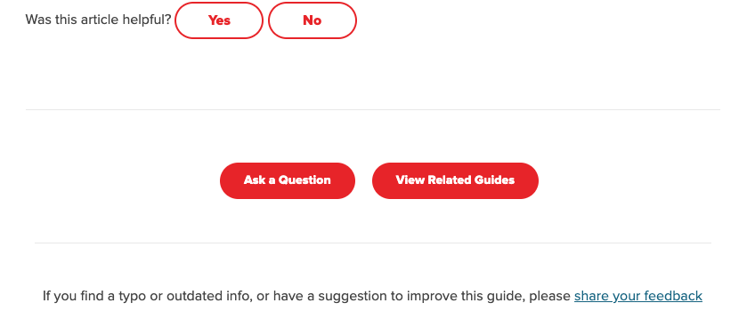
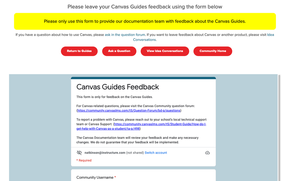
The first way is a link at the bottom of most of our Community guides that takes you to an embedded Google form. The form has a few fields filled out automatically, but was not very user friendly, easy to fill out, or mobile friendly. It also isn’t totally clear what the purpose of the form is and the page where it’s embedded is full of other text and buttons. Not a great experience for someone trying to let us know we have an image that needs to be updated or some text that needs to be revised. And because the form wasn’t completely clear and easier to use, it made our job harder to sort through the feedback and decipher everything that was submitted.
The second way to submit feedback is with a “Was this article helpful?” widget at the bottom of every guide. This presented us with feedback that’s easier to quantify, but the feedback commenting mechanism left a lot to be desired. It isn’t clear what type of feedback we’re looking for in these short comments and many members confused this feedback comment box for an “ask a question” comment box. It’s also not a great experience for our documentation teams, since the comments are plain text and are not sent anywhere. We have to hunt each one down individually and try to discern further context from a very brief comment.
With both of these used in tandem, it made it even more difficult for Community members to give us specific, relevant feedback. It’s not clear which feedback mechanism we want you to use, or which one carries more weight, or which method is easier to use. It also made it difficult for our team to track and act on this feedback to improve our user guides.
To solve this problem, we’ve combined and simplified these tools into one feedback workflow that we hope will serve to allow more Community members to give feedback in a more straightforward way and allow our team to more easily track, quantify, and use the feedback to improve our user guides and overall Community experience.
The new feedback workflow works like this:
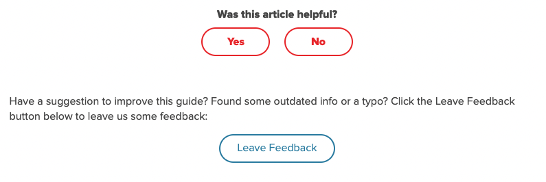
At the bottom of every product user guide in the Community you’ll see a “Was this article helpful?” widget, with “Yes” and “No” options. If you click Yes or No, your feedback is recorded as such in our community analytics (this data is anonymous and only used for guide improvement). This lets us know that our guide was helpful to you and served its purpose or that there are things that could have been improved. Thanks for the feedback!
You’ll also see a new button underneath these options, Leave Feedback. To leave more detailed feedback about why the guide might not have been helpful to you, click the Leave Feedback button. A pop-up modal will display on your screen with a form to fill out. You can select what type of feedback you’d like to leave (was there a typo or did something not make sense or something else?) and leave a feedback comment in the text area. Please be as specific as possible so we know where we can improve. When you submit your feedback, our team will work on researching and updating any applicable guide content as soon as we can.
If you have any questions, concerns, or thoughts on this new process, please leave a comment on this post. As always, we’re constantly working to improve the whole Community experience.
You must be a registered user to add a comment. If you've already registered, sign in. Otherwise, register and sign in.


