Bring Clarity to your Canvas Course Part 3: Home Page
- Subscribe to RSS Feed
- Mark as New
- Mark as Read
- Bookmark
- Subscribe
- Printer Friendly Page
- Report Inappropriate Content
Bring Clarity to your Canvas Course:
Course Navigation + Modules + Home Page
Part 3: Home Page
Hello, I am the Learning Management System Specialist in our K12 district and I provide support and instruction to our teachers and staff in the use of Canvas, promoting consistency, efficiency, and effectiveness. Please visit the other two parts of the blog series: Part 1: Course Navigation, and Part 2: Modules.
As a K12 district we mostly have year-long courses. A year’s worth of content can make for large courses with several modules and several items in each module. Clicking on Modules can mean scrolling and scrolling and scrolling to find the correct Module and content. Some teachers move the current module to the top - this can be helpful, but then modules tend to get out of order, which also can be confusing. To solve this, I recommend creating a Front Page with a clickable table-of-contents for your course, and setting it as the Home Page. This will help bring clarity to your course.
Here are my tips for having a useful and effective Home Page.
- Reduce redundancy by not including links on your Home Page to items that already exist in your Global Navigation or Course Navigation. Items to *not* include on your Home Page are: links to Announcements, Grades, or the Quizzes or Assignments index pages, or to Calendar. Use the valuable real estate on the Home Page to direct students to specific Modules/units, and resources they need daily. (Add content, such as Pages, Quizzes, and Assignments to the corresponding Module. When Due Dates are added to assessments, students also can access them on the Calendar and the To Do list. Other ways students can access various assessments is via Grades and Syllabus.)
- Use meaningful unit names. Instead of a link to “Unit 1” (what is Unit 1 about, anyways?), call it something like: “1: Elements of Art.” By the time a student gets to a later unit, they won’t remember what was covered in Unit 1 if it has a generic name, so it’s important that links to the modules/units have meaningful names.
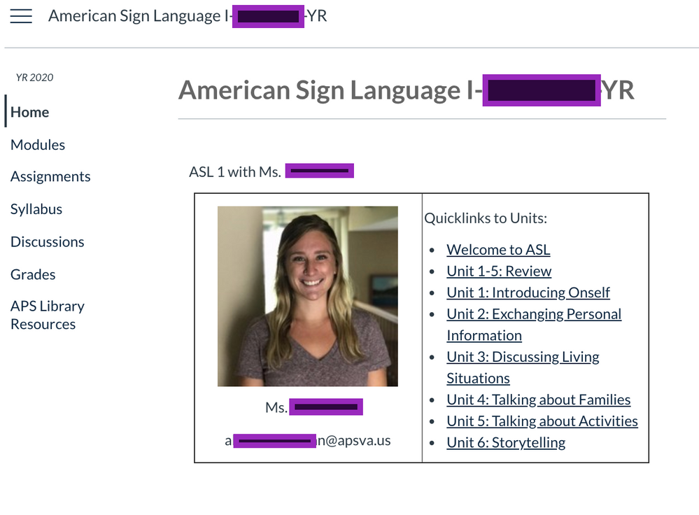
- Avoid making students scroll on the Home Page. Avoid placing a lot of text, or using a large image at the top of your home page that will require students to scroll down to find the links to the Modules and other important links. You may want to use a table, with two cells across, to organize your content. In the left cell can be a small welcoming image and a little text, and in the right cell have your unit links using text. Be aware that if your Home Page is too long and students have to scroll down a lot, they lose visibility of the course navigation menu on the left.
- Avoid multi-celled tables. I’m not a fan of using multi-celled tables on the Home Page. Why? For a few reasons: a) Tables can be finicky and sometimes require knowing HTML to format the way you need. b) Tables are not mobile friendly, and can display differently on mobile devices or different browsers. c) Tables are not accessible and should be used for tabular data, not designing. (Personally, I need to find time to learn how to use DIV tags, so if you have time, please do it. See @erin_keefe 's Tweet for more info: https://twitter.com/mskeefe/status/1220063738730024961?s=20)
- I know a lot of people are fans of beautiful, colorful buttons on the Home Page, but here are some reasons I recommend avoiding them:
- Images may be meaningful to you, but perhaps not clear to students. If you do include an image, please include text of the unit name below the image.
- Screen readers may have difficulty understanding the “buttons” or other images, and this can make navigating the course more difficult for students.
- You’ll need some image editing skills to resize images (you can use the RCE tools, too, but I recommend starting out with an image that is not ginormous).
- Unless your course is all planned out, you’ll have to continue adding images for any new modules. Depending on the number of units or links with images, this can become visually overwhelming.
- Home Pages with many images can become busy and cluttered.
Here is an image of a sample Home Page. By the way, notice how clean and minimal her course menu is!
In our district we are working on having more consistency across courses. Consistency across courses makes it easier for students, too, as they don't need to spend time figuring out how to navigate each teacher's course. One way to make things more clear and consistent is to create a simple, but clean and clear Home Page like the one above. This Home Page also allows teachers to do some customizing for their particular course needs. And having a homepage with links to Modules helps direct students where they need to go.
Bring Clarity to your Canvas Course:
You must be a registered user to add a comment. If you've already registered, sign in. Otherwise, register and sign in.

