Performance by Quintile Conundrum
- Mark as New
- Bookmark
- Subscribe
- Mute
- Subscribe to RSS Feed
- Permalink
- Report Inappropriate Content
Greetings, New Quizzes aficionados. As part of a recent project, I’ve been conducting a systematic comparison of Classic and New Quizzes. When I started looking at the “Quiz and Item Analysis” report in New Quizzes, I noticed some oddities in the way the data was represented in the Performance by Quintile graph. I’m interested in your take.
First let me confess that I am neither an assessment and measurement specialist nor do I play one on TV. I have, however, seen my share of item analysis reports in other quizzing tools, including Classic Quizzes in Canvas. My rudimentary understanding of the role of quantile analysis (be it tertile, quartile, or quintile) in a quiz item analysis is to break the population of quiz takers into 3, 4, or 5 more or less equally sized groups based on their overall performance of the quiz and then use these groupings as a lens for examining performance on individual quiz questions. The quantile graphs and tables that I am accustomed to seeing in an item analysis give the number and percent of students in each quantile that answered the question correctly (or frequency counts for each answer by quantile). This helps instructors to determine whether the individual questions are too easy or difficult as well as whether the question is able to discriminate effectively between students who performed well or poorly overall. Here’s a nice explanation (see “ITEM DIFFICULTY AND DISCRIMINATION: QUINTILE TABLE” section from the University of Illinois Center for Innovation in Teaching and Learning along with a sample report.
After examining several examples, I determined that the “Performance by Quintile” graph in New Quizzes was not actually what it purported to be. Instead, for each question, this graph simply provides a count representing the score distribution for the question. So, for example, on autograded questions with a single correct answer, the graph always has two bars at opposite extremes of the horizontal axis, one for the students who answered the question incorrectly and one for the students who answered correctly. The labels along horizontal axis do not represent quintiles based on overall performance but rather score ranges for the current question. And, of course, there are only two possibilities for autograded questions without partial credit, 0 and 100%.
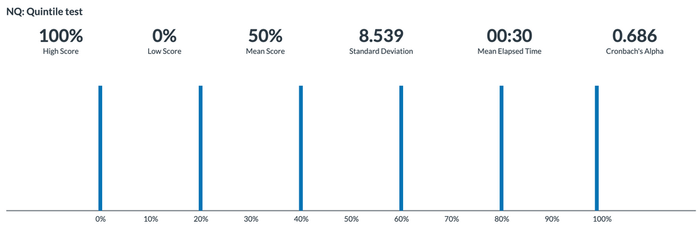
To test my initial hypothesis, I created a five question quiz with six test takers. The first student answered all five questions correctly, the next answered four, the next three and so on, resulting in an overall score distribution of 0, 20, 40, 60, 80, and 100--sufficient to populate each of five quintiles with at least one student. Here is the grade distribution graph at the top of the quiz.
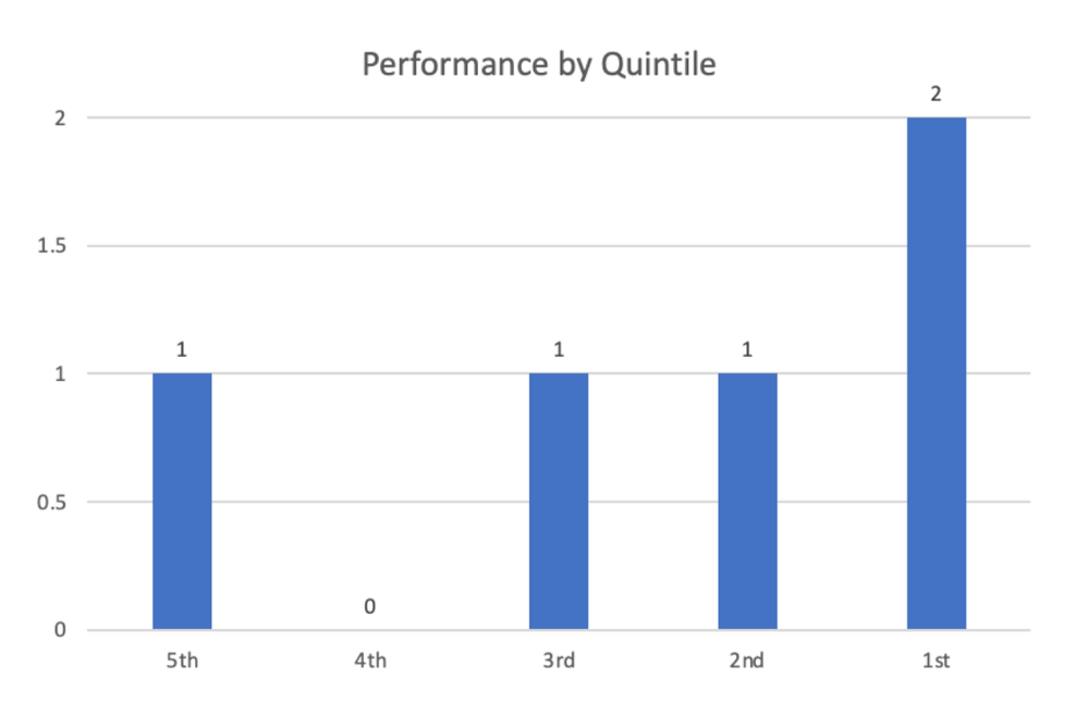
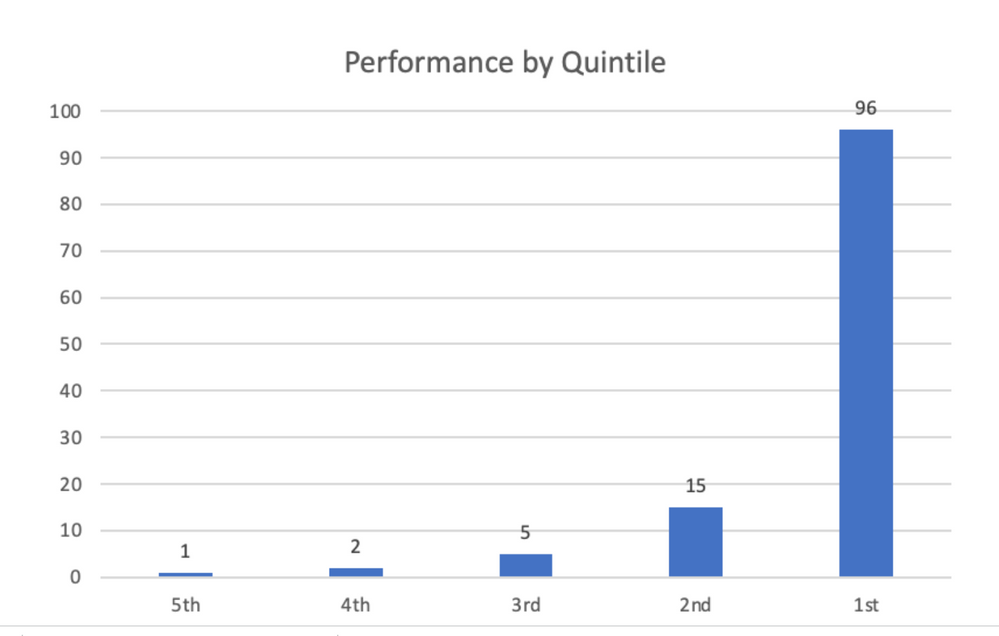
For question 1 in the quiz (a multiple choice question), all but 1 student got the answer correct. So, if the only student to answer the question incorrectly was in quintile 4, a real Performance by Quintile graph might look something like this:
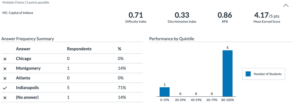
Now here’s the actual “Performance by Quintile” graph in New Quizzes for this question. No quintiles based on overall quiz performance--just a simple count of how many students score in each of the five ranges shown in the horizontal axis -- the five who answered correctly are represented by the single bar at the far right and the one incorrect student is shown in the 0-19% range. There is no indication of whether the student who answered incorrectly was a top performer or a bottom performer.
I have attached the full Quiz and Item Analysis report for the above quiz in case anyone is interested.
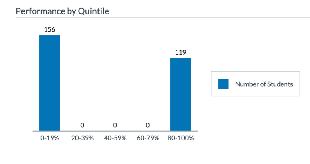
Here’s another real-life example of a multiple choice question in New Quizzes in a class with 275 students. The scores for the entire quiz ranged from 25% to 100% with the majority of students in the 50% - 75% range. In this case, 119 students got the answer correct and 156 students got it incorrect. Here again, the graph provides no indication of which students answered correctly.
A proper Performance by Quintile graph would tell me not only how many students got the question correct, but how they are distributed across the quintiles. A graph like this, for example, shows that the question discriminates well between high and low scoring students:
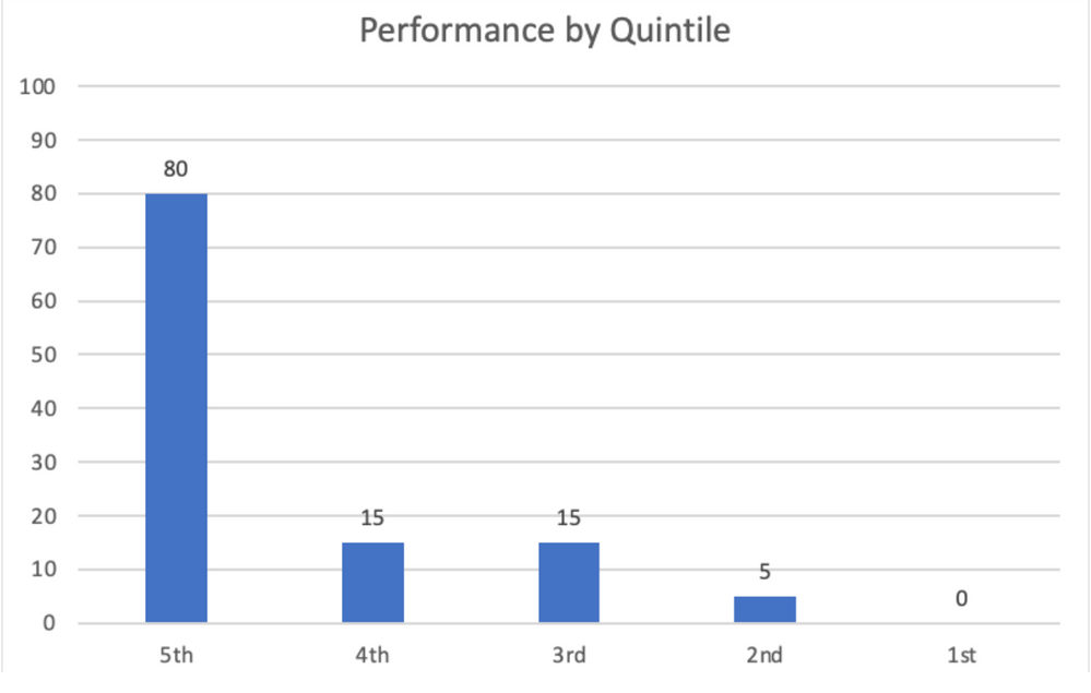
Whereas a graph like this suggests that there might have been something wrong with the question (perhaps the wrong answer was selected as correct) because the majority of correct answers were achieved by poor performers who might have guessed.
So why, you may wonder, am I rambling on about this? Well, as it happens, I submitted this issue to Instructure Support a few weeks back. The issue was elevated to Tier 2 and I was eventually told that the Performance by Quintile are behaving as intended. If that’s the case, I would argue that, at the very least, the label is incorrect and misleading, since the graph does not show Performance by Quintile. In addition, the graph is not particularly useful. There are much better ways to visualize the correct/incorrect score distributions, particularly for questions with only two possible scores. The Performance by Quintile graphs also raise questions about the other item analysis data in the report. Since we can’t export the full results, there is no way to confirm whether the discrimination index for each question is correct (see New Quiz Tool: Quiz and Item Analysis Report, Is Discrimination Index Valid When Using Item Banks?). And finally, if the developers of new quizzes won’t acknowledge the problem, we shouldn’t expect improvements in the reports in the future.
Okay…I’ve laid out my case. What do you all think?
Solved! Go to Solution.
- Mark as New
- Bookmark
- Subscribe
- Mute
- Subscribe to RSS Feed
- Permalink
- Report Inappropriate Content
Hi @leward,
First I'd like to thank you for this comprehensive writing! I wrote a blogpost about the latest update on Item Analysis. I'll ping you in private message for further discussion.

