Let Them be Little: Canvas Elementary Theme

The content in this blog is over six months old, and the comments are closed. For the most recent product updates and discussions, you're encouraged to explore newer posts from Instructure's Product Managers.

jsailor
Instructure
Instructure
16
6641

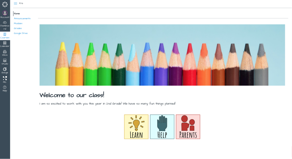
With recent world events turning K-12 schools and districts to online learning, we are excited to release a feature option that specifically aims to improve the experience of our youngest learners in Canvas—those in primary and elementary grade levels. The Canvas Elementary Theming feature option presents learners with a new look and feel including a newly introduced font and simplified course navigation. 


The new font, Architect's Daughter, makes the Canvas course more inviting as it is casual and playful in nature. The font supports those learning to read and write as the letter formation is simple and friendly, with clear distinction of letters that are not easily confused with one another. Also, because the single-story a and g glyphs (as shown in the lowercase letters in the images below) are used in the font, which is consistent with the letter formation that is taught in the primary grade levels and is included in most early literacy programs. 


348428_Screen Shot 2020-05-21 at 11.31.51 AM.png

348424_Screen Shot 2020-05-21 at 11.30.50 AM.png

This fun, new font is presented in the Global Navigation, Course Navigation, and Breadcrumbs Bar when the feature option is enabled for a course. It has also been added to the Rich Content Editor (RCE) as the default font for content creation. With the simplified Course Navigation, if a teacher has not previously customized the Course Navigation, it will automatically be simplified to show only four links for students - Home, Announcements, Grades, and Modules. If you have LTI tools enabled that should show in the Course Navigation, they will also show by default. It is important to note that students will not see Announcements or Modules as options in the Course Navigation if no content has been added to these index pages. 


348439_pastedImage_6.png


If you are teaching in a primary or elementary education setting, we hope you will give this new feature option a try. If you do not see it listed in your course options under settings, contact your district administrator to have it enabled for your account. We highly suggest that this option is set to allow to provide teachers the option of turning it on for their own individual courses as they see fit.


Also of note, this option will be enabled for all institutions in July 2020 as an account-level setting. Administrators will continue to manage the availability of the feature for teachers to manage within their own courses.   


Have fun and keep learning!

Tags (2)

The content in this blog is over six months old, and the comments are closed. For the most recent product updates and discussions, you're encouraged to explore newer posts from Instructure's Product Managers.

16 Comments
MattHanes
Community Champion

Greetings  @jsailor ,

This is a great addition! It should certainly help our younger students.

I don't want to come across as looking a gift horse in the mouth, but would it be possible to give us other options besides Architect's Daughter as a font choice for this feature? Unfortunately, while it has a single-story 'a' and 'g', there is still confusion of an uppercase 'i' and lowercase 'L' as well as the number one.

Say I wanted to type: 1. Icicles hang from shingles

In Architect's Daughter, it looks like this:
348464_pastedImage_1.png

Some other Google Font options that I think might be more helpful in the category of "clear distinction" could be Balsamiq Sans which looks like this:
348465_pastedImage_2.png

Or (please don't judge me for this one) Comic Neue which looks like this:
348466_pastedImage_3.png

Either way, thank you for thinking about this! And I don't suppose this option will extend into New Quizzes?

gailc
Community Novice

Great idea - what else does the theme offer younger students besides the font change?

jsailor
Instructure
Instructure
Author

Hi Matt,

I had a feeling I would hear from you on this enhancement! Smiley Happy And, I completely agree with you about solving one confusion (single-storey 'a' and 'g'), but still having others as you shared so clearly in your comment. 

Because the content creation using the new font is currently available through the new RCE, it will not be considered for New Quizzes until that functionality is updated to using the new RCE.

jsailor
Instructure
Instructure
Author

Hi Gail, 

The new font that is more inviting and playful is the main change. We also automatically limit what students see in the course navigation unless a teacher has already made changes to the visibility of specific items. Because most teachers organize their content through modules (which we also recommend as best practice) there typically is no need for students to also click to the individual index pages for assignments, quizzes, files, etc. To eliminate the confusion that is often felt by students that have these options available, we start hide these from student view upon enablement of the feature option. 

jhyatt
Community Novice

It was not clear from the blog post whether the font was chosen for readability and higher comprehension by young students. Can you clarify that for us?

chillman
Community Participant

I really hope there are more changes coming to the elementary theme than just the font option.  The font change does nothing to the function of Canvas.  As someone who is training teachers of those who teach kids as young as four and want our students to use Canvas independently, there are some legitimate concerns. 

We have done a lot of cool things with preparing our students for distance learning in the Fall (which you can see a few examples here) , but the RCE and new RCE are not very user friendly for elementary students to use.  

One option I would love to see is either Seesaw becoming an LTI available in Canvas or making the RCE for students much easier to use similarly to the Seesaw layout.  This is what the Seesaw layout looks like for students to respond.  They can respond with a video, an image in which they can record a voice over and annotate over top as well, link to external sites, draw and record, and much more. The large buttons are easier for dexterity and the options are easier to differentiate.

chillman
Community Participant

Suggestions for improving the Elementary Theme:

We have emphasized building an online community which requires our students to interact with each other.  This is pretty difficult for our littles to do without a parent right by them or using an external tool such as Flipgrid. Even with video tutorials for our students, there are still multiple steps in the content editor to upload a video or an image. This task may seem simple for grades 3+; however, multi-step directions for a 4 year old are pretty difficult. (Go to the reply, click the three dots on the right, click studio, and then record. Then, save and reply). The old video in option in RCE is so unreliable that the frustration level for littles will get very high if their videos don't save the first time.

After our engage piece, we give our "I can statements." We have recorded ourselves or our bitmojis giving audio directions with captions so that part should be easy enough.

From there, we have another page for our direct instruction.  No student interaction is needed for this piece; however, even a large button that has an arrow instead of the words next would be beneficial.

Then, we go into the guided and independent practice and without the use of external tools this is very difficult for littles to upload an assignment when reading is an issue. Also, the iOS Canvas app does not allow for many of the natural integrations for littles to occur because they also use an app. 

Finally we end in our launch for the day so if it is just a page with little interaction, no problem, but again discussions or submissions are pretty difficult.

IMHO, some of these things need to be developed pretty quickly because of the return to learn plan.  We can't expect parents to sit with their children to all of their distance learning, and without having met these students before to instruct or give guidance, it will be pretty difficult to move forward with the littles.

I know this is a lot of suggestions but wanted to throw out some ideas to suggest for making the elementary theme so much better than just a font change that does nothing to the delivery or ease of use for students.

jsailor
Instructure
Instructure
Author

 @MattHanes ‌, wanted to follow-up to be sure you noticed the change that we made this weekend (last weekend in beta, this weekend in production).

To ensure the font used in this theme uses symbols that meet the criteria for clear distinction of letters that are not easily confused with one another for all letters, we changed the font to Balsamiq Sans. 

Because many liked the addition of Architect's Daughter, we did leave it available as an option in the RCE. 

jsailor
Instructure
Instructure
Author

Hi Jon, 

Yes, the font was chosen to improve readability and comprehension for our younger students. We specifically wanted to ensure that we use the single-story and glyphs to be more inline with what is typically used in primary levels when learning to read and write. We've updated the font to Balsamiq Sans, which is much better suited for this purpose that the originally selected font. 

MattHanes
Community Champion

 @jsailor , thank you for making that change! I think that was a great compromise!

rislis
Community Champion

We are moving forward with Grades 3-5. This is the template we decided to use. Canvas Commons 

If we are able to start in buildings, we will encourage teachers to use the 3 pinned announcements to deliver content and assignments. If (or is it when) we move back to all virtual learning, we will encourage teachers to pin 5 announcements - dated for each day of a week. Students will be able to go back to announcements to see previous work and links will be taken to the first item in a module We will also ask teachers to make the last item of each module be a link to take students back to the Home page Via URL to avoid automatic movement to the next published module.

       Wish us luck as we present this to teachers next week. 

James
Community Champion

 @jsailor  

As of right now (8 hours after this post) you are still loading Architects Daughter and Balsamiq Sans in instances that do not have this feature enabled.

350508_pastedImage_1.png

350509_pastedImage_2.png

Can you explain why this is necessary or beneficial?

jsailor
Instructure
Instructure
Author

Hi,  @James ‌,

These fonts have been added to the list of fonts available to an instructor within the new RCE, so they are available to all users. Users should only see the font as an option to select if they open the formatting menu as shown in the screenshot below.

350534_pastedImage_1.png 

If the Elementary Theme is enabled, Balsamiq Sans will be made the default font for content creation and will also adjust the font in the Global Navigation, Course Navigation, and Breadcrumb. With the Elementary Theme off, the default font for the RCE and the font in the Global Navigation, Course Navigation, and Breadcrumb will remain Lato as before.  

If you are seeing functionality different from this, please submit a support ticket so that we can take a look. 

Thanks!

James
Community Champion

 @jsailor  

I filed a help ticket. None of the other fonts on your list are being loaded and I'm not using the new RCE (it majorly sucks for content creators). It's not a case of the fonts showing, it's a case of you loading things that don't need to be loaded because they cannot be used.

jsailor
Instructure
Instructure
Author

 @James ‌

Thank you for the clarification. I'll look for the support ticket so that we can investigate this further. 

williare2
Community Participant

There is a facebook group Online Art Teachers K-12, and we recently had a summer conference.  Therewas a great tutorial for creating Bitmoji classrooms given by Holly Bess Kincaid.  Her two videos from "summer camp" can found on youtube.  It convinced me that the Bitmoji classroom was more than just a cool trick...it gives visible directions (and you can attach audio/visual content) ...that is where you get beyond the font choice, right?  

Holly Bess Kincaid was using Google Slides where the homepage Bitmoji classroom was a slide with images that were links to other pages and/or external content.  

I am trying to determine feasibility for establishing Bitmoji classrooms within Canvas.  The home page would be a Bitmoji classroom.  There would need to be a large background image with .png images layered on top of it.  Links to other course pages and external content would need to be either attached to the images or somehow placed where we want them.

Can Canvas handle the image files without displaying broken image icons routinely?  

Can we associate links to Canvas course pages and content (quizzes, discussions)?

Can we link to external resources?