While instructions for how to cross-list sections are clear and not hard to follow, the process itself can use some improvement.
With the current process, unless a user has done it many times, they are very likely to get it wrong without the instructions at hand: they have to remember to go to the child site first, which is not always how their brain works in regard to cross-listing.
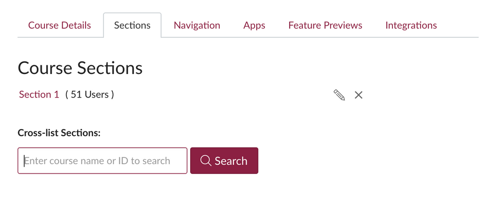
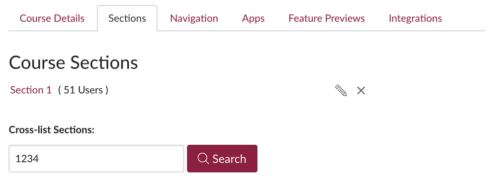
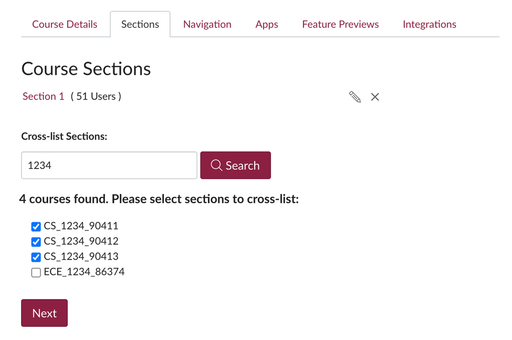
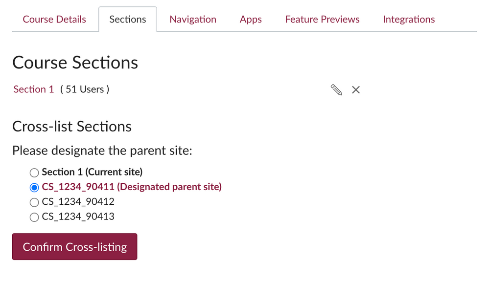
I feel the process can be made much easier if changes are made to the UI and the workflow looks something like the mockup below:
- Go to any course site you'd like to cross-list:
-
Search for other sites to cross-list:
- Pick sites to be cross-listed from search results:
- Designate main site:
- Done!
Similarly, de-cross-listing can be made easier as well.
Who rated this idea


