Home Sweet Homepages without Tables
- Subscribe to RSS Feed
- Mark as New
- Mark as Read
- Bookmark
- Subscribe
- Printer Friendly Page
- Report Inappropriate Content
Lately I've been busy as a bee, cross pollinating between the tips stefaniesanders shared in Creating an inviting course home page and the HTML Snippets @G_Petruzella shared in Columns Without Tables: code-snippet. Back and forth I went until I finally had something I think is sweet as honey and ready to share. Combining all the ideas and more I came up with some new homepage designs.
Design Notes:
- Not That Wide- When you are designing a homepage in Canvas you have to remember that you are working with less width than a page that is not set as the homepage. This is because the task bar on the right side of Canvas effectively takes up 285 pixels. Taking the left course nav into consideration as well, this leaves you with approximately 840 pixels of usable homepage space if you are designing with the WXGA (1366 x 768) screen resolution as your lowest common denominator.
- To Banner or Not to Banner- Your course homepage is like a welcome mat. Some are utilitarian, some are over the top and have too much going on and some are just blah. As a teacher you want your homepage to say come on in and I think having a nice visual, professional looking banner at the top of the page helps to set that tone. Banners that are 760 x 100 pixels are a common size used on various websites and that size works well for Canvas homepages too. You could go a little wider or taller maybe 840 x 120, but then you are pushing it. Going no wider than 760 allows for some wiggle room.
- Teacher Presence- Adding a teacher's picture to your homepage with some contact information is a great way to communicate that there is a caring, passionate and approachable human being here to help you learn. To do this, I settled on 140px wide as a good size and wanted that to look like it was right aligned to the banner image at the top of the homepage. This turned out to be tricky. Since you're not using tables and the page can be much wider than the banner image, I found that the picture was not really lining up well and looked out of sorts way over to the right or left. Ultimately, I setting the div width for the div that preceded the picture to a maximum fixed amount of pixels and discovered that this worked pretty well.
- Breaking Buttons- Originally I was planning on using HTML generated buttons using CSS properties found in the Canvas Style Guide. However, @dlyons who works at Instructure cautioned us not to rely on style guide elements in the RIch Content Editor Areas of Canvas. So there was that to consider, and the buttons made this just don't have enough pizzaz for my tastes. Therefore, I used some icons from Google's Material Icons Project and one of my favorite programs OmniGraffle - diagramming and graphic design for Mac, iPhone, and iPad to break with the traditional buttons and make some buttons that pop.
- Blurb Space- When you walk into a teacher's physical classroom 90% of the time you'll notice that they have a little message or important items written on one of their whiteboards. In Canvas we have announcements that can help with this as well as messaging but I still think homepages should have a blurb space. This is a small area that you can add a quick and timely message to and point out a few key things your students need to pay attention to. When designing your blurb space you want to increase the odds the it will actually get read and not glossed over so consider how Size Matters: Balancing Line Length And Font Size In Responsive Web Design. Is your font large enough? Are you lines 45-75 characters long?
- Share- If you have any suggestions or any homepages without tables you'd like to share, please add them to this post.
Update: I've included a new version (v2) that lines up as 3 columns on most desktop/laptops and has the buttons aligned vertically going down the left side of the page. I think that is my favorite of the two, but I go back and forth.
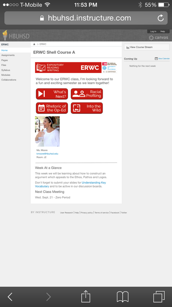
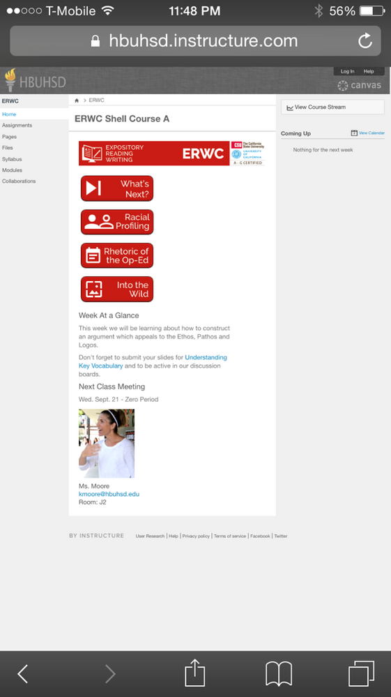
v1: Laptop (WXGA 1366 x 768)
v1: Phone 6 (Mobile Browser)
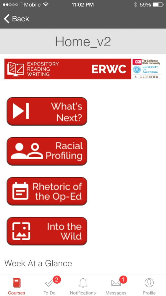
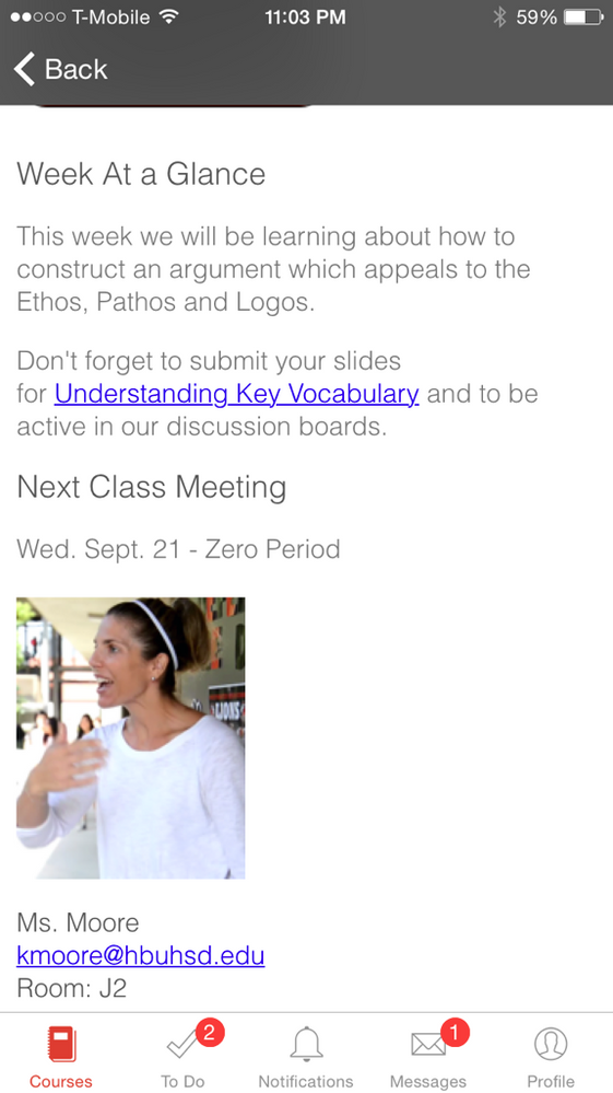
v1: iPhone 6 (Mobile App)
v2: Laptop (WXGA 1366 x 768)
v2: Phone 6 (Mobile Browser)
v2: iPhone 6 (Mobile App)
Source Code:
Canvas Homepage HTML ERWC - Google Docs (shared so anyone with link can make comments on code)
You must be a registered user to add a comment. If you've already registered, sign in. Otherwise, register and sign in.


