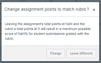
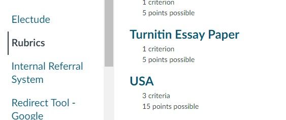
This sort of hints at a second level problem ... (at the risk of pulling the topic onto a tangent)
I really don't like the "trash can" icon. To me, it means "trash it", but to the programmer that could mean a lot of things: delete? disconnect? disassociate? make it smelly? disintegrate? burn it all?
If we are lucky, the app programmer was smart enough to include a mouse-over note, which this does. But it just says "Delete Rubric", which, as we've seen, is a little too vague for my comfort. Wiping things out of existence shouldn't be that easy, and every button should err on the side of the safe option ... lots of annoying "Are you sure?" messages, or better still: "You are about to completely delete this rubric from existence everywhere no matter what it's attached to. Are you good with that? [] yes [] no"
For that matter, any button that's so ambiguous that you feel the need to go double check to see what it did, isn't designed very well.
Connecting a rubric to an assignment should only ever be about the connection, NOT the existence. Maybe the button shouldn't be a "trash can" at all, but rather a "broken link" symbol and ALL IT DOES is disconnect ... "No disintegrations!"
Engineering philosophy: Make it hard to break and easy to fix.


This discussion post is outdated and has been archived. Please use the Community question forums and official documentation for the most current and accurate information.