Hi Dona,
First, tracking a user to a specific time and location has some issues, see How to produce login and unique login reports
I'm working on a solution for this, but I'm keeping it close to the chest for now. Stay tuned.
Now, I know we've talked in another thread about Canvas Data, so I'm going to jump right in.
I have a process that includes Canvas Data, Ruby, a free API, and Tableau to generate the map in this tweet...
https://twitter.com/NVLearningAcad/status/1006302472371990528
I use the pseudonym table for Current Login IP (because there's too much noise in Requests). The API I use for geolocation provides everything to map the record and timezones for other purposes. It's a short Ruby script, but the whole process is wrapped around Canvas Data, querying it and then saving the geo info to a new table. I can share it on Github if you can support it or have a developer/programmer who can use it as a starting point.
As far as Where in Canvas the user is, I generally try to target some kind of context.
It's one thing to look for page counts by user role, course etc... Apr 18, 2018 1:31 PM
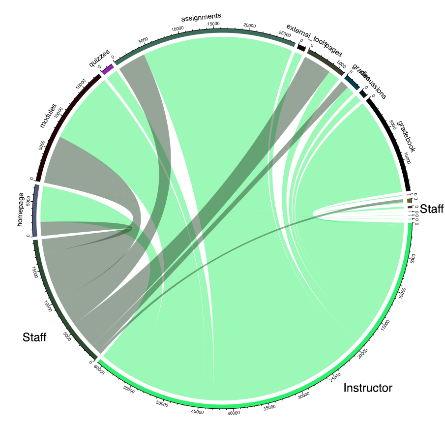
And another to map out the workflow the user took while navigating through Canvas, something like Sankey or Chord Charts (HE) Analytics in Course Design: Leveraging Canvas Data - Canvas Network
Here you see the instructor and two staff members navigating through the course, these are page counts. The staff are jumping into the course and helping, the one on the right which I erased to clean up PII, shows that staff member coming in and adding Announcements to the course, you can also see that little thread from the Staff on the Left jumping in to add an announcement.

This shows us what pages they visited and how often, but not how long.
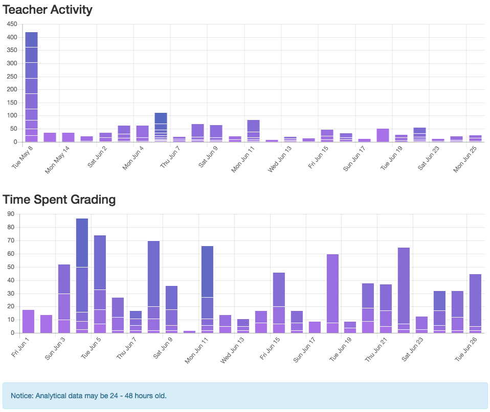
I find it's best to select a set of records or a type of record and specifically display that information with meaningful context. Below is a screenshot of our LTI Dashboard. The top chart shows time spent in the course by my best estimation using the Requests table. The second chart uses submission_dim and JOINS to try and determine how much time they spend grading assignments. These 2 charts don't really say Where the instructor was, but it does provide context when a School Admin wants to see how different staff spend their time. What something like this shows us after reviewing it for a couple semesters is that Teachers who do a lot of grading in SpeedGrader might have more time in the course or spend time grading, but teachers that have assignments that are graded obviously spend less. However, it's not necessarily an across the board comparison. Ex. A teacher may spend hours reading essays marking on them and coming back into Canvas and rapidly apply all the grades, which would show very little time.

I'd love to know what you're thinking or what your leadership wants to see, I'm always curious and ready to dig new rabbit holes.


