Fix the Canvas Course Invitation Email (New Students)
| This idea has been developed and deployed to Canvas |
For more information, please read through the Canvas Deploy Notes (2020-10-07).
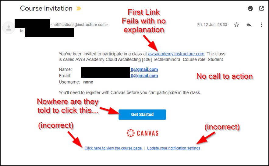
The email sent by Canvas to brand new users who need to register includes three problematic links – see marked up screen shot.
If the user clicks on one of those three links (commonly the first one in the email) it leads them to a log in page – which, of course, they cannot use. That in turn leads the user to think they need to try to recover their password (which won’t work since they are still in a pending state and don’t have a Canvas password yet). And that leads to support tickets being raised.
We believe that these links should all be REMOVED from this template as they serve no purpose and lead to more work for the Canvas support team and your customers support teams when students are confused and frustrated (which also creates a BAD FIRST IMPRESSION of Canvas and our own brand).
The ONLY button/link that will get them learning is the “Get Started” button – which should have singular focus in this message.
----
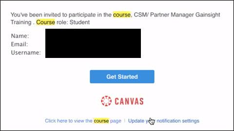
For context, there is a separate and distinct email template send to EXISTING Canvas users, which is not the problem. See screen shot below. The links at the bottom are distracting, but they are at least actionable for a user who has an account available on Canvas.


