[Mobile - Canvas Student] Include mobile login in Theming options
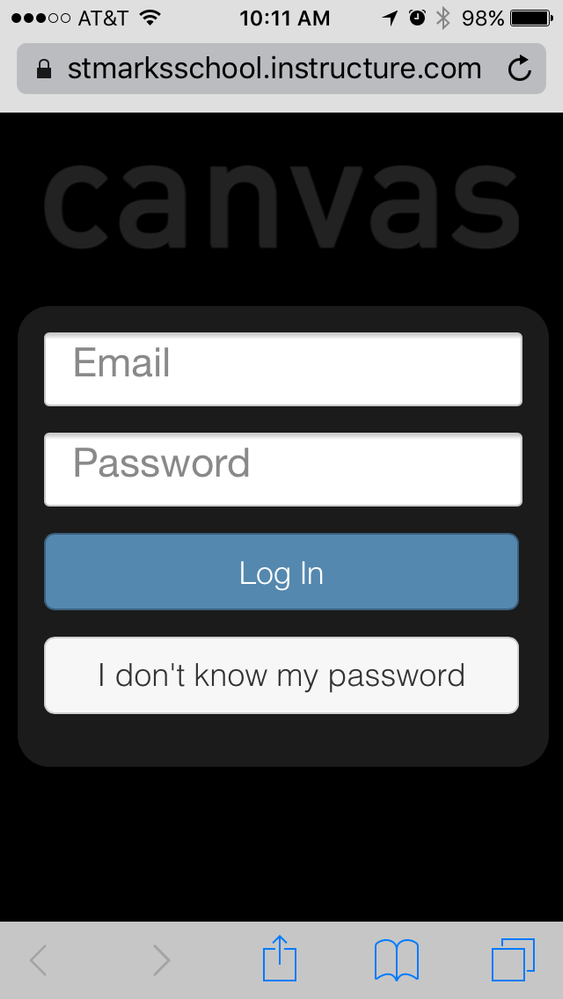
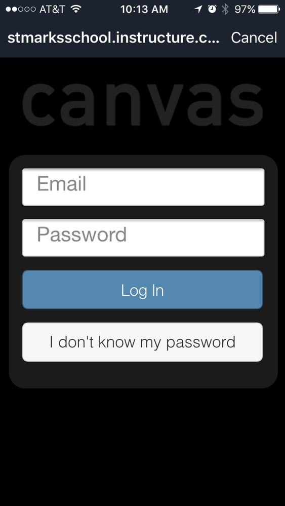
While it is certainly possible to generate CSS that will style this login (this, for example) to match institutional branding, the trend towards more admin-friendly theming would be welcome here.
As there are numerous instances of Canvas in the wild -- I gather Instructure has been fairly successful in garnering institutional adoption -- and our students often have logins in several instances, some confirmation as to which instance they are logging into in the moment is really helpful. In fact, it supports our support team in sorting out user errors if we're able to ask "well, was the login where your username wasn't working blue with a lion on it?"
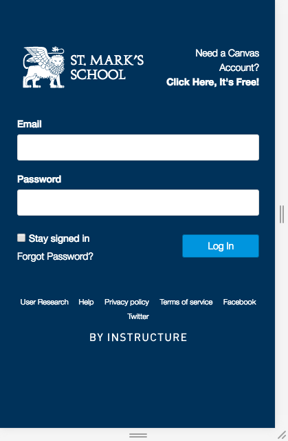
It would be really keen if the general login options could just be scaled to match the mobile login screen, perhaps thusly:
Note that all the magic I did to create this login page is toggle device mode in the Chrome Developer panel and roughly scale and center the desktop login. Seems like all the info necessary to create a branded mobile login is already in the Theme system. Please use it!


